After 14 years using Microsoft On Premise BI Tools (SQL Server, Reporting Services, Integration Services and Analysis Services) Its time to embrace Business Intelligence in the cloud.
Go to the workspace and check your report is available
The new Report is called RoleBasedSecurityTestAdventureworks
Next go to Security. Click on … Settings on the data set
Testing roles in the Service
Before assigning roles to a User or Group (As above), you can click on … against each role and Test as role
Once set up, it doesn’t matter how many times you republish a model. It wont cause issues with the security. This kind of security is called Static security because the values have been determined in the DAX expression in the desktop file.
Once you have tested your roles you can add users against each role.The Report is now ready use
This is fine when you are implementing a simple solution above but becomes a pain if you have, for example thousands of roles. employees who want access to their own payroll information.
The next how to guide will go through a basic dynamic security example
Another new feature from the May 2020 Microsoft Business Applications Summit
This became available in April 2020 and its a fantastic feature. Lets have a look at it
There is a lot going on in the Adventureworks Portal. Lets go to View to go into the Lineage View
The Lineage View gives us a lot of information so lets look at everything in more detail
Data Source
We start with the data sources. this gives us information about the type of Data Source
Local Database
Azure Database
xlsx
Click on each source to find out more information
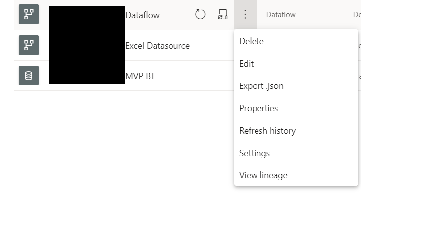
Dataflow
I can immediately see there are issues with the dataflow
Clicking the two arrows allows you to see the lineage of just that one object
Everything else is greyed out
Clicking on the data flow shows you the objects within the flow but you cant look any further at the items within the object or any of the code behind the objects
Data Sets
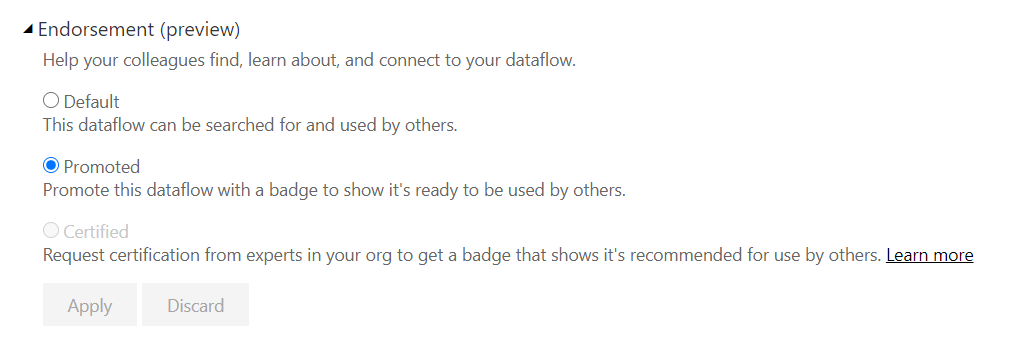
Note the blue icons. This shows that the data set has been promoted for use. There is also an icon for certified data sets (If admin allows you to certify).
You can Promote datasets, Dataflows are currently in Preview. To do this, go to the Settings and Endorsement
Back to the Lineage
Within the data set we can now see the data items within each table object.
We can also see the measures that have been created with DAX, but we cant see the code that creates the DAX
Reports
The Reports contain all the visuals. If you click on the Up Arrow you can open the report
Dashboards
Finally information about the dashboards.
the great thing about Lineage is the ability to see everything that connects together
This will even work for reports and dashboards that are connected to data sets in other App workspaces.
Alerts
Check the impact of any changes. here we see if impacts very little.
You can also send an email to everyone who needs to be notified that a new data set is being published. this goes out to your Contacts List
Go to Your App workspace and select Workspace Settings
Go into Advanced and change the contact list. this will ensure that everyone receives an email about any impacts and changes.
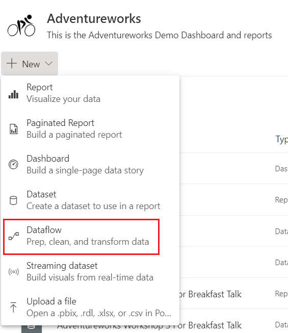
Dataflows allow you to separate your data transformations from your data sets. we can now centralise the dataflow and connect to the flow in power BI Desktop instead of having to connect to the data.
to create a dataflow, instead of getting data within the Power BI desktop pbix file, you create a dataflow in Power BI Service
This this takes you to Power Query Editor within the Service, where you can do all your transformations.
This is a great feature and goes along way to providing us with our Modern Enterprise Data Experience.
there is only ever one owner of a dataflow, which means that if you are not the owner you cannot work on the dataflow. Thank fully there is now a Take Over Option.
If you are not the owner and you are a Workspace admins or member you can take over ownership to work on the flow by going to
Settings(In the top menu bar)> Settings
And then to dataflows. If you arent the owner you will see the takeover button that allows you to work on the dataflow.
This is great but we did have some questions
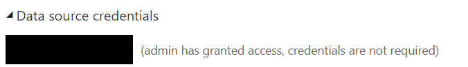
If the Initial owner added the Credentials to the Data Source to create the dataflow, does every Owner need to also add in the credentials?
From our Testing, when you take over the Data flow, you need to reset the Gateway, but you dont have to worry about the credentials.
This happens every time you take over the data flow
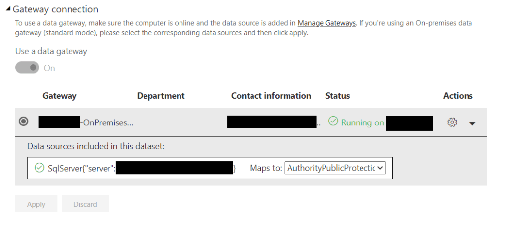
Dataflows connected to on premises data sources. How do we use the Gatway?
You cant use the Personal model of Gateway with a dataflow. You must use the Enterprise Gateway
You must have a Power BI Pro License to use the Gateway
The connections use the authentication and user information input into the data source configuration. When using takeover, these need to be re established.
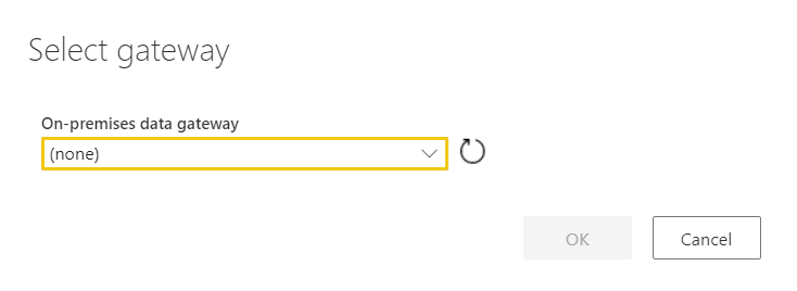
There are three developers working on a solution. Two have been at the company for a while and have no issues accessing the dataflow. However, when I take over the data flow and get to the Power Query Editor in Service I hit the following error
Clearly I, as yet don’t have access to the Enterprise Gateway
Gateway checklist
Installing the Gateway (You can download the Gateway from Power BI Service)
In this Example, the Gateway has been installed.
Step 1 is to Install it on a server.
2. Sign into your Power BI Account to configure the gateway
Once installed it needs to be configured. In Power BI Service, Settings, Manage Gateways
Decide upon a name and a recovery key (And make sure you don’t lose the key)
3 Add Data Sources to the Gateway
Server Name
Database Name
User Name
Password
Security or Authentication methods
Advanced setting specific to just that data source type
Again, because Laura can access the data source, this has all clearly been set up. Server ds2chl261 Database AppDB
4. Tell the Gateway who can access the data source.
Click the Users Table and add the users of the data source.
5. Amending the Gateway
Again you go into Settings and Manage Gateways
Choose your the Data source ( Server and Database ) and go to the users Tab to add Users
In the above example, the gateway is being amended by adding a new user.
Once in place, the user will simply be able to select the Gateway as above.
Preview of Promoted Dataflows
You can now as of June 2020, set your dataflow to promoted to ensure everyone knows that this a dataflow that has been created and managed centrally, possibly by your BI team. It will eventually give you your ‘one view of the truth’
Go to Settings for your dataflow
And Promote the dataflow in the same was as you can with a dataset.
Only do this if its established that this is now centrally managed rather than self service data mashup
Note that certified isn’t yet enabled because this is done by your Power BI Admin
One was from the session related to DAX and Power BI Models. We have already spoken about Steering clear from flat files. Power BI prefers the STAR Schema model comprising of a fact table and Dimensions providing all the filters for the metrics
I however, do seem to use snowflake schemas and it seems that even these aren’t recommended for Power BI.
So i wanted to have a look at this and see why I do it and what it actually means for Power BI. Also, how can I change my thinking on Snowflake to STAR
Example 1
This is very similar to something I am working on at the moment. We are looking at Events and these events consist of Agenda items. Its very easy to create a snowflake schema for this. Lets see how it would work in Power BI
I have loaded the data into Power BI
Fact to Dim is one to one. the relationships started as both direction. Moving the facts into a Fact table and the descriptions into a dim table in a 1 to 1 relationship is called creating a Degenerate table
I have changed it to 1 to many to get the single direction filter and the fact that the event table snowflaked off from events creates 1 to many.
If you however leave the model as one to one, both direction, it makes no difference to the results. Seperating the fact and dim when the relationship is a 1 to 1 is knows as a
this is an interesting look at the results. there are two events.
When you bring in data from the Snowflake dimension, it still shows the 2 event metric. However the metric looks a little confusing if dont understand the data
For example, the table with EventDetail and Event should sum to 12 (the 12 Agenda items) but it doesn’t. It Sums to the 2 event (Which is correct for the number of events but is not correct for the number of Agenda items)
So the next question the user wants is, how many agenda items are there per event?
I created a Measure in the fact table that does a distinct count of the Event Detail IDs
Again, this works a treat. There are 12 Agenda Items
And again, the new measure shows us correctly the number of agenda items.
the snowflake seems to be doing everything that it needs to do. At this point it still feels like Snowflake is still a good option. But, how would you change this into a snowflake Schema?
Fact table 1 to many
lets have a think about how 1 to many happens using the date dimension as a good example
Notice the the dim is on the one side and the Many is on the fact side.
This is what we are looking for. the dimension holds a short fat table (One date)
And the fact table is long and thin (The date ID is in the fact table many times)
Denormalise the Event and Agenda tables looks like this
The Fact is connected to the Event and Schedule by the Event ID
I created a new measure on the new Event and Schedule Dimension
# Events (STAR) = DISTINCTCOUNT('Event And Schedule'[EventDetID])
And I now have the same visuals against the Star and the Snowflake
So lets see how they match up usingPerformance Analyser (You may have to turn it on in Options and Settings – Options – Diagnostics)
I have created a blank page to start from
From the blank page start recording
Great, you can immediately see that the STAR was quicker. We have a tiny amount of data but if you have a lot of data this will really make a difference
So we created a Star schema and sped our reports up. Although there are no issues with the snowflake, this is a clear win for the star.
Incremental Refresh came available for Power BI Pro a few months ago but when tested there was am issue. Error Resource Name and Location Name Need to Match. This should have been fixed in April so here is a quick check list of how you approach incremental Refresh
Define your Incremental Refresh Policy
What is your data source?
Are new rows simply added to the dataset in power BI?
Are records deleted?
can old rows be updated?
If rows can be updated, how far back does this go?
How many years worth of data do you want to retain?
Which tables in your data set need incremental refresh?
Can you define the Static Date within the table that will be used for the Incremental refresh?
have you published to P
Each of these points are very important and will establish what you need to do to set up the incremental refresh, from your data source up to power BI Desktop and Service.
Set up incremental Refresh in Power Query Editor. Create Parameters
Go to transform data to get to the power Query Editor (You can either be in desktop or creating a dataflow in Service)
The two parameters that need setting up for incremental loading are RangeStart, RangeEnd
Range Start and Range End are set in the background when you run power BI. They partition the data
Query Folding – RangeStart and RangeEnd will be pushed to the source system. Its not recommended to run incremental processing on data sources that cant query fold (flat files, web feeds) You do get a warning message if you cant fold the query
You cant Query fold over a Spreadsheet. Its possible to query fold over a Sharepoint list. the recommendation is to set Incremental processing up over a relational data store.
For the desktop. allow yourself a good slice of the data to work with. for example, a year, two years worth of data.
Filter the data in the Model
Still in Power Query Editor.
Add your parameters to every table in your data set that requires incremental load
Find your static date. E.g. Order date, Received Date etc
Close and Apply
Define your Incremental Refresh policy in Power BI Desktop
Go to your first table and choose incremental refresh
Example screen shot of an Incremental refresh policy
Store Rows
In the Above example we are storing everything for 5 years. its set to months so the partitions are smaller
Refresh Rows
Our Refresh policy is very simple. Data is inserted. not deleted or imported.
If this was running every single day then you would only need to refresh rows in the last 1 day. However as a just in case 1 month has been used, in case for any reason the job is suspended or doesn’t run.
Detect Data Changes
Detect Data Changes has been used. The months data will only be refreshed if the ImportDate for this record is changed (Or there are new records)
No records are deleted so we don’t need to worry about this
If you want to use Detect Data changes you must have an Update date on your source data. This may impact your data source.
Are you running straight from source into Power BI and there is no Update Date available?
Then you will need to make the decision to have a reporting database layer, Where you can add UpdateDate logic to your table
Is there a possibility that records are also deleted?
You need to deal with this slightly differently
Set Soft Delete in your reporting data
Add isDeletedColumn and update LastUpdatetime and isdeleted to 1 in the warehouse
This will come through to your model as updated and you can filter out all the isDeleted records
Publish the new Power BI Report and Data Flow
You might be thinking at this point, but I dont want the filters that I have set for Desktop to be applied in Service. I want to see all my data in Service
Dont worry, in Service RangeStart and RangeEnd don’t keep the dates specified for the filters in Desktop.
they are set via your incremental refresh policy. So they are set as the partitions for our 60 months (Instead of setting it to 5 years, meaning there is one RangeStart and OneRangeEnd, you get RangeStart for Month one, RangeEnd for Month 1, RangeStart for Month2, RangeEnd for Month2 etc, breaking your 5 years down into much smaller partitions to work with,
Testing Your Incremental Refresh
Make sure before you add the incremental Refresh you have done a full process of your data. Its good to get an idea of the time you are working with
Once installed, connect to the SQL Database that is your data source
So long as you have the profiler extention installed you can Launch Profiler
If you don’t have it, you can download the extension
Once Launched Start a Profiler Session
Go into Power BI service, Datasets.
click on refresh now and then go to data Studio to see whats happening
From Logon to Logout during the run, it took 20 minutes because the entire model is refreshed. obviously it would be really good if we could get the time down using incremental refresh
Before you set up Incremental processing, ensure that the services preceding the Power BI Load have been well tested and signed off.
Once Incremental refresh is in place, you can refresh again and check your findings in Azure DAX Studio.
the current recommendation, due to all the possible data source amendments and issues, its recommended to start with a relational data base as your reporting layer. Then you can Query Fold, Add IsDeleted and Updatedate columns and logic to this data source.
The Microsoft Business Applications Summit was held online this year on the 6th of May and as a UK user, that meant an entertaining evening of Power BI and Business applications learning and updates .
The evening was incredibly well thought out with 30 minute sessions on each of the Power Platform areas.
Power BI
Power Apps
Power Automate
Power Virtual Agents
Our attendance was mostly based on the Power BI sessions that night. We wanted to focus on what to get excited about with Power BI and when to get excited about it. However there were also some great overviews of how to use all the applications together which helped us to understand the Power platform as a whole.
Power BI Is split into key area to drive data culture in your organisation
And each of these areas contain some fantastic new updates.
Each area is going to be looked at in a lot more detail in blog posts to follow but in the first instance, lets take a look at all the exciting updates.
All this comes from providing amazing data experiences to customers.
AI Infused Experiences
The very first AI visual for Power BI was the Key Influencer. Next came the Decomposition Tree and then the Q&A visual. All these visuals have proved big hits with report consumers who get the ability to understand all the factors that drive a metric, and can ask more and more questions against data in their own way.
Lets have a look at some of the Updates, and even more exciting is the new visual coming for Smart Narratives
Key Influencers Update
Key influencers are fantastic and we have been using them the moment they were added into Power BI as preview.
We have used it across lots of projects, For example, Social Media influencers. What influences a negative tweet. Customer Churn is another great use case for the Key influencer
April 2020
Key Influencers now supports continuous analysis for numeric targets
May 2020
Binning Support, Formatting options and Mobile Support
June 2020
More Visual Updates go into preview and will now be usable for Live Connect
July 2020
Counts will go into preview
August 2020
All the key Influences improvements should be moving to GA (General Availability)
Power BI Decomposition Trees Update
The Key influencer allows you to analyse a category within your data and discover influences and segments. The Decomposition tree allows a report consumer to analyse a business metric however they want.
May 2020
You will be able to conditionally format your visual very soon. Using the above visual, you might have the most engaged businesses in Nottingham, but conditional formatting could show the most percentages of meeting cancellations. We can do conditional formatting on another metric
You will also be able drill through from the decomposition tree visual to more detailed data.
There is a reason why people love this visual and we cannot wait to start implementing these updates into our reports.
June 2020
The Decomposition Tree will now be out of Preview and in General Availability
Q&A Visual
We can now include Q&A in the reports as well as just from the dashboards and there are some great new updates for this
April 2020
Add Terms within Q&A allow for better synonym matching and Suggest questions will allow you to tailor some ready made questions for your user
May 2020
New Q&A Visual Updates (TBA)
September 2020
Direct Query will be coming for Q&A Visuals.
New AI Visual – Smart Narratives
Available Later this year
We got a sneak peak of the New Smart Narratives visual and it looks so good.
Report authors will be able to add dynamic interactive narratives to reports and visuals. These narratives update when you slice and dice the data.
It automatically does trend analysis
The visual calculates the growth automatically with no user imput required
You can also add dynamic values as part of the narrative and even use Q&A to create the value
This is one development we are really looking forward to.
Power BI End User Personalisation
June 2020
Another development that is going to change things for report consumers in a really good way is personalisation
You may love a stacked area chart but Julie in HR May hate them. Consumers can now click on a visual, go to personalise and change the visual to suit their needs better. This visual is saved specifically for that user (As a modified view with a personal bookmark) and its easy to go back to the original visual.
This is currently in Preview so if you want to take advantage of it, make sure you go to Options and Settings > Options > Preview Features
PowerPoint for Data – Onboarding and Lessons Learned
Microsoft acknowledge that PowerPoint has really good on boarding features. Lots of people happily use Powerpoint. They should have the same experience with power BI
All the following updates come from lessons learned with PowerPoint:
April 2020
Lassoo Select of visuals and Datapoints. this is great. finally you can lasso (Drag a rectangle around) a number of visuals together in desktop. You can even do this with data points
May 2020
Drop Shadows. How to make a great report look even Nicer. Add Shadows to them. Another feature I cant wait to use
Power BI Templates Experience
September 2020
Report authors will get lots of help to create report pages with pre-made templates like PowerPoint layouts. Obviously Templates can already be created for Power BI but this will make everything much more intuitive and easy to use.
I’m a big fan of Story boarding in PowerPoint. I wonder if we will see this come into play in power BI?
Modern Enterprise BI
Power BI is no more a business led self service tool. Its can now be used right across your large scale business enterprise. We can now use Power BI as an enterprise scale analytics solution bringing together all our insights to drive actions and improve performance.
There are lots of key points to consider within this Microsoft strategy area. For example:
Admin and Governance
Lifecycle Management
Lineage and impact Analysis
The modern enterprise BI has the most impact when customers are using Power BI Premium capacity nodes. lets have a look at some of these areas in a little more detail, and specifically understand what Power BI License you need to have to make use of these new capabilities.
Power BI Lineage and Impact Analysis
April -2020
Lineage and Impact Analysis went into Public Preview in October 2019. We are very much looking forward to looking at this in more detail very soon.
the real excitement is, the ability to incorporate more services within Azure into the Lineage which will make it much more essential when looking at how your data is structured
Within the Power BI service, Change the view to Lineage View
You get little logos to show if your dataflows or data sets are promoted or certified.
Impact analysis is available from your data set. clicking Impact Analysis will allow you to assess the impact of a data set change. How will your changes impact downstream reports and dashboards?
You can also see your visitors and views and even notify people about upcoming changes.
It appears to be available for Pro as well as Premium but as yet, we aren’t aware of any differences between the two.
This will be explored in much more detail in a post coming soon.
Enterprise Semantic Models
Another big game changer for Power BI Users
Again, we are moving away from creating your data set within a power BI pbix file which is only available for the user. Just like Analysis Services Tabular Model, we can now create the model with Power BI, available for everyone to use, From business users, analysts, to Power Users.
The enterprise semantic model comes with some great updates:
Shared and certified Datasets
April 2020
When you certified a dataset in Power BI, You are stating that this data set is a single version of the truth. when we connect to a certified dataset the model may contain a large amount of data, and your specific reporting requirements may require you to only select a few tables from the central model.
XMLA Endpoint
May 2020
Power BI Premium Only
XMLA Endpoint allows 3rd parties to connect just like you can with Analysis Services models. This is yet another game changer as it allows organisations to create the one version of the truth using power BI.
Previously, this could have been done using Analysis Service, either in the cloud or on premise. Your own centralised Tabular model. this data model could be connected into from various data visualisation tools, and data management tools, e.g SQL Service Management Studio, DAX Studio, ALM tookit etc.
Now with XMLA endpoints open platform connectivity, the datasets you create in Power BI will be useable from a variety of other data visualisation tools, if your users don’t want to use Power BI.
This is excellent for IT Led self service. Your centralised Power BI Team can create the dataflows and models and business users can take those models and run with them. obviously Power BI is fantastic but you don’t lose out on users who absolutely want to stick with the visualisation tool that they know.
This is all about delivering a single one version of the truth semantic data model
Power BI Extensibility
Available later this year
This will enable external tool extensibility to unlock additional semantic modelling capabilities.
will all be able to get access to the Power BI Tabular model (data set) in the same way as they would an Analysis Services Tabular model.
This is due out later this year and as yet, its unsure if this is just for Premium or if it will be available to pro users too.
Translations (Available with Power BI Extensibility)
Translations allows you to create multi cultural datasets. These meta data translations are an offering of the analysis services semantic model, and previously locked away in the Analysis Services engine.
The extensibility model for Power BI will soon allow us to finally use Power BI translations within power BI Desktop
Clicking Tabular Editor allows you to connect to your Power BI dataset and use Analysis Services Features. Translations being one of the major draws to Analysis Services Tabular.
This should be available later this year, and will be looked at in much more detail within future posts
Deploy to Workspace Incremental Metadata only deployment
This is a Premium Only service. Imagine that you have implemented your translations and want to publish your new data set.
There are no data changes so you don’t want publish to involve the data. When you publish you will get impact analysis
However, you actually want to do an Incremental meta data only deployment. So instead of simply publish, go to the Settings within the Workspace in Power BI Service.
Go to your Premium tab
And copy the Workspace connection link. this Workspace connection can be used just like an Analysis Services Workspace. You can use this workspace name with the ALM toolkit (Under Extensibility) to look at comparisons and pick and choose what you want to update.
The Power BI Tabular model has been processed in the same way as you would an Analysis model. Thanks to these new External tools we can do so much more with the power BI Datasets.
Composite Report Models
September 2020
We have looked at the enterprise Semantic Model from the BI Developer. Now its time to look at what we can do for the data analysis.
Previously, there has been lots of talk about composite modelling
“Allows a report to have multiple data connections, including DirectQuery connections or import”
Composite models allow the developer to created an aggregated data set which allows you to reduce table sizes by having imported data at granular level (So you get the full suite of DAX to work with) and then you can drill down to granular data in direct query mode.
Composite report models are basically composite reports as opposed to composite models. I got a little confused between the two as they are both called composites but they are quite different.
As a data analyst you get data from a Certified data set. this is essentially a Live Query because you are connecting to a Power BI tabular model
these screen grabs are from the Conference. We will be researching this with our own data sets in due course
The analyst will now be able to combine data from multiple data sets and create relationships between them. Composite modelling can be mashed up with local data by the analyst. This will bring so much more power to the analyst.
It will be really interesting to see how this works over the next few months. Again its uncertain if this will be available for Pro users but we will be looking at this in much more detail soon.
Full Application Lifecycle Management
Public Preview May 2020
Power BI currently consists of the App Workspace (for collaboration) and Apps for consumers. this gives you your development, test and production environments.
Deployment Pipelines is the next level of lifecycle management. If you use DevOps you have seen and probably used Pipelines for other business requirements. For Premium capacity Workspaces, Pipelines can now be created to deploy to Develop, test and production Environments
This is a fantastic new development for modern enterprise BI. Each Workspace can be compared within Service and allows you to be more agile and responsive to users needs. We are really excited about this one.
Drive a Data Culture with pervasive BI throughout your Organisation
Automatic Performance optimisation with Azure Synapse Analytics
Relates to the Data Stack. Microsoft are working on deep integration with Azure Synape Analytics.
We will be looking at this in more detail later but there are big changes coming:
Materialised views to improve performance within the Synapse layer.
Useage based Optimisation against Synapse.
Common Data Service
This sits with the Action key point for driving data culture. this is another area that the Microsoft team were very excited about. As yet we are being cautious and want to do some more research around this topic.
You will now be able to direct query the Common Data Service. the CDS ties in with Power Apps and seems to be used very much within that domain. Its worth noting again at this point that Power BI Does not exist alone. It is part of the Power platform.
Internal data is stored in CDS. External data is brought in via connectors. there are 350+ connectors that can be used for External data. However data within the CDS is Smart, Secure, and Scalable.
We will be looking at CDS in much more detail in relation to Power BI
This is just a first high level look at some of the offerings from the Business Applications summit. There are so many great sessions to look at for more in depth details. It looks like an incredibly exciting time to be involved with Microsoft business Apps.
As ever with DAX, I tend to have to remind myself of the basic every so often, especially when i have bee concentrating on other topics.
We need to remember the following
Model Relationships propagate filters to other tables.
Product can be sold many times. (1 to many)
Have a look at the model in your Power BI desktop file
If you click on the join
You can see Cross Filter Direction (In this case Single) We can Filter the measure within the fact table by, for example, Product Name. But we cant Filter Product Name by, for example Sales amount within the fact table
When you are looking at Measures you basically filter a measure by either an implicit filter or an explicit filter within the DAX.
Confusing? How can the above information not be?
Lets take this a step backwards by Looking at implicit filtering
using the above example we have taken Color from the Product table and Order Quantity (The Metric) from the Fact table
We implicitly Filter Order Quantity by colour. No need to specify anything in DAX
Implicit – Suggested though not directly expressed
CALCULATE
Lets create a measure
Order Quanity of Yellow Products = CALCULATE(SUM(FactInternetSales[OrderQuantity]),DimProduct[Color]=”Yellow”)
So here CALCULATE evaluates the summed value of Order Quantity, against the explicit filter of color = Yellow. So in the above visual, it ignores the implicit value of the Color filter within the visual.
Here is a nice reminder
If you drag a field into your visual its an implicit filter
If you set the filter within your DAX its an explicit filter and it will override what is in your visual
CALCULATE allows you to calculate a value against a context (The filter modification).
Lets change this slightly
Order Quantity of Yellow Products = CALCULATE(SUM(FactInternetSales[OrderQuantity]),ALL(DimProduct))
Now instead of Colour = “Yellow” We are saying Calculate against all Products
This time, note the total matches the total. this is because we are ignoring the colour context and Getting the total of ALL products
* quick sanity check. The visual isn’t quite right. The totals should be the same on the rows and the total column. This must simply be an issue with the visual I used here.
FILTER
Filter basically returns a table that has been filtered. Lets have a look at a FILTER Function used in very much the Same way as CALCULATE above
TOTAL Order Quantity Yellow colour = CALCULATE(SUM(FactResellerSalesXL_CCI[Order Quantity]),FILTER(DimProduct,DimProduct[Color]="Yellow"))
We are again calculating the sum of Order Quantity, with a Filter of Color = yellow. Lets look at how the visual changes
This time, instead of seeing the total for yellow against every other colour quantity, we only as see the measure against yellow.
the great thing about FILTER is that you can have more than one Filter as an OR
TOTAL Order Quanity Yellow & Black = CALCULATE(SUM(FactResellerSalesXL_CCI[Order Quantity]),FILTER(DimProduct,DimProduct[Color]="Yellow"|| DimProduct[Color]="Black"))
Now we can see Yellow OR Black Quantities
how about if we want to see only yellow products in 2014. FILTER comes in useful for this
TOTAL Order Quanity Yellow & Black = CALCULATE(SUM(FactResellerSalesXL_CCI[Order Quantity]),FILTER(DimProduct,DimProduct[Color]="Yellow"),FILTER(DimDate,DimDate[CalendarYear] = 2014))
This time, Not only are we only seeing Yellow product Quantity but the Quantity sold in 2014
FILTER is obviously slower than CALCULATE so if you are only filtering on one thing, go for CALCULATE.
When you start working with Power BI at a smaller scale it can be fairly simple.
You can find your data sources
Import them into Power BI.
Do some work on the data in Power Query Editor.
Create some DAX to create measures
Add visuals into your report.
Publish the Reports and add dashboards.
Then Share them to Other Power BI Pro Users (Or free licence Users if you have Premium but at a smaller scale its very doubtful you would have Power BI Premium due to the costs.
However when you are dealing with a larger organisation there are other consideration. the last thing you want is a sprawling confusion on Power BI Reports and Dashboards, shared to anyone within the organisation (And possibly externally if external users have been added as guests)
Some reports will be really useful, others wont be used at all. Workspaces are being created everywhere and no governance is being applied to the entire set up.
This is where we need to start applying some governance and control. The first thing to understand is which Power BI Set up are you using?
If you are still at user Licence level then everyone will be working on Power BI Pro licenses, whether Contributor or consumer.
If your organisation is large, it will probably be working with a Power BI Premium capacity licence. Therefore if Workspaces are published in Premium, anyone with a Free Power BI Licence in your company can access Power BI content as a Reader
Anyone Contributing as a Developer will still need a Power BI Pro License.
There are three main deployment approaches to be aware of in a large scale environment
Business Led Self Service
This is where uses within the business teams lead on their own Power BI content
users create their own Reports, Dashboards and Datasets and add users when they want to share their content.
This is normally done by sharing at the User level
This is a great way of finding out who your Power Users are. They are the ones creating content and asking questions. get these people involved at all levels and you are on your way to a great adoption roadmap.
IT Led Self Service
This is where the BI team (IT) Create the datasets (Including all the DAX) for the business users. These users can then create all the Visualisations and reports over the data set
We can also now separate the data transformations (Dataflows) from the DAX (DataSets) which gives further opportunity to share work.
There will only be one owner of the dataflow and data set. The person who created it
because this is IT Led the data sets can be promoted (Or certified which is the highest level of attainment)
Promotion and certification is great for data discovery.
Data sets can be used by users (With Access) and Published to other workspaces
Users can also create their own DAX in their own published datasets.
Potentially, if this happens, the DAX, when proved useful should be added by the BI team into the original dataset.
At this level, the assumption is that access to the App Workspace and App with the different Power BI roles is managed as Azure AD Group Level
This means that we can centrally keep control of who has access to the App Workspaces and what Power BI roles are assigned
Certified
Only a small group of users should have certification rights, within the Power BI team. certification is the one we should always be working towards and you should have documentation that establishes the route to certification.
This means that you have control and your Small team of Power BI reviewers can check everything over and then change from promoted to certified
Promoted
If you own the data set you can promote it, to establish wider use of the data set. This can be done by BI Team members if IT Led self Service and BI team and Business Users with Pro Development License
Corporate power BI
Everything is created by the BI team centrally and consumed by the business users.
This is a great approach when you have to prioritise work and need to move fast. Its great when your report consumers possibly don’t have the skill sets to set up reports and dashboards.
Its also the best approach to take content that has been created Business led or IT Led and move it centrally, with all the security standards and governance in place. Only using the Corporate approach tends to create bottlenecks for business teams because of the longer set up period. it also disenfranchises
Which Deployment Approach to go for
Its always good to start of with the Corporate deployment Approach for your centralised analytics. Then have proper controls and governance in place to enable IT Led and Business Led deployment approaches
We need to aim for the Blended Approach which is IT Managed Self Service BI
So Ideally, you are looking at blending all three approaches. So long as you understand which approach you have used.
You still want users to get involve and want to create Power BI reports. You also want them to engage enough to want them to become certified and moved into central control when the content has proved important and useable.
Moving into the IT Managed model does involve more work. Imagine there is a self service App Workspace that has proved incredibly popular. Time to congratulate Power Users who pulled everything together and make sure they understand that moving into into Managed BI doesn’t mean they cant continue to work on their ideas and new content. Moving the content involves:
Checking that the data sources are good enough to work with.
Possibly updating the underlying Data Warehouse or Data Mart.
If the data is in excel spreadsheets, or text files, making sure this is managed.
There may be a lot of work done within the dataflow on data transformations. Some of this could be moved to the data source, freeing up Power BI resources.
To get the data set certified you may need extra involvement from BI team members to review the data set and verify it as acceptable for certification.
An Example Approach in Power BI
We are in an organisation called Adventureworks.
Within this We have various App Workspaces. All so far are Self Service. There has been no control over the process so far and there are three people with power BI Pro licenses (Imagine if this involved more Pro users. Some creating Separate Workspaces. Some reusing Workspaces)
Within these app workspace, users have been creating content, Reports, Dashboards, Datasets and dataflows
All three Workspaces have used the same data source
Adventureworks contains the most up to date data set and also contains dataflows
AT and JL workspaces contain similar information so on the whole there are three fairly identical separate data sets
For every workspace, users have been added, rather than user groups
Basically, we now have practically the same data source three times in Power BI, when there should only be one.
Bronze Silver and Gold Report template
One approach is to use the Bronze Silver and Gold Approach either via a template or a badge visual you can add to your reports
Bronze if you are doing Business led Self Service
Silver if you are doing IT led Self Service and you are using a dataset to create your own reports
Gold if its been fully checked and managed by the Central BI team. The Data set can be certified to use for Silver projects and all the reports and dashboards have been tested and have been proved as useful to the company.
The Process to entangle what has gone before
There is lots of work to do on the example above.
First of all we need to identify what type of approach have been used. For Jess and Amy, we can say that the Business led Self Service approach has been used. Each report and dashboard can be branded with the Bronze badge for business led.
For the Adventureworks we can again say that the Business led Self Service approach has been used. Dataflows within the service have been created and the data set has been promoted by the person creating the reports and dashboards but it was all done within the business.
In all three cases the user has created all the items for their reports and dashboards. therefore all reports and dashboards can be branded with Bronze.
So far we cant say that we have moved to the IT Managed blended approach, and its clear that users have been added ad hoc without much planning
Step 1. Identify if there is anything in Amy and Jess’s dataflow within Power BI that needs adding to the dataflow within Adventureworks. Then amend check off as complete.
Step 2. Identify any missing DAX Measures or calculated columns. Any identical measures with different names. Any data items that have been renamed between data sets. Any calculated Columns that can be moved into the dataflow. Ensure everything is added to the main dataset in Adventureworks and ensure the users of the other workspaces know what is happening
Step 3. Identify the differences between the reports. Hopefully each person has been working on different areas, but it may be that the reports need bringing together. This will take time. A report should never answer the same question twice.
Step 4. Amend appropriately. At the very least, all three reports should be using the Power BI Dataset that has been promoted as a usable source
Step 5. All these steps have led to a more IT managed deployment so we can add a silver badge to these reports.
Step 6. An extra review to check the dataflow and data sets within the central BI team. Also ensure that we aren’t duplicating work within the reports and dashboards, and this becomes Corporate Power BI, managed centrally. Our power users still have control and the ability to make changes. However everything is now more managed. We can now add a Gold badge to these reports and Certify the data sets
Step 7. Identify the users and the Power BI role levels they should have.
Create Groups within Azure AD for each Power BI Role and assign the users to these groups. This will mean that we are handling the contributors and readers centrally within Azure
–We have a schema called org. We are granting the SELECT permission for this schema to the above Role. this means that you can perform Select data Statements
GRANT SELECT ON SCHEMA :: Org TO db_Org_read
So we added a user and granted the user SELECT permissions
When we use this user ID and password in Desktop it works fine. We can refresh the data.
However in Service (Dataset – Schedule Refresh), the login credentials are invalid
Scheduled refresh
Authentication Method – Basic
Choose Basic if you plan to use SQL authentication instead of Windows authentication
Privacy level Setting for this Data Source – Organizational
An Organizational data source limits the visibility of a data source to a trusted group of people. An Organizational data source is isolated from all Public data sources, but is visible to other Organizational data sources.
The Solution
The user account you create needs to be added to the Data Source Credentials in the Power BI Service once the dataset has been uploaded.
Go to Settings
And again. Settings
And Edit Data Source Credentials of the data Set
This will add the user to the Data Source Credentials
Once added you can go back to the Schedule Refresh in the Data set in your app workspace and the Log in Credentials should now work.
Microsoft teams is your central hub for teamwork so we can all collaborate in one place. its an offering of Office 365.
Microsoft Teams are part of Office 365 Groups
You can either, Make a team and connect it to an existing office 365 Group
However Creating Teams rather that Office 365 Groups is probably the best solution
Teams can be private or public. They will have an owner and Members and guests.
When you create a new Team channel. For example
And then move to your Power BI Service you will find this …
An App workspace that corresponds to the team. In fact, you have lots of App Workspaces. Only some are actually relevant to power BI. Teams does not create the Power BI workspace. Teams actually creates an O365 group and Power BI uses the O365 groups created
You either
a. Want to work with it as a proper app workspace and add reports and Dashboards
b. Really don’t need it in Power BI and want to get rid
Lets look at these options in more detail
Use the Teams Workspace as an App Workspace
I have data on the training courses offered so I have decided I want to use this app workspace
the Report is published to the App Workspace
Here are the menu items for the Report created over the Teams app Workspace
And here are the menu items for an App workspace that was specifically created in Power BI
Notice that Settings and Access aren’t there. This means you cant collaborate with your team in the Workspace or look at the workspace settings. Why is this?
When New Workspaces are created in Power BI Via Teams, the App Workspace is created as Classic. Not the new Workspace. New Workspaces aren’t tied to the Office 365 Group.
In order to collaborate in classic you need to click on … and go to Members. This takes you to Office 365 and you have to add individual members from here.
We don’t want the Workspace to be tied to Office 365. and we want to change the App workspace from Classic to New
Are you an Admin / Owner of the team?
No. I am a member of this group. Because of this there are no other options to look at in here.
To Upgrade to the New App Workspace you need to be a Group Admin. If the person who created the Teams channel isn’t a regular user you may want to see if you can get yourself admin permissions via the Teams owner
And change from Member to Owner
Now as an owner you can Edit this workspace
You can now See Advanced. click on this to get to the upgrade option
Select Upgrade Now
Once the workspace is upgraded it is no longer tied to the Team or Office 365 and can be used like the standard Power BI New App Workspace.
Delete the App Workspace as its not required
The Team has been created and its now in your Power BI App Workspaces list. Its not required and its just adding extra information into Power BI that is not needed
You are the Owner of the Team and can see this when you go to Workspace Settings
DO NOT DELETE THE WORKSPACE
If at this point you delete the Workspace, its still connected to Office 365 and you will delete everything.
Use the information above to Upgrade the the New App Workspace before deleting.
The App Workspace must be disconnected first by not being a classic Workspace.
And if you want to try this out. test with a small team first. We have done numerous tests and after upgrade the Delete hasn’t removed anything but better to be safe than sorry.