After 14 years using Microsoft On Premise BI Tools (SQL Server, Reporting Services, Integration Services and Analysis Services) Its time to embrace Business Intelligence in the cloud.
Power BI report developers can either use the default Power BI visuals, or go to AppSource to pick up visuals.
Some of these visuals are available within Power BI certified, which means that these visuals have been through rigorous tests and have passed all the requirements.
But there are many other visuals you can use. some you have to set up an additional purchase for, for the additional features.
The question is always, as an organisation, do we allow users to use any visual, just the certified visuals, or only default visuals?
Organisational Visuals
The great news is that in Power BI Admin, you can now add visuals that you are happy for everyone to use within organisational visuals.
Lets try it out in Admin Portal
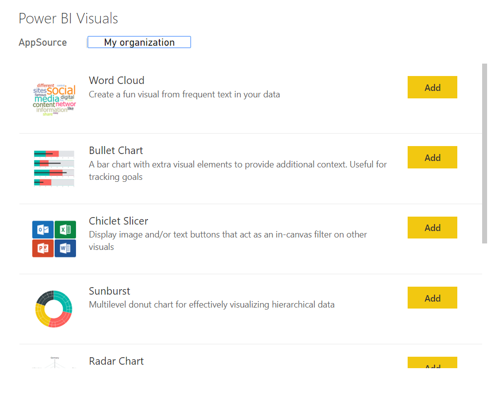
You can go straight to AppSource to add in the visuals
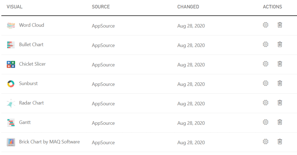
For this post, the following visuals are added
These are all popular visuals and now, the admin has added them as organisation visuals.
There are a few things we can do at this point
click on settings and enable the visuals for the entire organisation
The enabled visuals are available for everyone in the default visuals pane in Power BI Desktop
Admin tenant settings
To add more control to visuals, its possible to disable every visual that isn’t certified.
Visuals can then be added if they are deemed to be required within organisational visuals.
Pros
More knowledge and governance on what is being used across the organisation
Easier to resolve issues. There are cases where visuals have been changed or simply scrapped. This has caused issues with reports because there is no backwards compatibility to this.
Cons
Users who enjoy spending time testing visuals and seeing what they can do, your Power users may feel that they are being stopped from getting the most out of Power BI
Bottle necks, if you need to get your admin to add a visual, this may take time. One of the great things about Power BI is Self Service is the ability to simply play with your data. this may get lost to certain people without full use of visuals.
Using the organisation visuals
Your Power BI developers can now access visuals on the My Organisation tab knowing that these have been recommended at admin level
Its completely up to you what level of access you require for visuals, but the fact that we can now add selected visuals automatically into every project is great news.
However I do have one question. If visuals can only be used when they are added to the view, How do you discover new visuals or check out new ones, to see if they should be added?
Calculation groups look like a game changer, but are they? These have been available for Analysis Services tabular models for a while. Now Tabular editor Lets you build calculation groups for Power BI.
Taking one of our current pbix files as an example.
There are metrics for number of events, Financial metrics, timing metrics. Each one has to be added to Year to Date, Last month, last Year, Month to date etc metrics.
The same measures are repeated over and over again for the different metrics in the report.
And adding metrics in Power BI desktop isn’t a fast process. Its actually quite fiddly so adding the first lot of DAX required always takes a lot of time.
The Solution
As from July 2020 you can reach tabular editor Via External tools
You must have them installed at the right version for this to work.
You must enable Store datasets using enhanced metadata format in Options > Preview features
You are taken straight to the model you are connected to
Right click on Tables. Create New and Calculation Group
Time Intelligence
The best example to look at is time intelligence
This example is renamed to time Intelligence. What has been created is essentially a single column table.
the rows are based on all the calculation items that I already have in this model.
I initially recreate all the metrics from source as SUMs so they can be used within measures. Along with this I may have other base calculations like Distinct Count of IDs to make a number of events. Minimum, Maximum, Average etc.
right click Calculation items and choose new calculation item
In this example, go back to the original pbix and copy a time intelligence DAX measure
Total Sales is a measure created with SUM() using the Sales Amount metric from the data source
The measure is replaced with the scalar function SELECTEDMEASURE()
Instead of having to recreate this DAX over all your ID’s where necessary you only need to do it once
Scalar function – a function that returns one single value
The base DAX in this data set can now be added into Tabular Editor
You can imagine starting a prototype model with DAX for a specific metric. Then recreating as calculation groups so you can add all your other metrics without having to copy and paste the same measures over and over again
Tabular Editor currently has no intellisense so you wouldn’t write and test your DAX in here. this would be done in Desktop. If you wrote incorrect DAX in here and Saved to Power BI, you would then see an error icon in Tabular Editor.
Adding more time Intelligence from the original report
The rows are based on all the calculation items that are already have in this example model.
However the DAX needed to be amended because previously the Year to date measure was used to create variance (Two separate measures). We need to be able to give each measure the underlying measure by using variables in order to use them successfully.
So for example
YTD Sales Var % = DIVIDE([YTD Sales Var],[LY YTD Revenue])
Note that YTD Sales var and LY YTD Revenue Measures have already been created over the original year to date measure. We cant have this so we need to move to
YTD Sales Var % = VAR CY = [Total Sales]
VAR TYTD = TOTALYTD([Total Sales],DimDate[FullDateAlternateKey])
VAR LYTD = CALCULATE(
                   TOTALYTD([Total Sales],DimDate[FullDateAlternateKey])
           ,SAMEPERIODLASTYEAR(DimDate[FullDateAlternateKey]))
VAR VYTD = TOTALYTD([Total Sales],DimDate[FullDateAlternateKey])-
          CALCULATE(
                   TOTALYTD([Total Sales],DimDate[FullDateAlternateKey]),
          SAMEPERIODLASTYEAR(DimDate[FullDateAlternateKey]))
RETURN DIVIDE(VYTD,LYTD)
Within this measure we call the base measure and create the variance% by calling variables.
Now these time Intelligence measures can be created in Tabular Editor
currentYTDLast YTDYTD Var
Notice that you cant use another variable within a variable. So our Total year to date has to be re added within the last year to date measure.
If we were doing this without calculation groups in mind we would simply reference the year to date measure we had created
YTD Var %
Again, Notice how we cant reuse a variable within a variable. So LTYD needs the full DAX inside the SAMEPERIODLASTYEAR DAX.
And Year to Date variance requires both last year to date and total year to date. this makes your DAX more complex than simply using a measure already set up.
In the above instance I could take out TYTD Variable but honestly. Im leaving it there as a reminder of what the DAX is for Year to Date
YoY Var %LYYoYQTD
As you can see, each measure uses one base measure
And for the percentages I added format String Expression “0.00%”
Save the calculation group into the main desktop file
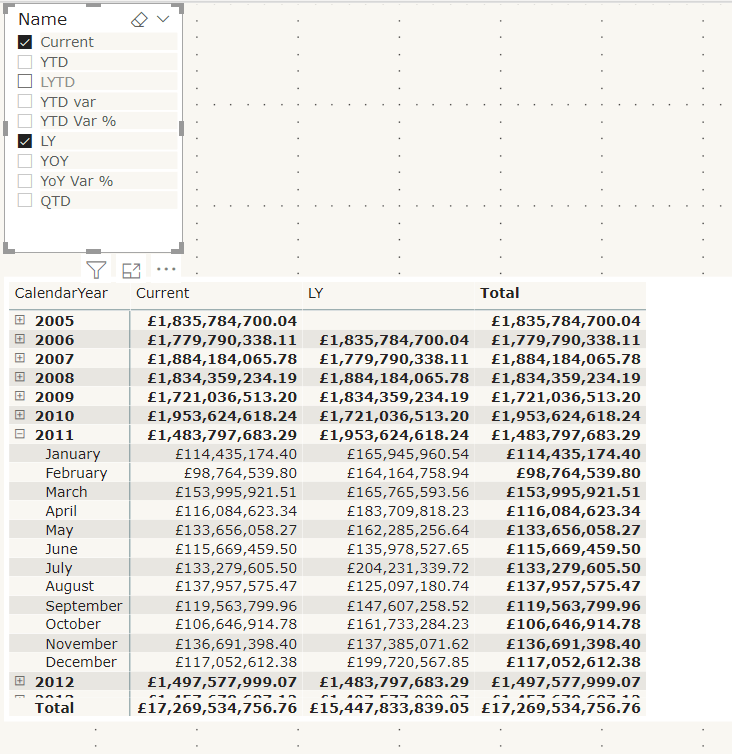
Lets see the calculated measure group in action using a matrix
Name from the time Intelligence group has been added to columns on the matrix.
Year and Month are in Rows
Total Sales, the base measure has been added to values
Name has also been added to a Slicer so you can turn off those you aren’t interested in.
To me, the big win of calculation groups is being able to create one measure and using it across multiple measures instead of creating the same measure over and over again.
And quickly switch to quantity by adding that measure to value
Issues with using calculation groups
formatting each item is much more difficult in tabular editor because you have to know the code. There is no help for creating these expressions.
Similarly, you cant develop DAX Here, you need to do it first within power BI Desktop
Your DAX has to become much more complex, rather than creating a measure and then referencing this measure within another measure. Like Year to Date and Last Year to Date
You cant create the matrix with Months in columns
This is using the measures created in the data set. As you can see, the Months are shown as columns and the measures are also displayed
You cant do this with column groups.
Lets have a look at some visuals already created with time Intelligence to see if we can recreate
Variance Waterfall chart
This is an example of a waterfall variance chart for year to date. If we didn’t have measures outside of a calculation group, could we still pull off the exact same solution?
Table: No you cant recreate the table. You would have to move to a matrix
With a filter on name to the measures you are interested in. It doesn’t appear that you can turn off grand totals though so we have some information there that we don’t need. the Total column.
So, ok but not great
Waterfall visual; there doesn’t appear to be any way you can recreate this. so to create my variance visuals there has to be a measure that can be used.
Conclusion
Calculation groups seem to only for for one visual. the Matrix. Where you can add the base measure to values and the Name to columns.
Even the matrix cant be fully configured to how it would normally be shown with months in columns and the measures underneath.
In order to use time intelligence for all other visuals, there still needs to be measures in your model to use.
It would be a great idea if you could fully get rid of your duplicated measures but you cant.
Because of this, I still don’t have the results I need to spend time creating calculation groups.
Other people seem to be seriously excited about this though so maybe I am missing something. Please let me know if I am, I would be very interested to get another point of view
So now we have all three tools connected into Power BI. Lets have a look at what they can do for you. the following is a few basics from each tool
DAX Studio
With a Power BI pbix file open. go to External tools and click on DAX Studio. It will automatically connect to the data set you have open
Go to Advanced and View metrics
This is a great way of using the Vertipaq Analyser to look at Tables, Columns, relationships, partitions and a Summary of your data model
You get to see which items have low and high cardinality. What items are taking up too much space in your model and really helps you get a feel for what you can do to make your model better
ALM Toolkit
The ALM toolkit comes from the Analysis Services space. Due to Power BI encompassing an Enterprise architecture along with self service, we can now start to use these community tools with Power BI datasets.
Its a schema comparison tool for your datasets.
Use it many scenarios such as incremental Refreshing, metadata only deployment (Now available for Premium and Pro)
This is another big hitter and requires a much more in depth look
Tabular Editor
Again, tabular Editor will connect to the tabular database you have open within your pbix file.
This is an excellent tool to help with quickly modifying tabular models.
If you do anything in here, like add measures into a folder, you will see the change straight away in Power BI Desktop.
You can also test and create measures in here which can offer a much easier way to do this than within power BI Desktop.
basically, using this tool you can automate some of the more tedious tasks and save lots of time.
Like DAX Studio. You can also analyse your entire model to get a feel any improvements you can make.
There are some great videos out there on how to make the most out of this tool and if you use Power BI heavily this is a must have.
Working with users who like a lot of Table visuals in their reports, there is sometimes a tendency to not want to include the measure in the table visual which can result in the following annoying situation
Using another really basic example
the Fact is about Events and the join is between EventtypeKey and DateKey
Our Visual contains the Event Description from the Event Dimension. this visual could contain data items from multiple dimensions but the thing to understand here is that these dimensions are not part of the column chart visual
The Column visual contains Month name from the Date Dimension and the Number of events metric
Number of events = DISTINCTCOUNT('Fact'[EventKey])
If we click on a column the hope is that the table visual interacts and we only see Events in that month.
Not the case. You can click on a bar and you still see every event description. In this instance our join is not helping. How you you resolve this?
Adding the measure into the table visual
The connection is now there because of the measure so this works. But the user doesn’t want the measure in the table visual.
So what Next
Add a Filter to the table visual
If we ensure that we only show items where that specific measure is not blank we can finally see the visuals interact.
A simple filter and a bit of thought over the data model and the joins has resolved the issue and now we can have tables with data from other dimensions that aren’t used in the visuals
Its always nice to work through the updates by relating them to something you are working on.
Lets have a look at the Gradient Legends
lets start with a simple events chart for 2020
the Measure is
Number of Events = DISTINCTCOUNT('Event Metrics'[Event Id])
So Now lets colour the columns based on number of Events from Last year
LY Events = CALCULATE([Number of Events],SAMEPERIODLASTYEAR('Date'[Date]))
This is great because we now get an idea of how different last year was, But without any legend information its quite difficult to understand the new information
Lets add a legend
Here is where the 2020 updates come into play. we can now see that the colour is related to Last year events and it goes from 0.9K up to 1.2 K so we can see that in 2019 July had the highest number of Events.
(I have set the colour to red because in the context of our report, More events isnt actually a good thing)
Just remember, you cant add a legend data item into your visual if you are going to do this, but this is a really great new feature
We are looking at a Star Schema with a Date table connected to the Fact table by Order date Key
for these examples, the active relationship is the only one that matters
Lets have a look at all the issues arising from using the Date table without marking at a Date table
Date Slicer seems to remove the report filter flag for the last 3 years
Rolling 3 year flag= IF(DATEDIFF('Date'[Date].[Date],TODAY(),YEAR)<=3 && DATEDIFF('Date'[Date].[Date],TODAY(),YEAR)>=0,1,0)
This flag has been added to the entire report and set to 1 to make sure there is only information from these 3 years
If I add date as a table I get 2017 2018 2019 and 2020 as expected for a rolling flag.
However As soon as I change that table into a Slicer, all the years appear in the data set.
In this case from 2016. The filter stops being applied on the slicer
DAX FUNCTION SAMEPERIODLASTYEAR and the date hierarchy
We have some DAX to create SAMEPERIODLASTYEAR.
This is the DAX
LY Total = CALCULATE([Total],SAMEPERIODLASTYEAR('Date'[Date].[Date]))
Note the .[Date] at the end. Because we are using the date hierarchy to create the measure you can choose which level of the hierarchy to use. In this case we are saying we want the date level.
This will come back later
This is used in a visual and we have added Month Year which is a column in the date table.
As you can see, last year displays exactly the same as the current measure. This does not work
it works using the DateTime Hierarchy in the visual? However in this instance this date time hierarchy isn’t required. We don’t want the user to have to drill down to month from year every time.
In this example, the only field you can use for any measure that is date time specific is the date field
Mark as Date time
Always make sure you have a date table connected to a fact table
Note that the Date is now not connected to a back end hierarchy table.
Marking as Date table means that all your data within this table can be used for Date Measures
However lets look at the DAX that was created
All the Lat year measures are now erroring. this is because of the .[Date] at the end of the DAX
The date does not contain a hierarchy any more so if you have used .[Date] This needs removing. Its specifically related to the hierarchy.
A Year to day hierarchy has been created in the date table. This means that you have created a more compact data model and saved space.
And you can now use Month Year on the Axis
Date Table is Marked. How to work with it
This is part of the star schema in Power BI
Now the date table is marked as date, the Date hierarchy table is removed for Date within the Date table. this saves space and you can simply create your own date hierarchy to work with
The Active Join is on Received Date
All my measures so far are based on received date
Each Date in the fact table creates an extra date table to produce the hierarchy. So to save space, you should create inactive joins to the other dates and then remove the dates in the Fact table leaving just the keys. the model should then reduce in size
This works great for the measures. I can create measures based on the none active ones and simply choose to USERELATIONSHIP
LY Totals by Closed Date = CALCULATE([Total],USERELATIONSHIP('Complaint Metrics'[Closed Date Key],'Date'[Date Key]),SAMEPERIODLASTYEAR('Date'[Date]))
The above is an example of using the Closed Date None active join for Last years Totals
So i can have measures for Received this Year, Received Last year and Closed this year , Closed Last year (For Example)
This is all absolutely spot on. However there is more logic we need to think about. What about when the users want to create a drill through
This visual was created on the active relatioship so its recieved date
However your users may want to drill through to the following
how to do this?
Currently you may have the Active join on received date and Inactive on Start and Closed date
In my example, I have also kept the dates in the fact table along with the Date Keys for each Date.
Because they are in the fact table they all have date hierarchies.
Remove the Date Hierarchies across your entire dataset
You could keep them there and simply remove their hierarchies
File > Options and Settings > Options
You can turn off time intelligence for the specific report OR globally. the recommendation is to actually do this globally when you use a date table
This way you can use the dates in the fact table for drill down without creating unnecessary data with the date hierarchies
Role Play dimensions
If you want to drill down to all your dates on a regular basis, AND if there isn’t one main date and other dates that are not used as often.
In Power Query Editor go to your date table and create a reference table for each date
In this case the Date table has been referenced once and is named date created. date as been renamed to date Engagement
with this set up, there is only one join to each date key so no inactive relationships.
Any DAX you create can reference the correct date tables and your Dates can be removed from the fact table
the big downside is you have a much more complex schema with many more dimensions so only go for this if your dates are all frequently used.
In the example above, the user just wants to drill through and see all the dates so they can be left in the fact table in a Date Folder without their hierarchies
But this has been a really useful bit of research on marking the date table, Date Hierarchies and role playing
We have already looked at a very simple dynamic level solution example using two tables. Now We move to dynamic security where other users still have full access
At this point it should be noted that I am the Admin of the App Workspace
This means that I can see everything at dynamic level.
Create a New report
for this example, a brand new App workspace Area and report is created
2 tables are created in Power BI to test
Employee Table
Sales table
Add a Manager Role
Notice the isManager column within the Employee table. It is set to 1 for the manager and 0 for everyone else
Manage Relationships
We now need to amend the Employee role slightly that we set up previously within Manage Roles.. This is our previous Logic
the following code can be added to Table filter DAX expression. We will look at this in more detail.
In order to get an understanding of the DAX lets go to the inner DAX and move outwards.
Filter:Allows you to manipulate data context to create dynamic calculations. Which means that it returns a table that has already been filtered.
In this case the <table> to be filtered is the Iterator. the <filter> expression is a true or false boolean that gets evaluated for each row of the table. this is the Row Context . in this case is it true or false that the email in the data is equal to the email currently set within UserName()
FILTER is not used independently, but as a function that is embedded in other functions that require a table as an argument.
MaXX: Evaluates an Expression for each row and returns the largest numeric value. So it takes the result of the filter (the whole row from the table object) and Brings back the Max number.
So in this case, we can create a quick measure to understand what it is doing using my email address hardcoded into the measure
result_columnName is an existing column you want to return. [IsManager]
search_columnName is the column where the lookup gets performed [Email]
search_value is related to the actual value you are searching for. Not a column. USERPRINCIPALNAME()
Brings back IsManager where the userprincipalname is the current Email address
Go back to Modelling and Manage roles. This is currently set to [EmailAddress] = USERNAME() but we are going to replace with the above IF
Republish and go back to Service
Back in Datasets > Security Add your emails as a role and save
Again you can test as role from here.
Test one
In this case:
User 1 is Admin and can see all the rows
User 2
Just the one row of data is displayed for user 2
User 3
User 3 sees all the records because of the IsManager Flag
Conclusion
If you publish the workspace as an app, Row level security will work for all end users, except for Admins, Members and Contributors in the workspace. These three roles can see all data, whether in the workspace or app.
for this, My user 1 and User 2 would be added into the App and then they can see the reports with Row Level Security in Place
Both Static and Dynamic Role level security need a fair amount of maintenance.
Another security logic area that need to be looked at in more detail is when you want users to see everything in the top level report, but they can only drill down on the detail if they are allowed to see the detail.
We have already looked at a very simple Static Row level solution example using two tables. Now We move to dynamic security
Here you create 1 rule only and the users are added to a table. Each logged in user will see their own data.
Dynamic Row Level security therefore uses a Users log in credentials to filter datasets.
Power BI Desktop Get Data
Open up Power BI and click on recent Sources because we are going to reuse the Adventureworks data
Select DimEmployee, FactResellerSales, DimProduct, DimProductCatgory and DimProductSubCategory (Import)
You can go to the relationships pane to view the relationships of the data brought in
For this example, every employee wants to be able to view their own information, but no one else’s.
The Email address in DimEmployee contains the email address of the Power BI account
For this example, we are going to give two employees email address that use Power BI within our own company. (Because obviously, we don’t have Adventureworks email addresses set up with our Power BI Service)
At this point it should be noted that I have Admin Access in the App Workspace that we are publishing to. This means that I have full access regardless of row level security
Choose two other team members with Power Bi Pro Access to add to the dataset in the next step. This will be set in the next step of the process
Power BI Desktop. Create New Measures
First of all, I am going to create two measures on the Employee Table. Click on … Against Employee in Fields and Select New Measure
Repeat for Employee Principal User = USERPRINCIPALNAME()
And a measure in the fact table Now = NOW()
What is the difference between USERNAME() and USERPRINCIPALNAME()
The USERNAME() DAX function returns the user’s domain login in the format domain\user) locally, but returns the user principal name (the user’s login credential) in the Power BI service.
Therefore, security role filter expressions, user permissions tables, and any other dynamic user functionality added to Power BI datasets should align with the UPN email address format provided by USERPRINCIPALNAME().
Power BI Power Query. Set up UserName
Click on Transform Data from Home
Go to Transform and select the email address column. Go to replace Values and replace linda3@adventure-works.com with another email address (I am using my own email address here)
Do the same with a couple more email addresses for the two test addresses (Internal email addresses of your choosing)
Once completed Close and Apply.
Power BI Desktop. Create Visualisations in Report
The report is specifically to show the dynamic row level security so I’m not setting up anything special
Card: User (Measure above)
Card: Now. (Go to Modelling and format to change the format of Now (As above))
Column Chart: Axis – Order Date, Value – Sales Amount
Pie Chart: Legend – EnglishProductSubcategory, Value – Sales Amount
Card: Principal User (Again, measure created above)
Note the User Name shown in Desktop. Before we set up the roles lets simply publish what we have into the service
I will again Publish to Adventureworks demo. Click on the new report from the App Workspace you have chosen
Note now we are at service level my email address has become my user name, which now matches the Email Address in the Employees Table. My Email address is used to authenticate my Power BI account.
As an admin in the app workspace security doesn’t apply to this email address
Go back to Desktop
Set up Security
Modelling > Manage Roles
If you try viewing as Employee in Desktop you will see no data because within desktop, your email address isn’t used as your user name. Republish and replace your Report
Service
In Service, as before, go to Security by clicking … against the data set within the App workspace.
Add all the email addresses of members here. If it matches employee email they will see their information. Add all your email addresses as members above
Top tip. Obviously you don’t want to be adding single emails here so the best thing to do is to create an Azure AD Group and add all your users into this. They can then be managed centrally and we simply add the group here
I also add the other two users into Members. if you click … by Employee you can test as role
Note that now I can see my sales information and personal details and can only see my information. I can change to another email to see their details.
How does this effect Access in the App workspace and App?
There are two places to look at the reports. the App workspace where developers contribute to the work.
Access Levels Admin – Member – Contributor – Viewer (We dont tend use viewer within the app workspace)
AND the App where the reports are consumed by people in the business. the access level here is basically Viewer with a few possible add ons from contributor if required
If the email above isn’t in th App Workspace, the user cant access from here.
If the user hasn’t been added to the App they wont be able to view the report contents. Lets have a look at some examples
The Model
for Dynamic Security you must have a table with your user details (Email Address) The simplest design is to have this in a dimension that connects to the fact table
The more complex the table relationships you will have to check that your Security still works.
If your table is not joined to the DimEmployee table, you will see all the records.
If you have issues with your security look at your relationships and what tables are being used in your reports
Conclusion
The logic within this post answers one specific question. But what if we want certain users to be able to see everything? The next how to guide will go into more detail on how to set up users who can see everything
In a previous blog we looked at setting up a Pipeline
However, we have found an issue, when you Deploy to Test or Production. the issue resulted in getting a better understanding of the permissions you need in order to create and control the process
The Deployment hangs and doesn’t continue on to creating a new Premium App Workspace. If you click refresh, a workspace gets created but it is none premium. In other cases nothing gets created at all.
This is due to the person who is setting up the Pipeline. They may be Admin in the initial Power BI App Workspace but they may not be able to continue on to actually create the Premium Workspaces
In our example, the Power BI Administrator set up the Premium App workspace and then assigned myself as admin. I didn’t set it up.
there are two ways of doing this, especially when working against Dev and Test. They can be set up as Power BI Embedded in an A SKU
Or you can have a Premium capacity Workspace (You must have this if you want the Production area)
Example using the A SKU
We are using Power BI Embedded created in Azure
I am able to create the Premium test and Premium Production environments. But after testing with a colleague, the issue happened.
Lets have a look at what we have set
Power BI App Workspace
We are both Admin
Azure Power BI Embedded
In Azure. Search for Power Bi Embedded. We already have this set up.
Go to Access Control (IAM)
We have User 2 (Rebecca) set as Owner. We also tried this at contributor level but the issue still occurred.
Contributor – Lets you manage everything except access to resources
Owner – Lets you manage everything including access to resources
You need to go to Power BI Capacity Administrator. I was previously set as the capacity administrator to the Power BI Embedded Capacity. Once Becka was added here we were able to successfully move through the Power Bi Pipeline steps without anything hanging.
Therefore, If you are a user in charge of setting up Power BI Pipelines, you must be a Power BI capacity Administrator
To Test. Do you have to be Owner or Contributor in order to use the Power BI Pipeline once it is set up?
Azure Power BI Premium capacity
Power BI Premium is not created as an Azure Service.
Power BI Premium is Managed by the Power BI administrator within Power BI service. Settings and Admin portal
You actually don’t have to be a Capacity Admin in Premium, but do need Capacity assignment privileges.
The Capacity or Power BI Service Admin can arrange for this to be sorted And you need to be able to create new workspaces,
In May 2020 a new pipeline appeared. Deployment Pipelines
Having worked with Devops, It looks like it is identical to the Pipeline that allows you run builds, perform tests and release code to the various production environments.
Power BI deployment Pipelines are a new way for BI teams to manage the content lifecycle.
It is only available in Power BI Premium
Another current restriction is that it doesnt work with dataflows
There are some great reasons to use deployment pipelines
To Improve your productivity
Faster delivery of your updates
Reduction of manual work and errors
Lets see how it works with an example
Requirements
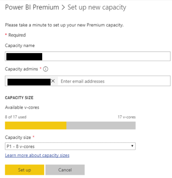
The Workspaces must be in Premium capacity (You can set up the Dev and test areas on an A SKU to save money)
The Developer must have a power BI Pro License
The developer must be an owner of the data sets in the target workspace
Setting up the pipeline Example
In this example, I want a development Test and Production area.
Each of these areas has a separate data source. One each for Dev Test and Prod (But this might not be the case for your own development)
The first instance we will create a dataset that contains the dataflow.
You need a workspace with a diamond against it (Which signifies its in Premium capacity)
You will need to be Admin in the workspace to carry out the task of creating the Pipeline
At some point I want to check against Member access
The Report
A test report is created over the development data (Which is a table in the Dev Azure Database)
At this point, make sure you change the current value of the parameter to check they are all working. This report has been published up to the Premium workspace
You don’t have to do this. You can use Rules within the Pipeline if you wish.
Start a Power BI Deployment pipeline
The Look and feel of the Deployment Pipeline is great
Create a Pipeline
Now we are into the actual main Pipeline area. You can only assign one workspace to the pipeline. When we move through the pipeline it automatically creates the other workspaces for you.
Our Pipeline testing workspace is going to be set up as the development area
Assign a Workspace
You dont need to start with development. You can start with test or Production but in this case we are going straight to the Dev area. Also you don’t need to have all three environments. This now gets assigned to the Development pipeline
At this point you can see what will be part of the Dev Pipeline. Show more shows you the content within. At this point you can visibly select items that you want to deploy up to the next stage, but in this example all three of them is required.
Rename Pipeline Testing to Pipeline testing (Dev). Click on … and go to Workspace settings
Publish App
Your report consumers and testers will want to use your reports and dashboards as apps. You can create Apps at every stage. To do this click on … and Publish app
Deploy to test
Clicking Deploy to test creates a copy in your Test area
It will copy your Reports, Datasets and dashboards into the test area. If you have dataflows you should note that these currently don’t get included
Rename to Pipeline testing (Test) if required
At this point we may want the test area to be connected to a different data source than the development environment. Because we set up Parameters in the pbix file to change to different databases, we can use parameter rules. If if you dont have parameters set up you can create a data source rule.
Dataset Settings
At this point. go back to your New Test Premium Workspace.
Against the data set click … and Settings
I have changed the Parameter to the correct one
Now refresh the credentials
And repeat when you get to Production App Workspace
Deployment Settings (Back in the Pipeline)
Get to Deployment Settings when clicking on the lighting bolt
Parameters have been set in the pbix files so these should be used in this example.
You can use rules(Below) if you don’t have parameters but remember to check your Data set settings first.
Because the source is a database, the pipeline knows to ask for a server and a database. Make sure your Database is set up correctly first within Service.
Deploy to Production
Clean up and set up the same rules (Ensuring after deployment you check your Data set Settings before setting up the rules).
Updates to Development Area
You can also just deploy specified items that you have worked on
For this test, go back to the desktop and add a couple of visuals. Then Publish into the development workspace.
Look to compare the changes
The comparison shows that two items have changed. Deploying into test will copy the new information across
You will also see icons for new and deleted.
Now we can see that production is still using the previous datasets, reports and dashboards. we wont copy across until we are happy the changes are correct.
These are now three individual Workspaces with individual data sets and reports. You will need to set up scheduled refresh for each area.
You can also publish downstream if required by clicking … If the item is available
Limitations
Not for Dataflows or Excel items
Premium Only
The Production workspace must be in premium. You can use A SKU or Power BI Embedded to save money. (A Sku’s can be set up within Azure and are Test environments. they can be paused)
Still looking at the reports that use the dataflow. Lets see if it can compare. The pbix files is opened and amended. then published to the dev Workspace.
At least it tells you which items have changed
With the push to move to dataflows to separate transformation to the actual creation of DAX analytics, it seems like an urgent requirement.
Hopefully this will be resolved soon.
Best Practice
When this is all up and running it is recommended to separate the datasets from reports and dashboards. to do this use the selective deploy
Plan your Permissions model
Who should have access to the pipeline?
Which operations should users with pipeline access be able to perform in each stage?
Who’s reviewing content in the test stage and should they have access to the pipeline?
Who will oversee deployment to the production stage?
Which workspace are you assigning and where in the process are you assigning it to?
Do you need to make changes to the permissions of the workspace you’re assigning?