After 14 years using Microsoft On Premise BI Tools (SQL Server, Reporting Services, Integration Services and Analysis Services) Its time to embrace Business Intelligence in the cloud.
When I first started working with Power BI, Apps were still way off in the future. Therefore when they came in I was a little confused. What are they for? Why do I need to use them?
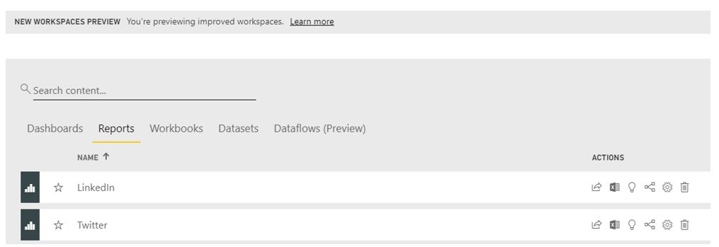
Before talking about apps its worth having a quick look at
the Power BI workspace environment
Workspaces: Personal
Your own personal workspace. You can’t share company level reports from here because you are the only one with access. Use for your own reports. This is available for free
Workspaces: App
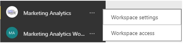
Workspace
The app workspace was called Group workspace. Group
workspaces used to be office 360 workspaces and individuals were invited to the
workspace. All with the same access rights.
The app workspace allows for multiple admins. Dashboards and
Reports are shared to a wider audience from here. Nothing is affected if there
are personnel changes
Apps
Apps – Are a 1 to 1 map to an App workspace and provide end
users a read only experience for the particular objects in the workspace that
you want them to see. It is the only way to share if you use the Premium
license.
But we can already add users into the app workspace or share dashboards or reports. Why do we need to create apps?
Business users often need multiple Power BI dashboards and
reports to create real business insight.
If you imagine the scenario without using an app. In Power
BI you click on Workspaces and view an App Workspace containing: Sales, HR,
Marketing, Opportunity Analysis, Distribution, Production, Finance and
Accounting Dashboards and Reports
Managing permissions on each individual dashboard is time
consuming with a large number of users. Its also difficult for end user because
they have lots of dashboards to navigate.
We need an easier way of deploying sets of dashboards and reports to large audiences.
And from my own point of view. Once I started creating apps for my users, It just looks good. Its a really nice way of sharing your reports.
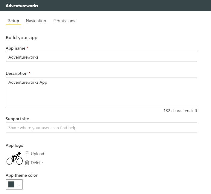
Using my Adventureworks Demo as an app example
Ive created some reports and I want to publish them to an App Workspace.
First of all I set up the App Workspace in Power BI Service (At the bottom of the workspace left hand menu)
I make it look pretty with a nice logo and a name.
Save the new App workspace. And Ill come back to the sharing later
Then I go back to Power BI Desktop and Publish my reports to my new App Workspace.
Once published I can then go in, create the dashboards in the app workspace and generally make them look good enough to show to my users.
I work with one other person on these reports so I want that person to have access to the Workspace
This is where Access comes in. Click on Access
I’m setting that person up as a contributor. Contributors can “Create, edit, and delete content in the workspace” and “Publish reports to the workspace, delete content.”
This means that the new Contributor will be able to see the Dashboards and Reports via Shared with me
Now we are both happy we want people to start using the Adventureworks Dashboards and reports, we want to share with our users (Who are external but have Power BI Pro)
Time to Publish your app
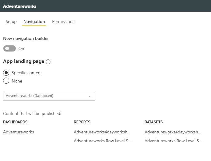
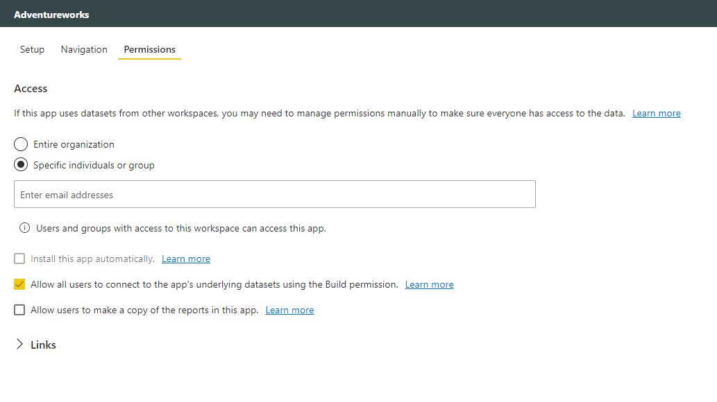
There are 3 screens to work through
Setup
Navigation
Permisions
For Permissions simply add all your users and then publish the app
Once published you will get the following message
You can sent the URL to the User and they can download the app. Then the user can see a great age of Published Apps
All sorted and after the initial confusion its fairly straight forward
I have created two very basic test reports to work with to simplify the process
they both use the same table of data
Report 1
Page 1 Is just filtered on year and has a few visuals.
It contains column charts with month on the Axis
Page 2 is a basic table
Drill through field is Month and Cross report is switched on On
Report 2
Page 1 is Filtered on Year and Region and has a few visuals including a column chart with Month on the Axis
Report 2 is the source because we will be drilling through from here
Report 1 is the Target because we are drilling through to page 2 from Report 2
Cross Report Drillthrough Toggle
Cross Report is set to ON for the Source Report (As above)
Leave Cross Report Set to Off for the Target Report
Report Setting Options
Both reports are Set File > Options and Settings > Options > Report Settings
Cross Report Drill through – Allow Visuals in this report to use Drill through Targets from other reports
Both reports are published to a workspace.
Once in the Service I create a very simple dashboard from a visual from each report as my starting point
here is where it goes wrong
Start at the Dashboard and go to region. click on the Total from region report Tile
Once in here I right click and get the drill through on the Other report, So far so good. I click this and go to the drill through
Note that the filters are kept as expected from the region report.
Now I decide to go back to the dashboard because I want to go to the main report.
In this case I click the back button (Because the back button doesnt work on the report when you move between reports)
Or I can simply click on the Bread crumb trail of POC reports and Dashboards and go back to the dashboard this way
This time I want to go to the main report with just the Date slicer.
And this is where the problem lies. Notice that the filters from the drill through are still applied so this year report is filtered by Month and region.
When moving back to the start we don’t want the drill through filter applying. If you drill through in the same report this works absolutely fine. You can go back and the filters are unapplied. However they arent unapplied when drilling through to other reports.
The Solution
For each report if you go into File > Options and Settings > Options > Report settings and make sure Persistent Filters is ticked ‘Dont allow end users to save filters’
I have a slicer on year so i can select the year to look at. Without the year selected its fine (Ive put the data into a table simply to have a look at)
As you can see the last year information is shown in the column
if I choose 2019 to look at i want to see 2019 with Last year against it
See how the Last year value disappears. I was expecting that creating this measure would allow you to see Last years metric even with a year slicer set
The answer to this is actually quite simple
Here I have used Year which is an actual data column in my date table to slice the data with and its not working
This time I have used year from my date hierarchy and its worked
Which to me meas that if you are using these kind of time based measures, if you want to slice by date you HAVE to use the time period from the date hierarchy in the slicer rather than another data item (As in the example. I used the Year column created in the date dimension)
There are many ways of sharing Reports and dashboards. You
can add users to an app workspace. You can share dashboards. You can create
apps. But what is the most appropriate way to deal with specific situations?
Share a Dashboard
In Power BI Service, go to the Dashboard that needs sharing and click Share dashboard at the top right of the screen.
Here you can share to users within your organization as well as outside your organization. You can also decide if that person can also share the dashboard (Anyone you share the dashboard with will need Power BI Pro to view the dashboard)
If the dashboard is Shared, the underlying reports are
shared also.
The recipient will get an email to tell them. Power BI adds the dashboard or report to their Shared with me List page.
Share a Dashboard
You can also do the same when sharing a report. There is a
Share button at Report level
When recipients outside your organization click the link on the email for both dashboards or reports, they do not get the usual dashboard portal. They see the contents in its own browser window. Not the Power BI Portal. They then have to bookmark the link for future access.
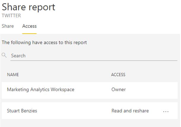
Checking who has access to the Dashboard/Report
Simply click on Access to get this information.
People outside your organization are listed as guests
You can click on … to amend their access, like stopping them from resharing or revoking their access rights to the report / dashboard
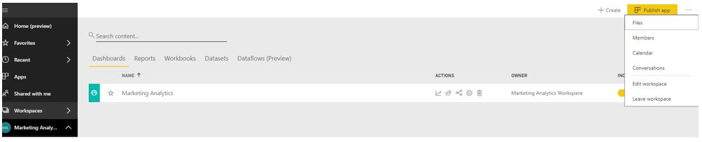
Adding to the App Workspace
What is an app
workspace?
The old workspace created an office 365 group for every
workspace but that created a lot of office 365 groups. You could only add
individuals to the workspace. You couldn’t add security groups. All members
could either be Edit or Read only.
App Workspaces are still in Preview (As at Nov 18) and when
you go to Create new app workspace there is a yellow bar saying Try Now for New
Improved workspaces. They work the same
as the old workspace but adding users is different. Individuals, Mail enabled
security groups, Office 365 groups can be added.
Each individual gets options for access privileges rather
than everyone in the group having the same.
Apps can be published to the App workspace (1 app per app
workspace) and replace content packs
Apps are 1 to 1 relationships with workspaces. You can share
many different reports and dashboards at one time from the workspace, this is
also well used and will be looked at in another how to guide
Old workspaces are going to be obsolete at some point in the future so its worth moving everything to the new App workspaces now.
Admin
Can change and delete workspaces
Can add other admins
Everything a member can do
Member
Reshare
Publish and Update Apps
Everything a contributor can do
Contributor
Add/edit/delete content within the workspace
Everything a viewer can do
Viewer
View Content within the workspace
Replaces read only workspaces
Adding new Members to
old Workspaces
In the Workspace, Click on … And Choose Members
This takes you into Office 365 where you can see all the members of the App workspace and
invite other people to the group
New Workspace App Set up
This is now out of Preview. If you were setting up the old way (By reverting to classic) you could start by adding individuals here. Once set up you could add uses as above (Adding new Members to old Workspaces)
Note that here you can Upload an image for the workspace. Add a name and description but users can’t be added here.
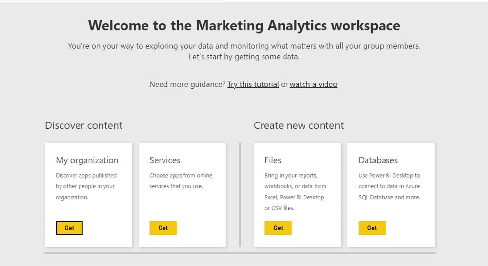
Instead of being taken into 365 you see the Welcome to
screen.
For this example, go back to Desktop and Publish Report(s) to the new workspace. Re-click on the new Workspace and you can now see the following
New Workspaces
preview lets you know you are in a Workspace App rather than a Workspace
To add users you can click on Access at the top of the screen.
Or click on Workspace Access by going to the workspace within Workspaces and clicking …
You can now add individuals, Office 365 groups or Mail
Enabled security Groups (Rather than just individuals)
Please remember, If the user is outside your organization, Share the dashboard via the app. Don’t add them to the App workspace
Share or add?
The different ways (above) are designed to give you
flexibility.
In general, users should only be directly added to the
workspace if they are report authors. End users who are just consuming reports
should have them shared so that they show up in the “Shared with Me”
section, or as an App.
When you share a dashboard, user can only view the dashboard
and related report(you can also let them re-share the dashboard),
When you add users to an app workspace(or new app workspace), you can give them permissions to edit the report so that they can work with you.
Update the App.
You can work on reports in the App Workspace with other members of your team.
Then when you are happy and want to show to Users you can go back to the Workspace and Update App
When creating Power BI reports you will be working with
multiple pages and may want to include a menu for each page. We can also go
further and set up toggles to display your data in different ways
To create Power BI reports that are more user friendly and
interactive we need to understand Bookmarks
Cost Of Organised Crime UK 2010 2011.pbix (Example Power BI
Desktop File)
horr73-tabs.xlsx (Example File to be used with the Power BI
report)
The Report contains a few pages of very basic reports
because I want to focus on bookmarks, buttons and toggles
I have created 6 reports. Choose some data that you are interested in and set up numerous reports
Setting up Bookmarks
I want to add buttons on each page, so the user can click
quickly to each report. To do this we
need to set up bookmarks for each page.
My first page is called A1 1. Go to the page and click on View to select Bookmarks pane
With the correct page selected click Add and I’m calling this bookmark A1 1. Because you have created it with the A1 1 page (1st page selected) this is now your book mark for Page 1
Go to each page an and set up a new bookmark
Now you can click on Each bookmark and note that you are seeing the right report against each bookmark
Choose your buttons
You can go about this a few ways. We can add images or Buttons. For this example, I am going to use images with different borders to denote on or off
For your first page choose a relevant image (Or button and add text)
Position your button / Image on the page
Do this for every page until you have a button for each page on page 1
Once you are happy with the positioning copy and paste each
button / image to the exact position on each page
This will mean rearranging your pages slightly to
incorporate the menu
Connect your button to a bookmark
Each Button needs connecting to a bookmark. For Page 1, we do not need to do anything to Page 1 icon because the user is on Page 1. Go to icon 2
In format image, set Action to 1. Connect it to the correct
bookmark.
I have also added a tooltip over the image
Repeat for all the other images on page 1 (Apart from the
image for page 1)
Once completed go to page to and repeat for every image on
page 2 (Apart from the image for page 2)
At the end of this, all the buttons on every page should be
active and connected to the correct bookmark
APART from the button for the page you are on which should be inactive
Format the Inactive Button on every page
You can’t test the buttons in desktop but imagine you are
clicking to different pages. How do you know which button is inactive because
you are on that page? You need to distinguish the different between active and
inactive buttons
Go back to page 1. I have used an image and there are other
ways of doing this. If you are using a button. Or if you want to use another
image etc.
I am simply going to replace each image with an image to
show that you are here.
On page 1. Delete the inactive Page 1 Logo and replace with
the new logo
Do this for every page
You could also change the back ground, add a border etc.
Test out your buttons in Service
I am going to use my Workspace in the service. In Home, go
to Publish and Publish to My Workspace (Or whichever app workspace you want to
publish too)
Go to your workspace and Reports and click on the new report
that you have made
Click on each button to make sure it links to the correct page
Tidying up the reports
You can now get to each report via your buttons. Note that each report also has a tab at the bottom of the screen. Only want the user to click on the buttons. Not the tabs as it may get confusing. Go back to desktop
Right click on Page 2 and choose hide page. Do this for every page apart from page 1
Page 1 will become our main page so I’m going to rename this
Main
Republish you report and go back to service
Note that you now can’t see the tabs for the other reports
Toggles
You report is looking good but for one of my pages I want to
show the data in a different format and I want the user to be able to select
the way they look at the data
For this I need images of toggles which I have downloaded
This is slightly more complex than setting up the bookmarks
for each button. Go to the report that you want to change and add a new
bookmark. I’m calling it A1 10 Tables
Its time to open up the selection view.
Note that for the original bookmark, the selection shows you everything on this book mark. I need to go to the new bookmark and hide everything that’s specific to the original page
I would also like to mention here that you can also now Change the name of the item in the selection bar so all your images can relate to the image in the report, rather than just displaying card.
This was a feature added in a later Power BI Update.
In the new Bookmark click on the icon against the objects on
your report to hide
I have hidden 3 objects.
(The current design makes it almost impossible to
distinguish Hidden from none hidden objects which I’m hoping they change)
https://ideas.powerbi.com/forums/
265200-power-bi-ideas/suggestions/36265075-selection-pane-icons
I am going to add a table to this new book mark
now I have cleared space
Note that the table is now in the selection.
However, if you go back to the original bookmark the table
will be in here too overlapping with all your other visualisations.
Simply select the first bookmark. Hide the table. Right
click on the first book mark and update. You can now flip between the two bookmarks
to see it move from visualisations to a table
Add your toggles
Finally, we need to add toggles so we can use them to toggle between bookmarks. On Bookmark one I need to add space for the toggle. I’m also adding some text
Now go to the second bookmark. Notice that you can see the
toggle and text. They will need hiding but in the meantime. Add the second
toggle image and make sure it’s the same size as your other toggle
With the first toggle in place, resize the 2nd
toggle and then place this toggle over the top of the first toggle. Add your
text
Go back to bookmark one and hide the new toggle and text.
Remember to Update the Bookmark.
Go back to the new bookmark and hide the 1st
toggle and text item. Click to each bookmark so you are happy with what you can
see
Bookmark 1
Bookmark 2
Connect up your toggles
Now its time to connect your toggle. Bookmark 1 needs to go
to Bookmark 2 and Bookmark 2 needs to go to Bookmark 1
In Bookmark 1. Select the 1st toggle. Same as before. Under
Format Image, switch Action to on. Set to Bookmark and select Book mark 2
Repeat for Bookmark 2
Test your Bookmarks
Go back to the first report. Save and publish your updated
report
Each Month Power BI Releases an update and we like to go
through the updates and come up with our favorites of the month (And those
updates that aren’t as successful)
Reporting
Filter Pane
The Filter pane has been updated and filters have been removed from the Fields pane. This is great because it was slightly confusing to drag and amend filters in ‘Fields’ but then see them in the Filter pane. Now you drag the field straight to the filter pane
You can also rename Filter headers which makes them much more useable.
If you go to Options and Settings > Options > Report Settings,
you can also tick Allow Users to Change Filter Types.
This means the user can choose between advanced and basic Filter Pane. This is great if you want more filter usability for the user
There are still issues for me when it comes down to the new
Filter Pane and Slicers. This could be confusing to a user. If Edit
interactions was added to Filters, then many slicers could be removed from
reports ensuring more screen time for visuals.
Conditional Formatting for Visual Titles
I click on Doncaster and the visual Changes but the Title Remains the same. I want it to dynamically include the selected region.
There is a button by Title Text with three dots showing that
there is a hidden menu.
Here you can select a measure that you have created
containing the title you want, rather than use the standard title
Sentiment Score Title = “Percentage Sentiment Group for” & SELECTEDVALUE(Tweet[Location])
Previously, you can create your own headers for visuals, but they were simply hard coded. Here is my visual for Sentiment Group. I also have a Region Filter on the page.
All my Reports are filtered on Months so now each visual can
contain this information.
Conditional formatting for web URL actions for buttons shapes and images
Finally, we can now change and image depending on a dynamic
measure. This is one of my favorite new features. For example, this is
fantastic for showing conditional image for feedback, Positive, Negative, Up
Down etc.
This work the same as visual titles above
Even better, we should be getting an update soon where you
can add the DAX straight into the Title Text rather than needing a separate
measure.
My conditional visual for this new feature would be….
Analytics
Drill through across reports
For me, Drill through is one of the most important concepts
behind Power BI and its not yet fully functioning. For example, all the market
place visuals don’t have this ability. It’s really frustrating to find the
perfect visual and then realise you can’t drill through to further information.
This new functionality gives me some hope that we might see future fixes to this. We can now set up a navigation experience across reports.
Start with the target page (the page you want to land on from other reports) and set Cross Report Toggle to on.
You also need to then turn cross report on for the reports that you drill through from. You can do this as above or in Service / Reports
If for example I’m drilling through by Region. I right click
on the Region Data Point in a visual and I can see the drill through Report [Page
Name and Report]
This is going to be incredibly helpful when I want to divide
larger reports into smaller ones (With less data in each)
The Key Influences visual was one of my favorite updates a couple of months ago and I have used it to support Twitter sentiment grouping. (Negative, Positive, Neutral)
Previously I could only analyse by category but now we can analyse a continuous numerical field. To do this set Analysis Type to Continuous.
We can now analyse data items like sales amount.
This new visual has already proved really popular with users and its good to know its improving all the time.
Partial Synonym matching for Q&A
Another really great feature. When a user is asking
questions in Q&A, even if they can’t remember the exact phrasing, Q&A
will give them suggestions.
Data Connectivity
Lots of new data connectors. Power BU Dataflows, Oracle
Essbase, PDF Connector, Intersystems IRIS, Indexima (Big data), Luminis InformationGrid,
Solver BI360 and Paxata.
Its doubtful that I will be needing these connectors
currently but it’s great to see new connectors being added every month. Its
worth noting that the on premises data sources will need the new release of the
April On Premises Data Gateway which should be coming soon.
Web by Example Connector
– Allows you to scrape data from HTML Pages and is now even smarter. This is
currently in preview and I can’t wait to see how it works.
Data Preparation
Data Profiling enhancements
In Power Query Editor New Profiling enhancements are
available to check your data
In View > we have Column Distribution, Column Profiles column quality. Try ticking these options for discover lots of information about the quality of your data.
This is such a good feature when you are starting to add and
understand your data. A quick look at my Sentiment group shows I have nothing
outside of Positive Negative and Neutral. I can quickly see any issues that may
need resolving.
Fuzzy Merge Feature
Another smart preparation feature which helps with merging
records. I haven’t needed to use this yet but its good to know that this also
speeds up merging of records.
M Intellisense supported in Formula bar
If for example you go to Add Column, Custom Column. You can
type in your custom code and Intellisense will provide lists of functions etc.
to help you. We didn’t have this before in Power Query mode, so this will
really enrich the experience.
This has been such a good month for Power BI. I am excited
about being able to create custom headers and visuals and I can’t wait to try
the updated Key Influences Visual.
Each Month Power BI Releases an update and we like to go
through the updates and come up with our favorites of the month (And those
updates that aren’t as successful)
Modelling
Disable auto date tables for new reports
If you have dates within your tables, all dates have a
hidden auto date table for each date. This can increase the file size.
This can now be turned off if you have everything within a date time dimension.
Your dates will not have the automatic drill down hierarchy.
The hierarchy will be set in the date dimension manually.
It would be useful to know if this has any impact with DAX functions like TOTALYTD and SAMEPERIODLASTYEAR
Performance analyzer pane
Its so useful to be able to analyse how our Visuals and data
impacts report performance and the analyser pane now allows us to see behind
the scenes so we can optimize performance.
If I open my Adventureworks pbix file in Desktop and go to view
The Performance analyzer is now available to select
There are two ways to check performance. One is to start
recording and then use it as a user would interact with your reports.
Once you click Start Recording you can then decide to
Refresh visuals which creates an example where the user is opening the report.
In this example, refresh Visuals is chosen
This gives you the duration (ms)
Straight away you can see that Sales Amount, Order Quantity and Discount amount are taking the longest time but nothing here is overly worrying.
There is another way of using the report. If you are interested in a specific visual. Highlight the visual and click refresh visuals which is a new icon available when the Performance analyzer is selected.
Remember to clear first
Checking the Scatter chart, Other is taking the longest time.
Other is not as obvious as DAX Query or visual display. There are a lot of contributing factors
within other. For example, if your visual is in a queue because you have a lot
of visuals, this time will be within other.
The more visuals the longer other will be.
This is a great new feature, especially if your pages are struggling
and you want to know why. Being able to export your results is also a really
useful feature.
Personally, I think a drill down on Other would be really beneficial but otherwise this is a great update
Filter pane improvements
Filters can now be reordered. A small but useful improvement
Line Data Label Position control
For Line charts. When lines are near each other it has been difficult to tell what label belongs to what line. This has now been resolved. Within Format > Data Labels there is a Customise Series toggle.
Once set to On, there are lots of options for each Line
In this case, Only Position is altered. Under for Sales amount. Its actually quite confusing that there is only one section even through we have two lines.
The trick is that you set Sales amount, then go back up and select the other line and resolve the formatting (Flicking back to Sales amount and the options chosen are still selected)
I have already had lots off issues with Line charts looking
cluttered when using labels so this is a real hit for me.
KPI Visual Indicator Text size control
At long last. Instead of having to go with the KPI Text size
which has always make the KPI’s seem overly large for a report, we can finally change
the text size.
I use a lot of KPIs so this is a very welcome change.
An original KPI. The Figure is way too large which means you can only have a few KPI’s and you can only use them as large tiles. Note that the visual is too small for the metric.
Great, the new Text size option allows us to have much more control over the design of the KPIs and out overall reports
There is still so much that needs to be done with the KPI. For example, the word Goal: Sometimes this isn’t specifically a goal. I use KPIs for example to show the difference between this year and last year. You cant change this at the moment but this really needs to be updated to make the KPI more useable for different scenarios.
Analytics
Key influencers visual Improvements (preview)
Here is an example visual looking at what influences the Product Pricing category
Binning Support and Formatting
In this example, NSAT has been added to the Explain by. NSAT is a numeric fields. 1,2,3,4 etc. The visual has put the NSAT into bins for you in a way to categorise this field to produce better results.
There is also more formatting capabilities, you can adjust
colours within ‘Analyis Visual Colours’
Primary color – The colour for the Bubble or bar
Secondary color – The colour for the other bubbles or bars
Mobile Support
Its been updated to work on mobile devices
I love this visual. I use it for sentiment scoring on Tweets
for Positive, negative and neutral tweets. It can do so much but the colours
were different to my other reports. I can not rectify this and make it blend
more with the overall look. This is a
real winner.
Custom Visuals
Power Slicer
The new Power Slicer, Available from the Market Place should have better formatting and chiclet availability in here. There is also a default value selector.
(new Date()).getMonth()+1
The above is the JavaScript for select current Month
There are lost of different layout options. You can format the
slicer. It looks better than the original filter
I tried the new Power Slicer and Like many other people
found it un-useable because of the watermark. It is a real pity because Its
mentioned on the Power BI Update video but its not a successful update.
I was really looking forward to using this visual, so this was disappointing
Data Connectivity
Another Major disappointment is the Azure Cost Management
Connector. I was really looking forward to getting started with this but
haven’t yet been given the correct details to use it. The How to guides appear
to be out of date.
It asks for the Billing Profile ID, but no one knows what
this is.
Here’s hoping they sort this out soon because at present
this data connector is not working.
Each Month Power BI Releases an update and we like to go
through the updates and come up with our favorites of the month (And those
updates that aren’t as successful)
Modelling
Top of the updates for me this month is the update to the
Modelling view
The Modelling / Relationship icon has changed. You can show your model in different views so
have the full model. Then separate views making things much easier to deal with
when checking models.
You can select a field and edit the properties of that field
in the properties model
Folders can also be added to select fields that should be
displayed together
Reporting
Default tooltip formatting
This may be my favorite update this month. Tooltips are so important when working with interactive Reports so having the ability for format them, to give them the look of the overall report is very important to the look and feel.
In order to work with this, you need to go into Formatting and scroll down to Tooltip. Then Choose Default and Formatting options will become available.
Cross highlight by Axis label
Another small but great new feature. You can now select the title of the column / bar etc. instead of highlighting the column which makes things much easier when working with low value columns like above
This is fantastic, and I can now select the title to drill
through instead of trying to click onto the bar when the data is a small
number. This is a great new feature.
Static web URL support for buttons shapes and images
We can finally now go to URLs via buttons shapes and images. Go to ‘Action’ and select Web URL as Type.
Very useful feature when you want to connect to other tools to deliver full Business Intelligence to the company.
Selection pane improvements
Using Shift Click or Control Click we can now choose
multiple objects in the selection pane.
I’m incredibly happy with this one because I voted on it on
the idea’s forum.
The best thing for me is that you can rename objects to make them easier to find instead of just Button1 Button2 etc.
Previously it was possible to have lots of objects with the same name. Button, Text Box etc. Now you can finally name them ensuring that working with Bookmarks or layer orders are a lot easier
Heat Maps
My least favorite update within Reporting is the Heat Map option on Bing Maps.
There are lots of things you can do to configure the heat map,
but I still find it quite an ugly look. I always prefer the round data points
or even better, the Filled map. In my mind it just looks neater than the heat
map. Still, any extra formatting functionality
are a good thing
Custom Visuals
Power Slicer
The new Power Slicer, Available from the Market Place should have better formatting and chiclet availability in here. There is also a default value selector.
(new Date().getMonth()+1
The above is the javaScript for select current Month
There are lots of different layout options. You can format the
slicer. It looks better than the original filter
I tried the new Power Slicer and Like many other people
found it un-useable because of the watermark. It is a real pity because Its
mentioned on the Power BI Update video but its not a successful update.
I was really looking forward to using this visual, so this
was disappointing
Data Connectivity
Another Major disappointment is the Azure Cost Management
Connector. I was really looking forward to getting started with this but
haven’t yet been given the correct details to use it. The How to guides appear
to be out of date.
It asks for the Billing Profile ID, but no one knows what
this is.
Here’s hoping they sort this out soon because at present this data connector is not working.
Each Month Power BI Releases an update and we like to go through the updates and come up with our favorites of the month (And those updates that aren’t as successful)
Reporting
Analytics
Key influencers visual Preview
I’m sure this is mine and many other Power BI Users favourite update this Month. As soon as I saw it I got excited and Ive already used it for a project relating to social media data. This is the first AI visual for Power BI. Pick a KPI and the visual will find what matters most. It’s another Preview feature so you need to go back into Options > Preview and select Key influencers visual
At
present, the metric you are analyzing must be categorical so you cant analyse
on Sales amount. Churn is good to analyse with this visual. Or satisfaction
score
I used the sentiment group of a comment (Positive, Negative,
Neutral)
You don’t want to analyse on catagorical data with lots of
categories so this is a really good one to use.
This is a really interactive visual. You can feed your data items into the report to see what are the key influences to your metric
Top segments gives you even more functionality. Go and have
a look at this visual. It will really make your reports shine for the user.
Updates to the new filter pane in preview
I have some concerns on this new feature. It has caused some user issues for me which I will explain below.
Go to Options > Preview and turn the new filter experience on and then restart. It will be available for any new reports
If you click off of any visual and go into Format there is a new filter pane format section where you can format your filters header size, border, font etc.
So when you apply filters to the Report, Page or visual,
they will appear here for users rather than having to go in to visualisations.
There is also a filter
cards pane so you can make the filter panes look nice
Much easier for users to understand what filters are being used with reports and interact with them
About that Filter Issue
To the right of the Screen is the new Filters Pane
On the left in the report I have a hidden date Hierarchy
Slicer so the user can click on the button [To open up the bookmark with the
hidden slicer panel] Choose a month and Click the button [To open the bookmark
without the slicer panel]
The Report now looks a little confusing to the casual
viewer. Do they go to filters or click on the button to get to slicers?
Why would you need a slicer if you can just add to filters?
I have a Report set at month level. So, you have cards to show current month metrics
On this report there are also visuals to display the months in the year. Obviously if you select a month on the slicer, this would interact with the above report and you would only see that Month.
Here is where Edit Interactions come in. Go to Format, Click on the slicer and then Edit Interaction and I can simply switch interaction to off for the above visual. Once set, the slicer wont interact and you get your full year visual.
If you were to get
rid of the slicer and add Date into the page Level Filter, It looks great, but
you cant edit interactions so although it looks great and makes sense to the
user, you cant use it because of this key issue.
The question is, if you could edit interactions on a page filter would you need slicers at all?
This is just a mini gripe but one worth mentioning
Word wrap on Titles
Another small touch that makes a big difference. Previously you couldn’t wrap a long title which could look quite ugly on the reports but now you can.
I did have a few teething problems with Word Wrap. If used sometimes the visual would be cut off at the bottom. Meaning that the above visual would be missing the Categories on the horizontal axis. This seems to be resolved now.
Rounded corners for visual borders
haven’t personally used this formatting options for any Reports
year but I have tried them out on test data and it’s a nice update.
It really changes the look of your dashboards. As soon as I work on a project where this may work I will definitely be using this.
Custom Visuals
Additional Purchases for Custom Visuals
This is where I hit the thumbs down button for Power BI and
I think it’s a real misstep. Some visuals now have to be paid for. Microsoft is
excited about this but its not gone down that well. The visuals with in app
purchasing are now marked with a price tag.
I have many concerns with this. The first is that we are
already paying for the use of Power BI but there aren’t enough visuals in the
main Power BI pane so you have to use custom visuals.
One of the key issues I have with custom visuals are you
can’t drill through on them. As a BI Developer, I use visuals to drill through
to more detailed analysis. Users ask, Why can I drill down from this column
chart but not through the waffle chart?
A waffle chart looks good and replaces the pie chart but you cant drill
through on that segment.
Personally I don’t think Market Place visuals are worth
extra payments currently because of these kind of issues.
Each Month Power BI Releases an update and we like to go through the updates and come up with our favorites of the month (And those updates that aren’t as successful)
Reporting
Finally we have smart guides to help align visuals. I
remember this from Reporting Services and alignment is now so much easier.
Tooltip for is now available for button visuals, and Visual Interaction has now has updated on visuals to make them easier to see when you are setting your interactions.
Great work and will really help going forward.
Selection View
Open
the selection pane and there is now a tab order toggle. It shows every object
on the report and what the current Order is. This can be rearranged if
necessary
This would be even better if, like reporting services you could name your report items. Text1, Text2 etc. isn’t helpful when you are trying to work with your objects
Modelling
DAX is now easier in the formula bar. It’s a bigger bar.
Previously you could only see up to 11 lines of DAX code. You can also Zoom to
see the DAX code better
I still find adding measures and columns difficult to work
with and could be made more user friendly. For example, I do a lot of copying
and pasting of measures in order to reuse them. I copy. Click new measure and
paste. Nothing pastes. Whoops, The selection wasn’t fully on of the measure I
copied. Slowly becoming a pet hate. Go back to the old measure, Copy again
making sure the highlight is blue.
Click to create the measure and copy the DAX code. I start
to delete the column name and the DAX query disappears. So I have to find it
again. This happens most times so creating measures is incredibly time
consuming and quite annoying. There is a lot of work needed on this area of
power BI.
It’s a short post this month of small updates. There are a few custom visuals and new
connectors that are new but nothing I would so far need to use.
The snap to grid is definitely my top update this month.