Data Factory, Moving multiple lookup worksheets from Excel to one lookup table in SQL Server

A current project has an xlsx containing around 40 lookups in individual worksheets

Each worksheet consists of a code and a description

We decide that we want every single lookup in one lookups table in SQL Server.

This will have a Lookup Name, Code and Description that we can then use for the rest of the project

We want to do everything in one go in Data Factory.

For this Im going to use a simple example with just 3 worksheets

Azure Data Lake Gen 2

We are going to store the source data within a data lake.

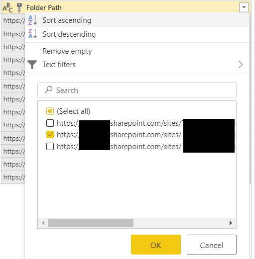
The Source data looks like this

Lookup B worksheet

Lookup C Worksheet

SQL Server

I have an Azure SQL Database and on it I create the one table that all the reference lookups will go into

GO
CREATE TABLE [staging].[Lookups](
[LabelKey] [int] IDENTITY(1,1) NOT NULL,
[LabelName] varchar NULL,
[Code] [int] NULL,
[LabelDescr] varchar NULL,
[Importdate] [datetime] NULL
) ON [PRIMARY]
GO
ALTER TABLE [staging].[Lookups] ADD DEFAULT (getdate()) FOR [Importdate]
GO

LabelKey has been added just to create a valid key for the table. LabelName has also been added which will be the name of the worksheet.

Finally ImportDate is added because we want to know exactly what time this data was imported into the table

Now we need to provide Data Factory with a list of worksheets

CREATE TABLE [staging].[LookupNames](
[LabelKey] [int] IDENTITY(1,1) NOT NULL,
[Labels] varchar NULL,
[Importdate] [datetime] NULL
) ON [PRIMARY]
GO
ALTER TABLE [staging].[LookupNames] ADD DEFAULT (getdate()) FOR [Importdate]
GO

Lookup Names is our seed table and will provide us with the worksheet names

we have populated it like this

SELECT 'Lookup A' UNION
SELECT 'Lookup B' UNION
SELECT 'Lookup C' 

Data Factory

Linked Services

Firstly we need to provide our linked services. Source and destination

go to Linked services via

and choose new.

call it ADLS_LS and select your Azure Subscription and Storage account.

At this point the connection was tested and was successful so we didn’t need to do anything further

Next, create your Azure SQL Database Linked Service

And call is SQLDB_LS (Or what ever you feel is the right naming convention. _LS is good because you can see exactly what are the linked services in the JSON script created

Again add in your details (We used a role that we created in SQL Server DB specifically for data factory with GRANT EXEC, SELECT, INSERT, UPDATE, DELETE on all the schemas)

Ensure the connection is successful

Data Sets

Now to come up with the actual source and destination datasets. If we parameterise them then we can reuse a single data set for lots of other activities within the pipeline

Click on the and choose New dataset

Choose the Format. In this case its Excel

We don’t want to specify any of the location values until we get to the pipeline, including the worksheet

Make sure First row as header is ticked (Unless you don’t have a header in Excel)

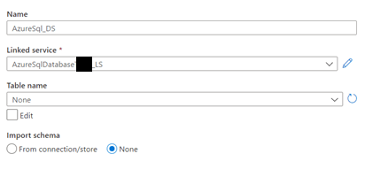
And create parameters

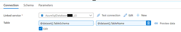
This means we can use this one Data set for all the SQL data sources

Pipelines

Now to create the pipeline specifically for the lookup

This is the basic pipeline we are going to add.

Lookup

First of all In Activities search for lookup and drag this into the pane

This uses the SQL dataset because we are going to use our SQL table that contains all the names of the worksheets.

Note that first row only is not ticked because we are bringing all the information through

ForEach

@activity(‘GetLookups’).output.Value

We are going to get the entire data set (Value) fed into the GetLookups Lookup.

Sequential is ticked because we are going to move through all the worksheets names in the table (Ensure that your Worksheets have exactly the same name as what is specified in your table)

Click on the Activities (1) to get to the activity

Copy Activity within the Foreach

We now set up the source of the copy activity

We use all the parameters within the dataset and add in the information from our Azure data Lake Gen 2 in the Storage Resource.

Within our Lookups table there is a column called labelname and we are going to populate this with the Labels column from our item. Out Item in the foreach loop and was created via the Lookup. And that lookup contained all the columns from our LookupNames SQL Table

The data will go into the Lookups table

Thats everything. You should be able to test your Pipeline by clicking debug and the Foreach should move through worksheet specified within your lookupnames table and add your information into SQL

Truncating lookup tables before re adding data

we want to be able to repeat this process and unless we add a truncate statement into our process we will keep readding the same information

We can add the following Stored procedure into SQL

/*
05/10/2020 Debbie Edwards - Peak - Truncate lookups
EXEC [staging].[USP_Truncatelookups]
*/
Create PROCEDURE [staging].[USP_Truncatelookups]
AS
BEGIN
IF EXISTS(SELECT * FROM [dbo].[sysobjects] WHERE Name = 'lookups')
TRUNCATE TABLE [staging].[Lookups]
DBCC CHECKIDENT ('Staging.Lookups', RESEED, 1)
END

And this can be added to the the Pipeline before the foreach loop and Lookup with a Stored Procedure Activity

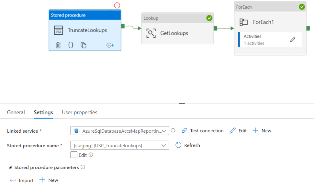
You wont be able to see the Stored procedure if you havent granted EXEC access to the specific Database Role name and schema

Always give the least amount of privileges and them move up if you need to

--Bring back information about the members in your roles
SELECT DP1.name AS DatabaseRoleName,
isnull (DP2.name, 'No members') AS DatabaseUserName
FROM sys.database_role_members AS DRM
RIGHT OUTER JOIN sys.database_principals AS DP1
ON DRM.role_principal_id = DP1.principal_id
LEFT OUTER JOIN sys.database_principals AS DP2
ON DRM.member_principal_id = DP2.principal_id
WHERE DP1.type = 'R'
ORDER BY DP1.name;
SELECT DISTINCT rp.name,
ObjectType = rp.type_desc,
PermissionType = pm.class_desc,
pm.permission_name,
pm.state_desc,
ObjectType = CASE
WHEN obj.type_desc IS NULL
OR obj.type_desc = 'SYSTEM_TABLE' THEN
pm.class_desc
ELSE obj.type_desc
END,
s.Name as SchemaName,
[ObjectName] = Isnull(ss.name, Object_name(pm.major_id))
FROM sys.database_principals rp
INNER JOIN sys.database_permissions pm
ON pm.grantee_principal_id = rp.principal_id
LEFT JOIN sys.schemas ss
ON pm.major_id = ss.schema_id
LEFT JOIN sys.objects obj
ON pm.[major_id] = obj.[object_id]
LEFT JOIN sys.schemas s
ON s.schema_id = obj.schema_id
WHERE rp.type_desc = 'DATABASE_ROLE'
AND pm.class_desc <> 'DATABASE'
AND rp.name = 'db_NameofRole'

you should hopefully have a good pipeline to run in your lookup information into one lookup table and truncate that table when ever you run the process

Power BI September 2020 Updates Total Labels for Stacked visuals

We recently had a requirement for a visual for a stacked column chart with a grand total

Our stacked chart contains:

  • Axis – Month year
  • Legend – Category
  • Values – Metric

To get this working we had to create a line and stacked column chart.

The line was hidden so we just had the data points and we just about got away with it. it did look a little messy though.

For the Line we went to Format

And set the stroke width to 0 so the line wasn’t visible. Only the data points and labels are visible.

Now there is a fix for this specific issue so we can try it on this specific report visual

First the report gets changed back to a stacked column chart

In format there is a new Total labels Option

Total labels are now on and a background colour of grey has been used.

The visual now looks much simpler. This small change will make a great deal of difference. time to find all those work arounds in the reports we have already created

Power BI Updates September 2020 – Mini blog – Maintain layer order

To get an understanding of this new feature lets have a quick look at a chiclet

it currently has a rectangle shape behind it. If you click on the rectangle and it becomes highlighted, the shape is brought to the front so we cant see the chiclet

So every time you hover over the report with the rectangle selected it pops up which is quite annoying

With the rectangle still selected, go to its format and switch maintain layer order off.

Now even with the rectangle selected it wont pop up over the chiclet.

This is great if you have more complex reports with bookmarks and underlying shapes to create a nice report structure. You can set this so your backgrounds wont obscure your visuals when you are using the reports.

its a pity this doesn’t do the same within Desktop. When you are developer you are still hit with the same issue. So this only applies to service.

Power BI September 2020 Updates: Smart Narratives

We have been hearing so much about this, I am very excited for Smart narratives

Smart narratives offer insights into your visuals which are also customisable

Lets use the Adventureworks demo report to try it out

Because its still in preview you will need to turn it on in Options and settings > Options

Add Smart narratives to a visual

I have a report than contains a scatter chart. I always find these a bit difficult to read

You can right click on the visual and choose summarize and this will add a smart narrative for that specific visual

We can now immediately see that 2010 was our best year. we are also told what our best selling product was and our highest earning product.

If I click on a bar in the bar chart for year smart narratives doesn’t change. Neither does it change if I click on Europe in the treemap.

It does change if you select a point in the scatter chart

I have selected a point in 2014 which also cross filters the other two visuals.

The smart narrative is actually not that helpful now ‘2014 had the highest total sales’

this isn’t true. Because we have selected 2014 this shouldn’t really be in the text.

The smarter version would be to tell us which month had the highest sales in the calendar year but I only have year in the visual.

Add Smart narratives to a Report

Here is a report created earlier for Sales.

Select Smart narratives from visualisations

we now have some great insights into the report as a whole.

Again there is a problem when, for example you select a year. for 2009 we get

‘Sales Amount and Order Quantity diverged the most when the calendar year was 2009’ This isn’t actually true again, its simply because the selection of 2009 means smart narratives only has 2009 data to go on. I suspect this may need tweaking for the next release for users who are selecting data points

Edit Existing text

We wanted to know the maximum discount applied so a sentence was added to the end, then + Value was selected to add in the new value

You can also use Q&A to add information into the smart narrative

Here we want to add the year to the maximum discount

Each value has a name and we can now find that value and format it

In this instance its worth making sure you name your values properly so you can get back to them.

Here I set the Maximum discount to English pounds

We can also make our text bold

So far, really good, I cant wait to use this on reports. However some work needs to be done when a user selects a value on a visual because the narrative only works on the selected item and therefore assumes it the highest value.

It would also be great if the smart narrative set things in bold automatically like values and years

Other than that great start. it would be interesting to see how it does against other tools like Oracle and Tableau’s offering.

Power BI Dataflows, Computed Entities and Query Folding

When you create a dataflow in Power BI Service without using Premium capacity you may hit issues Like ‘cant refresh dataflow

Linked Entities are when you link objects from different dataflows within Power Query Editor. to create transformations over a linked entity you need to create a computed entity that references the linked entity. There are none of these in this particular project but I do have…..

Computed entities are entities that reference linked entities, and which rely on in-storage calculations for performance and scale. Unlike “normal” entities which use the Power Query M engine to extract data from external data sources, and to load it into CDM Folders in Azure Data Lake Storage gen2

https://ssbipolar.com/2018/10/23/dataflows-in-power-bi-overview-part-6-linked-and-computed-entities/#:~:text=Computed%20entities%20are%20entities%20that,Azure%20Data%20Lake%20Storage%20gen2.

Data had been duplicated from the original table in the dataflow, but it had accidentally been created as a reference so it couldn’t be done.

As soon as you reference another query in a dataflow a Computed Entity is created.

This led to a bit of research on differences between Query Editor in Desktop and Service and how you can avoid the above issues.

Its also very possible that the dataflow in Service is slower than in desktop. After advocating the use of dataflows when creating solutions within teams and large scale organisations I wanted to get more information.

To get more understanding on what is going on in the Dataflow:

  • The dataflow is stored as csv data. It may be partitioned into multiple physical files.  
  • Power BI service ingests the contents of all of these files and loads them into memory.
  • It then performs a table-scan on each set of data to do the join or other transformations
  • It doesn’t use indexing of data typing because its schema-less (without the benefit of any indexing or data typing because schema-less.)
  • This is inefficient, and slow.
  • There are possibilities of moving your dataflows into your own Gen2 DataLake to extend capabilities over the data with Azure machine learning

Lets have a look at some Computed entity Examples

Referencing tables

Right click on customer and create reference to create additional the reference table

Note that the new table shows an icon of ⚡

Merging tables

Merging also created computed entities too which means that there will be no way to merge keys into fact tables when doing star schema modelling.

Append

Computed entities also occur with appended queries

So far it would seem that in order for dataflows to be the best option you should be in Premium capacity to make use of computed entities OR your transformations should be done at source.

Dataflows and Query Folding

There are also other things to consider when working with dataflows

It would seem that if you use the dataflow in Service, Power BI Query Editor cant use Query Folding at all.

Query Folding

This happens in Power Query editor to help increase performance. Query folding takes your edits and transformations which are also tracked as native queries in SQL (For example)

This ensures that the queries can done on the original data source without taking up Power BI resources

There are benefits like faster refresh and automatic compatibility with Direct query. This is because the transformations in Power Query Editor are done at source and uses the results to load into power BI tabular model.

You achieve best data refresh performance by ensuring that query folding occurs

https://docs.microsoft.com/en-us/power-bi/guidance/power-query-folding

Before we have a look at Query Folding in a Desktop File lets get some answers on what does and doesn’t support Query Folding. there is no definitive guidance on this so these are only a few examples

What does support Query Folding

  • Filtering (on rows or columns)
  • Aggregates and GROUP BY
  • Joins
  • Pivot and unpivot
  • Duplicating columns
  • Numeric calculations
  • Simple transformations, such as UPPER, LOWER etc
  • Removing columns.
  • Renaming columns
  • Filtering rows
  • Merging queries
  • Appending queries
  • Custom columns with simple logic
  • Pivot and Unpivot

What doesn’t support Query Folding

  • Merge columns
  • Indexes
  • Changing Date to Year, Month name etc
  • Merging queries based on different sources.
  • Appending queries based on different sources.
  • Adding custom columns with complex logic.
  • Changing a column data type.

Desktop Power Query Editor

To look at query folding, the source can’t be a Power BI report over a data file because only a database can support Query folding like Azure SQL DB for example.

Right click on your step. If View Native Query is enabled, the SQL can track the M Query

You can also look at the SQL that has been created

select [].[DateKey] as [DateKey], [].[FullDateAlternateKey] as [FullDateAlternateKey],
[].[DayNumberOfWeek] as [DayNumberOfWeek], [].[EnglishDayNameOfWeek] as [EnglishDayNameOfWeek],
[].[SpanishDayNameOfWeek] as [SpanishDayNameOfWeek], [].[FrenchDayNameOfWeek] as [FrenchDayNameOfWeek],
[].[DayNumberOfMonth] as [DayNumberOfMonth], [].[DayNumberOfYear] as [DayNumberOfYear],
[].[WeekNumberOfYear] as [WeekNumberOfYear], [].[EnglishMonthName] as [EnglishMonthName],
[].[SpanishMonthName] as [SpanishMonthName], [].[FrenchMonthName] as [FrenchMonthName],
[].[MonthNumberOfYear] as [MonthNumberOfYear], [].[CalendarQuarter] as [CalendarQuarter],
[].[CalendarYear] as [CalendarYear], [].[CalendarSemester] as [CalendarSemester],
[].[FiscalQuarter] as [FiscalQuarter], [].[FiscalYear] as [FiscalYear],
[].[FiscalSemester] as [FiscalSemester], [].[FullDateAlternateKey] as [FullDateAlternateKey - Copy]
from [dbo].[DimDate] as [_]

Moving onto the next step. Creating month name from date

Query folding is greyed out. You cant query fold on this step because SQL cant be created to represent creating the month name from a date.

And If the date is duplicated again after this, View Native Query is also greyed out. Once you have done a step that prevents query folding, no more query folding can happen.

This represents quite a complex problem. If you want to use Query folding for faster refresh you need a very in-depth understanding on what you can and cant do with Query folding (Like creating an Index etc) and attempt to do everything first before you introduce steps that will stop query folding.

After developing lots of Power BI reports, I cant even imagine being able to think at this level.

Merge

lets have a look at a step you can do that works with Query folding

Merging your Query allows you to keep Native Query

from [dbo].[DimProduct] as [_]
) as [$Outer]
left outer join [dbo].[DimProductSubcategory] as [$Inner] on ([$Outer].[ProductSubcategoryKey2] = [$Inner].[ProductSubcategoryKey])

So, its really worth doing, especially if you are working with a large data set. However its a difficult one to achieve.

Service Power Query Editor

We have looked at Query folding in Desktop. Now lets look at Query Editor in Service, which is the recommended way to go at enterprise level (dataflows).

When you right click on a Step in Service, the option is not available.

You cant query fold in the dataflow and there currently doesn’t seem to be any plans to do so.

Tips

  • Anything that cant be query folded would be better off created within your SQL Database reporting area
  • Look through all your applied steps. find where Native query option is disabled. Are there any steps after this that could use Query folding. It may be worth trying to restructure the order of steps
  • If you use dataflows you cant do any Query folding which needs to be an accepted negative for going the dataflow route
  • If you cant query fold there is a possibility of using Native Queries. However be aware that once you do this, no query folding can happen if you are in Desktop.
  • .xlsx, .csv, .txt files (etc) cant use query folding but don’t tend to be large data sets
  • Do as much transformational processing as you can at source. for example a SQL Reporting database

Power BI Dataflow issues. Let the whole dev team know

Currently, if your dataflow fails the only person who will be notified is the owner of the dataflow.

We want all our developers within the team to know. There doesn’t appear to be any way to do this at the moment but there is a workaround that was suggested to me by on the Power BI Forums by collinq as an idea starter and I thought I would run with it and see what happens.

It all relies on a Refresh date

Refresh date

In my main dataflow I have the following Query

This was created from a blank query

let  Source = #table(type table[LastRefresh=datetime], {{DateTime.LocalNow()}})in  Source

This gets updated every time there is a refresh on the main dataflow

Create a New Report in Power BI Desktop

Go to Power BI desktop and Get Data

Dataflow is the source of the data

And we only need this object

I am going to edit the Query in Power Query Editor

Last Refresh date has been split into Date and time.

Then a custom column was created for todays date

DateTime.LocalNow()

This was split into Date and Time. It is very likely that we may decide to use time later so this is why it has been added for now.

Now we find the number of days between the last refresh and today

0 -Duration.Days(Duration.From([last Refresh Date]-[Todays Date]))

0- is added to remove the minus at the start of the number so -1 becomes 1

Close and Apply and a card is added

Publish to Service

Power BI Service

Go to the report that has just been created

And Pin the card to a dashboard. In this case, an Issues dashboard has been created

The idea at this point is. If the Refresh date isn’t refreshed the number of days between will become 2 because todays date will change and we can be notified

This will need testing

Power BI Dashboard (Create Alerts)

Go to the dashboard

Choose Manage Alerts

We want to know if it goes above 1. this means that last nights refresh has failed to happen.

(But if it fails to happen, will the Current date refresh?)

At present, an alert will only be sent to the owner of the report and it will be seen within Power BI but we want everyone to know.

This is why we are going to use Power Automate / Logic Apps

We have an Azure Subscription so I can add a Logic App within our subscription

Instead of clicking the above link we are going to go into Azure, but the principal will be the same

Save the Alert

Schedule a refresh

The new report has created a dataset

go to Settings and Scheduled refresh to keep this up to date

Azure Logic Apps

Create a new Logic App in Azure

Search for Power BI. We want the trigger ‘When a data driven alert is triggered(Preview)

I am signing in with my own credentials (Note that my password is updated every month so if these credentials are used it will need adding into the governance.

Our alert has been saved and added to the alert list

Just for the time being its being left at 3 times a day

We have our trigger, now we need to know what will happen on the trigger

New Step

for the time being chose a fairly easy option of sending an email

You can search for the dynamic content as you create the body and subject. Here we want to bring to attention the value in the tile and the alert threshold.

  • The HTML <li> element is used to represent an item in a list
  • The <strong> tag is used to separate the text from the rest of the content. Browsers traditionally bold the text found within the <strong> tag
  • The <big> tag is used to make the text one size bigger
  • The <ultag defines an unordered (bulleted) list
  • The <a> tag defines a hyperlink, which is used to link from one page to another. The most important attribute of the <a> element is the href attribute, which indicates the link’s destination.

I have added two users to the email so they can both be notified

Save your logic app. Its ready

Testing the New Process

The dataflow is schedule to refresh at 11 PM

Dataflow issues data flow is scheduled at 12 AM

On the night of the 28th of September, everything failed. I got the emails because I am the dataflow owner but no email from the actual set up.

Testing has failed

lets have a look to see whats happened.

We have two fails, and one on the dataflow we have set up

It looks like the refresh token expired. Please go to this dataset’s settings page, and reenter the OAuth2 credentials for the Extension data source.

Going into the report and we still see this

Which is incorrect.

We would get more of an understanding if we could match up the dates to what is happening.

However its clearly not updated

Dataflow Settings

Scheduled refresh is on and set to run at 12 midnight. The errors were emailed through just after 11.

The alert is there.

lets go back to desktop and add some more information.

After a refresh in Desktop we can now see this information

Which is correct. this says to me that even though we have a refresh going on, it didn’t refresh in Service possibly. The new report is published up to Service.

Back in Service

This is interesting. Our new multi row card shows the correct information. However our card still says 1 day which isn’t correct.

A quick refresh of the data set and we can still see one on the card so we have a difference in between Service and Desktop.

Refresh of the report and now its worked and we can see 2 days difference

So there are a few issues here. Why did it not refresh the card on the data set refresh but it did when the actual report was refreshed?

Its actually the dashboard that is doing the work here. the new multi card is pinned to the dashboard. lets go and have a look at it.

The dashboard only updated once the new visual was pinned to it

So the failure has been that the report and dashboard didn’t refresh, even though it is set to refresh.

You can get to the data set refresh history in Data sets and then Refresh History

And you can get to the Dataflow refresh history via Dataflows

Data Set Issues Refresh History

Dataflow Issues Refresh History

The actual Schedule seems to be fine. All I can think of is that possibly at 12 it is still 1 day so I could possibly introduce more data refreshes to the dataflow issues data set

Test 2 Adding more refreshes on the Dataflow issues data set

Its a very quick refresh because its just two dates. Lets see if this changes things.

Where to create your reports. Power BI Service or the Power BI Desktop

Since starting to use Power BI we have been advocating the following ‘basic’ model

However. You can also create reports within Power BI Service. This is mentioned within the certification route for DA 100 Analysing Data with Power BI. Which makes things a little more confusing and I have been asked on lots of occasions. “If you can do everything in Service, what is the point of using Desktop?”

This post will hopefully answer that question.

Creating Reports in Service

First of all lets have a look at how creating a report would work in Service.

Within the Adventureworks Workspace, Click on New and go to Report

Now Select a dataset to create a report

You are shown your list of datasets that are available to you so immediately its clear what this route could be used for:

  • The Report Analyst. the DAX and Data model have been built and the analyst can simply add visuals over the dataset created

Within service, a very basic report is created.

As the analyst I realise that I want more DAX

If you click on to get to the options against a table, You cant create DAX.

  • So if you create your reports in Service you cant create DAX.
  • You also cant do anything with the data model if required
  • And you cant go to the data pane like you can in Desktop

Data and Model aren’t available like they are within desktop.

When you are dealing with a larger model, its always useful to be able to flick across to the model area to view your model, to get a good idea of what you are working with. Because of this, its not recommended to work with the Reports in Service if you look at the data model as a guide whilst creating reports.

Saving your reports in Service

Continuing on with the process. Click Save

The Adventureworks report is now added as content. Lets have a look at Lineage by changing the View to Lineage.

The new report is now up but this leaves some confusion. Which reports are maintained within Desktop and which reports aren’t? There is no way of knowing. Both the above reports look the same.

Within the Adventureworks report which was created in desktop, you can go to Edit

and Download report (which is currently still in Preview)

Obviously you would want to get the current file from the owner of that file but this is one way of generating pbix file is behind the report.

You can do the process above with the Service created report. This increases complexity and possible confusion. How do we know as users what reports have a pbix file and which do not?

The only answer is to go to the Lineage and find the contact to ask

Editing a Report in Service

Before looking at editing a report, lets get a quick overview of Roles in Power BI

Viewer

The viewer role isn’t set in the Workspace anymore. This is best done within the App to allow report readers to view content

It seems the only reason we have viewer if you wanted to test what your report users can do within the workspace.

They can only view content and set their own personal bookmarks. Create comments etc. they cant edit the content.

Contributor

the contributor role is the developer role.

  • Publish your report into the workspace
  • Edit the content in the workspace if required by building dashboards
  • Delete any content within the workspace
  • You get access to all the workspace objects and can analyse in Excel etc

At contributor level you cant publish into an app. Only the Member or Admin can do this.

Member

Members can do all the actions of Contributors but they can also publish and update apps. this essentially allows the member to push content into the production area. (Bearing in mind that Premium Power BI Pipelines allow you to fully manage your Lifecycle with Dev Test and production workspaces)

Admin

The Admin has full access to the workspace. In addition to Member actions they can add more admins and more users and delete the workspace.

Issues with Editing Content

For this example, I am a Contributor within someone else’s App Workspace

Contributor allows you to Edit, So without letting the owner of the report know, I add a new page with a visual and Save.

In the meantime, the report creator decides to update and republish their report from the pbix file.

Once republished by the pbix owner all my work is gone.

This is another reason to be very careful when editing reports in Service. If you intend to continue to update your pbix file, anything created in Service should be moved into the pbix before republishing, which relies on your business governance.

Final notes

The only data set that cant be added to a pbix file is a real time streaming data set. data is added to a temporary cache so it expires and you can only use streaming visuals for this type of streaming data set.

Otherwise, with all other data sets, the recommendation is to create a file within Power BI desktop.

This is a great visual to check if you are thinking of editing in Service

Even then you need to think about usage and if the report has a pbix file underneath it.

Personally, it creates too much added complexity when creating and editing reports in service. if you have contributor access you should have Power BI desktop.

lets have a final look at types of Power BI User

Your central BI dev team should be working with Power BI Dataflows in Service where possible to separate the transformations into Service away from the model and the DAX. they should be creating reports in desktop

Your Power users will also be using Desktop and may also be taking advantage of promoted dataflows

Consumers should be accessing from an App only.

The only use case of the edit could be at analyst level, where the analyst is taking advantage of a promoted or certified data set and building out from what is there (With contributor role)

At this point, its recommended to come up with some governance here. Is this use case ok within your company, OR should all reports have an underlying file created in Desktop?

The choice is at individual company level but we prefer to ensure that desktop is used and reports are not created or edited at Service Level. That we we can put governance in place on the pbix files themselves and be in a better position at managing the full scope of Power BI.

Power BI August 2020 Updates Perspectives for Personalised visuals in Preview

Personalised visuals have been out for a while (The ability for report consumers to change the visual to more suit their needs), but we need to make sure that users aren’t over whelmed by field options.

Lets look at a quick demo using Adventureworks data.

First of all, you need to make sure Personalised Views are enabled in Options

Enable Personalised views

Its not enough to turn the preview feature on. You have to enable it. for this example its going to be done in Power BI Desktop

Personalised visuals has been set up at current file level because there may be other reports that you don’t want to enable this on.

First of all create a simple visual

Note the new icon which denotes that it can be personalised.

This visual gets published up to your App Workspace. Then published to the Power BI App for your report consumers

If you have a lot of fields you might not want to overwhelm the users with them in Axis and Legend as above.

Tabular Editor

Back to Desktop and we can open up Tabular Editor (Ensure you have the latest version downloaded)

You are immediately connected to the tabular data model and can see the tables and the empty Perspectives folder.

Right click on Perspectives and choose New Perspective and name the perspective

Go to tables and fields then right click and add to perspective

When you Show an item in perspectives, it doesnt change the perspective. Which is a little annoying because you cant see what you have added. If you try adding the item again it will be greyed out which is the only way of knowing at this point.

  • It would be helpful to see the list of items that you have added

Save in Tabular Editor and also in your Power BI desktop file

Back to Power BI Desktop

Without selecting a visual click on Format for the entire report

There is a new Personalize Visual menu item which can now be set to the perspective Created in Tabular Editor

Hopefully soon we will be able to select visuals to personalise and select perspectives at visual level rather than at report level to further lock down what should be seen per visual. This would be most helpful.

Save and Publish to Service and your user will only be able to work with those items in the perspective

Power BI Service

Now only items available in the perspective are available to the user

Future hopes for Personalised Visuals

  • make it easier to see the list of items in the perspective in Tabular Editor
  • Set Personalised at Visual level rather than report level
  • It would be even better to have them set at Axis, Legend and Values level. You could make all measures available to the Values Perspective only which would be really helpful.

So a great start but I hope they introduce the functionality above to make this new functionality even better for our users

Power BI. How to connect up to a sharepoint folder containing multiple files using a dataflow

We have a current use case where we have a Sharepoint folder that will contain monthly files.

We want to create a dataflow that contains everything that we need to pull into a shared data set

The point of this is to have one data set filtered to the correct folder you wish to use.

Then bring in all the data into one data flow. This means that each file should have an identical spec or you will get errors

Step 1 is to open up a Power BI Service and create a dataflow

Ensure you know where your files are in Sharepoint

There are two example files and we have the base Sharepoint URL

In Power BI Desktop get Data

We want Sharepoint online folder

Add in the base address of your Sharepoint site as above and click Next

At this point you can see all your files in all the folders in Sharepoint

Just click OK. we don’t want to combine all the files from all the folders.

What you want to see now is just one applies step (source)

and we can see the two files that we want to merge. Scroll to folders and then filter on the folder

Click on OK

We are left with the two files in the selected folder

click on the arrows against Content

Its using Example File as the first file. In this example click on IDB to continue and OK

The Data is now in Power Query Editor. We have a Source name column which contains the files. Here we can see our two files.

Notice that you have additional Queries. along with your query

  • There is a Sample file
  • A Parameter
  • and a function

Sample File

let  
Source = SharePoint.Files("https://Co.sharepoint.com/sites/TeamDataStore/", 
[ApiVersion = 15]),  
#"Filtered rows" = Table.SelectRows(Source, each [Folder Path] = "https://Co.sharepoint.com/sites/teamDataStore/Shared Documents/General/Submissions/"),  
#"Filtered hidden files" = Table.SelectRows(#"Filtered rows", 
each [Attributes]?[Hidden]? <> true),  
Navigation = #"Filtered hidden files"{0}[Content]in  Navigation

the Source file Contains the Sharepoint side and the folder that we have filtered on

Parameter

let  
Parameter = #"Sample file" meta [IsParameterQuery = true, IsParameterQueryRequired = true, Type = type binary]in  Parameter

This is taking the Sample File(s) as the parameter

Parameters allow us to pass information or instructions into functions and procedures

Function

let  
Source = (Parameter as binary) => let  Source = Excel.Workbook(Parameter, null, true),  Navigation = Source{[Item = "IDB", Kind = "Sheet"]}[Data],  #"Promoted headers" = Table.PromoteHeaders(Navigation, [PromoteAllScalars = true]),  
#"Changed column type" = Table.TransformColumnTypes(#"Promoted headers", {All the columns})
in  #"Changed column type"in  Source

And the function applies the parameter as the source and then does all of our transformation steps

function is a block of organized, reusable code that is used to perform a single, related action

Power BI has done some of the hard work for us. We can continue to add steps to our transformation processes and so long as the format of all the files are the same we should be able to refresh the data and continue to combine new files from the Sharepoint folder

Power BI Updates August 2020 Organisational visuals in Power BI Admin

Power BI report developers can either use the default Power BI visuals, or go to AppSource to pick up visuals.

Some of these visuals are available within Power BI certified, which means that these visuals have been through rigorous tests and have passed all the requirements.

But there are many other visuals you can use. some you have to set up an additional purchase for, for the additional features.

The question is always, as an organisation, do we allow users to use any visual, just the certified visuals, or only default visuals?

Organisational Visuals

The great news is that in Power BI Admin, you can now add visuals that you are happy for everyone to use within organisational visuals.

Lets try it out in Admin Portal

You can go straight to AppSource to add in the visuals

For this post, the following visuals are added

These are all popular visuals and now, the admin has added them as organisation visuals.

There are a few things we can do at this point

click on settings and enable the visuals for the entire organisation

The enabled visuals are available for everyone in the default visuals pane in Power BI Desktop

Admin tenant settings

To add more control to visuals, its possible to disable every visual that isn’t certified.

Visuals can then be added if they are deemed to be required within organisational visuals.

Pros

More knowledge and governance on what is being used across the organisation

Easier to resolve issues. There are cases where visuals have been changed or simply scrapped. This has caused issues with reports because there is no backwards compatibility to this.

Cons

Users who enjoy spending time testing visuals and seeing what they can do, your Power users may feel that they are being stopped from getting the most out of Power BI

Bottle necks, if you need to get your admin to add a visual, this may take time. One of the great things about Power BI is Self Service is the ability to simply play with your data. this may get lost to certain people without full use of visuals.

Using the organisation visuals

Your Power BI developers can now access visuals on the My Organisation tab knowing that these have been recommended at admin level

Its completely up to you what level of access you require for visuals, but the fact that we can now add selected visuals automatically into every project is great news.

However I do have one question. If visuals can only be used when they are added to the view, How do you discover new visuals or check out new ones, to see if they should be added?

Design a site like this with WordPress.com
Get started