After 14 years using Microsoft On Premise BI Tools (SQL Server, Reporting Services, Integration Services and Analysis Services) Its time to embrace Business Intelligence in the cloud.
We currently have a project where the metrics are actually flags to count whether a record is true or false rather than business metrics like Amount, SaleAmount etc
Is something completed? 1 or 0
Is something in Development? 1 or 0
Is something Out of Scope ? 1 or 0
Etc.
Now, if you left these in the fact table you could sum them to create a measure. But you are left with thousands of rows of just 1s and 0s. against all the keys in the fact table.
Also, they aren’t really metrics. They are true and false flags and as a consequence should not be in a fact table.
The above solutions is not what Kimball would recommend. Kimball recommends a Junk Dimension
Definition from Kimball: — A junk dimension is the combination of several row-level cardinality flags and attributes into a single dimension table rather than modeling them as a separate dimension
It should also be noted that a junk dimension can contain flags and other attributes that don’t quite fit anywhere else.
The star schema looks like this (This is just an example STAR)
Flags are split between two areas D1 and D2 which has also been added to the junk dimension as its basically just a title to split the metrics into two rows in a table.
These two areas are two completely separate low level fact tables, with different metrics and dimensions. think of for example ‘Human resources’ and Marketing’.
we have them here because we have a high level granularity STAR Schema comparing some of the similar flags across the two departments.
This could have been added as a separate dimension but as its just one data item it seemed more sensible to add it here.
So instead of having them repeated over and over again in Fact. We just have every option available set in the junk dimension once. So every single record where F1 is true for Area D1 goes to Key 0.
Summing the flags
The flags are Bool. True false columns so we cant simply sum them up. If we were to do that we would need to convert them to int
Flag int = CONVERT([Flag],INTEGER)
Once converted we could sum them.
SUM([Flag Int]
The junk dimension is used against multiple fact tables and here is the first issue.
If we create DAX this way, there is no mention of the central fact table. Therefore if you use it it just counts all the true flags in the dimension, completely separately from the fact table.
We need that join to the fact table in the DAX
So we dont need to Convert the Flag to an int to use it in a measure. We can do the following:
The CALCULATE function evaluates the Count of the Junk keys that are already integer within the fact table. This is important because we have now created a reference to one of the fact tables.
And we are counting where the Flag is equal to True in the Dim
||
Allows us to add another and. In this case we are only looking at the D1 area.
We can add these logically into the separate fact tables
Another requirement came through for a table that showed the current month figures against last months figures,
However, to save space the two values were in the same column, last month contained in a ()
So part one was to create the date time intelligence for last month,
And then to attempt to concatenate the two figures just for the table
Time intelligence to see this time last month
There are various ways of doing this
Prev Month At Risk = CALCULATE([At Risk],PARALLELPERIOD('Dim'[Date], -1,MONTH))
Here we use CALCULATE to evaluate the SUM of At Risk (created in a base measure already) in a modified filter context. Which is PARALLELPERIOD using the date from the Date Dim.
PARALLELPERIOD takes the current set of dates (For us its month and year) and shifts the first and last date in the period specified a number of intervals. -1 takes us back a month.
This is the chosen method but you can also use
CALCULATE([At Risk],DATEADD(‘DimDate'[Date],-1,MONTH)) DATEADD returns a table that contains dates shifted forwards or backwards in time the number of intervals from the date in the current context. Again we are sing Month and Year in the current Context.
Returns a table that contains a column of dates, shifted either forward or backward in time by the specified number of intervals from the dates in the current context
PREVIOUSMONTH('Dim Report Snapshot Date'[Date]))
PREVIOUSMONTH returns all dates from the previous month using the first date in your context. As we are using month, our first date is 0103 so it goes back to 0102
Returns a table (Its a table expression) Returns a single column of date time values from the same period in your current context from last year, SAMEPERIODLAST Year can only go back a year.
Concatenate current month and Last Month into one single value
This is for a table only. Not to be used for Proper analytics.
So first we need to convert the number into a string.
And then we can concatenate. The following was used
At Risk = VAR varMeasure = CONVERT([At Risk],STRING)
VAR varPrev = CONVERT([At Risk],STRING)
VAR varConcata = CONCATENATE(varMeasure,”(“)
VAR varConcatb = CONCATENATE(varPrev,”)”)
RETURN
CONCATENATE(varConcata,varConcatb)
There will be lots of other ways to do this but I decided on the following Creating Variables to hold:
The measure converted to a string
The previous (Month) measure converted to a string
CONCATENATE (You can only concatenate two things using this method) so The measure was concatenated with (
CONCATENATE, Doing the second part of the concatenation. The previous Month String value with )
Finally we return a Concatenation of a and B so make a string value we can use for the table.
We have sold specific quantities of products. Can we look at a week for a year in a slicer and see the percentage of items sold for each day. Which days do we sell the most products overall?
We have the following model (Just the parts that will be required for this exercise
And thanks to the Power BI Forums for giving me some help on figuring this out.
What we want to end up with is:
A year Slicer
Product category on rows of a matrix
The Day Name from Date on the Columns of the Matrix
And % Quantity for that day based on all the days of the week as the value
Power Query Editor
At first I believed that I needed to add some kind of Ranking order for the DAX to use and as this will be a column its better to do in Power Query Editor (Or in the Sort DB)
To speed things up I created a Year Week Column in SQL DB consisting of the following examples
202101
202102
202135
So the weeks 1 to 9 was padded out with a zero. I then formatted this to a number field and called it Year Week. Every seven rows within that week in the date table will have the same Year Week Number Applied
Measure
I can now create the measure. Lets have a look at it in a bit more detail
Order Quantity by Week % = Var varOrderQtyWeek = CALCULATE(SUM(FactResellerSales[Order Quantity]), FILTER(ALL(DimDate), DimDate[Year Week]))
RETURN DIVIDE(SUM(FactResellerSales[Order Quantity]), varOrderQtyWeek)
And this measure is then set as a percentage.
First of all we create a variable. It gets the Sum of Order Quantity and it filters by using an ALL on the column Year Week we just created in the Date Table
“ALL Returns all the rows in a table, or all the values in a column, ignoring any filters that might have been applied (On Year Week).”
And we return the sum of order Quantity (Which in the context is just for, for example Friday and Accessories by the Sum of Order Quantity
This appears to work
We have Implicitly filtered by Product Category and Day Name of Week.
the question here is, did we even need to set ALL on Year Week column in date. Could we have just said use the entire date
Order Quantity by Week % = Var
varOrderQtyWeek = CALCULATE(SUM(FactResellerSales[Order Quantity]), ALL(DimDate))

RETURN DIVIDE(SUM(FactResellerSales[Order Quantity]), varOrderQtyWeek)
This is working in the same way and makes sense to me. We are using all the dates in the date table. And removing the Filter will create a faster DAX query.
Its looking at the entire data set and we can see that everything totals to 100%. So for us, taking into account all years Thursdays look like a good day especially for accessories.
However we don’t want to analyse the full data set and when we add in a year slicer the logic fails
As you can see, the story is still true but its telling the wrong story. Now for Accessories we have 31% of sales happening in 2021, attributing to smaller percentages across the days.
So we want to change the DAX to accept the Year Slicer
Order Quantity by Week % =

Var VarALLEXCEPT = CALCULATE(SUM(FactResellerSales[Order Quantity]), ALLEXCEPT(DimDate,DimDate[CalendarYear]))

RETURN
DIVIDE(SUM(FactResellerSales[Order Quantity]), VarALLEXCEPT)
And this appears to now work just taking the year 2012 into consideration because we are using ALLEXCEPT
Thursday is definitely a good day.
“ELLEXCEPT Removes all context filters in the table except filters that have been applied to the specified columns.”
So we create a variable to get the Sum or Order Quantity with ALLEXCEPT our Date Slicer which in this case is the calendar year slicer
So we are using 2012 from the date Dimension in the slicer. And Bikes from Product and Thursday as the Week Name from date in the Matrix
We Divide the Sum of Quantity which has all the filters applied. Bikes. Thursday. 2021
By the Sum Of Quantity with all, Exceptwe do apply the Calendar Year.
DIVIDE(50/100)
50 is Bikes on a Thursday in 2012
100 is Bikes in 2012
DAX is something I do struggle with a little. You think you understand it. Turn your head from the screen and its gone again.
But hopefully this goes a little way to understanding how this DAX in this specific context has been approached
And for the reports we never use we can either use the measure above with a filter
Or explicitly add a filter into a new measure
# Reports Never Used = CALCULATE([# reports],DimReport[neverusedFlag]=true)
# Datasets Never Used = CALCULATE([# Datasets],DimDataset[neverusedFlag]=true)
Notice that I set Edit Interactions to off between the date slicer and the two cards because the cards are simply telling me how many reports and dashboards have never been used
So this part of the process is all fine.
Our Next Business Question is
Show me the reports and datasets used in September by date
This is another straight forward request
And both interact with the Date Filter.
And now to the question
Show me the reports and datasets NOT used in September
So we use our date slicer and we want to see items outside of that date slicer. We need to create a more complex measure to do what we need
Is Not in the Date Filter Flag =
// assumes a slicer on DimDate[ActivityDateKey] and there is an implicit filter on the visual
VAR VActivityDates = SELECTCOLUMNS(DimDate,"Dates", DimDate[DateKey])
VAR VDates = CALENDAR(MINX(DimDate,DimDate[DateKey]),MAXX(DimDate,DimDate[DateKey]))
Lets break the above down a little to understand what is happening
SELECTCOLUMNS
VAR VActivityDates = SELECTCOLUMNS(DimDate,”Dates”, DimDate[DateKey])
First of all create a variable. SELECTCOLUMNS
“Adds calculated columns to the given table or table expression.”
We start with the table they come from. then we give the name to the column in SELECTCOLUMNS “ColumnName”, Next comes the expression which in this case is the column reference.
CALENDAR
VAR VDates = CALENDAR(MINX(DimDate,DimDate[DateKey]),MAXX(DimDate,DimDate[DateKey]))
Next comes the VDates Variable. Calendar Returns a table with a single column named “Date” and it contains a contiguous set of dates. We need to provide the range of dates. In this case MINX finds the earliest date and MAXX finds the Maximum date in our date dimension
Now this should work with our slicer. In this case Min 01/09/2021 Max 30/09/2021
INTERSECT
INTERSECT(VActivityDates,VDates)
And now we get to the measure that will be RETURNED
“INTERSECT A table that contains all the rows in table_expression1 that are also in table_expression2”
COUNTROWS
COUNTROWS simply counts the number of rows within a table or an expression
So here we can see the intersect and if working together. If there are rows counted (True – There are rows then 0 else 1.
Still Struggling to understand? Me too. Lets draw it
Here is where I am a little confused. I’m not sure which part of the DAX works with the slicer. SELECTCOLUMNS or CALENDAR MINX MAXX? I’m making the assumption that CALENDAR takes the min and max of the slicer but its incredibly difficult to test so if anyone has any more insight on this that would be fantastic.
And we can now look at everything together in a report
We have used Is Not =1 in the ‘Is not in the Date Filter’ as out value and its always ever 0 or 1
But now we are asked another business question
How MANY reports did we not view in the current date slicer?
with the measure as it stands. It needs the Report Name or the Data set name to provide details
We can’t use what we have in a card because we cant add the implicit filter (Report Name etc).
So How can we do this one?
We can solve it using variables
Total Reports not in date Filter =
//Clear all filters which are applied to the specified table.ALLCROSSFILTERED
var VAllReports =CALCULATE([# reports],ALLCROSSFILTERED(DimDate))
//Total within the date filtervar
VInFilter = [# reports]
//All reports - Reports inside the slicer
Return VAllReports-VInFilter
Using ALLCROSSFILTERED brings back the total reports 4 as it removes all the filters
then we get back the total of reports in the date slicer and finally take in filter away from all the reports.
Out # reports is a measure made from distinct report IDs already. We now have everything we need to create these reports thanks to DAX.
Imagine the scenario. You are dealing with two dates. date A and B. You create an active and an inactive relationship to your date table.
You can create Dax with USERELATIONSHIP for any measures that use the inactive join. Great for the bar charts, line charts etc.
But what if you have a slicer for Year on the report? At the moment that slicer is connected to Date A because you simple drag year from the date table.
This report needs to be sliced against Date B. Is there a way to do this?
Lets look at one of our measures that uses USERELATIONSHIP
YTD Measure =
CALCULATE(TOTALYTD([Number of Records],’Date'[Date]), USERELATIONSHIP(Metrics[DateKeyB],’Date'[DateKey]))
The USERELATIONSHIP can only be used with CALCULATE,CALCULATETABLE, CLOSINGBALANCEMONTH, CLOSINGBALANCEQUARTER, CLOSINGBALANCEYEAR, OPENINGBALANCEMONTH, OPENINGBALANCEQUARTER, OPENINGBALANCEYEAR, TOTALMTD, TOTALQTD and TOTALYTD
From this it is clear you can only use it in a measure with a metric.
And you cannot use a Measure in a slicer. Slicers have to be created from a column.
Which means that our inactive dates can’t be used in a slicer. And this is problematic because if you have a page of time based visuals all using the USERELATIONSHIP then its a fair shout that you are going to have a slicer too for example ‘Year’
So can we come up with a workaround?
Workaround 1. Adding date information to the fact table
Out model rules are
DateKeys in the Fact table. I also hold the dates hidden just in case
The dateKey Joins to the date Dimension which contains Year, Day, Month etc
So what I am going to do in this case is add my relationship B details into the fact table just for the time being.
s.[DateB] AS [Date B],
--Workaround 1
DATEPART(Year,s.[DateB]) AS [Year B],
DATENAME(Month,s.[DateB]) AS [Month B],
DATEPart(Month,s.[DateB]) AS [Month No B],
[staging].[fnQuarter](s.[DateB]) AS [Quarter B],
I have created a Quarter function with the specific quarter logic which is use for every Quarter period.
This is then refreshed into the Power BI Dataflow
And then refreshed into my data set.
All ready to work with. What I decided to do in Power BI was create a table containing those values.
Support End Date (For Slicers) =
SUMMARIZE ( 'GrowthHubMetrics',
GrowthHubMetrics[SupportDateKey],
'GrowthHubMetrics'[Support End Quarter],
'GrowthHubMetrics'[Support End Month],
'GrowthHubMetrics'[Support End Month No],
'GrowthHubMetrics'[Support End Year],
'GrowthHubMetrics'[Support End Date])
The dates in the fact table were then hidden leaving the above Slicer table.
And then I remembered that Date time Measures don’t work without a continuous date table and DateB isn’t continuous.
But then I remembered that I had already put in a lot of work creating all the date time measures on the inactive join to the date table using USERELATIONSHIP so actually all the date time measure are fine.
Would I go back and create a date table for dateA and a date table for DateB so I can have slicers and drill down to the date. Its very possible but that renders the use of USERELATIONSHIP Pretty null and void, unless you still want to slice these visuals against DateA.
Connect the DAX table to the model.
the date Table for Slicers is connected up to Dimdate in the model and we are ready to go
So all the measures are still connected to the date table through the inactive join
But the slicer can be set up over the new DAX table
I’m hoping to get a better way of doing this as we go because it seems that you should be able to do this without having to create another table.
Update
In the end, this became so complex and issue heavy (Drill throughs not working properly etc) I gave up. Created a reference of the date table for Date B. Connected this up. removed the DAX table and changed all my measures to get rid of USERRELATIONSHIP.
So Pages 1 to2 use DateA and Pages 3 and 4 use DATEB.
As a conclusion, if you are wanting to use Drill through and Drill down I think I would recommend role playing dimensions. the complexity of the USERELATIONSHIP with just seems incredibly complex at the moment.
Its a shame because I love the idea of switching to a none active join but in practice its proved unworkable.
The analysis is performed at the record level of the ‘table’ A field in explain by is not on the ” table or a table from the same data source and related to it by a many to one relationship. Try Summarising it
This model is all about behaviour and attitudes for an event company who put on IT events for companies who want to learn more about cloud based solutions.
The stakeholders are all the people who go on the courses, and those people who arrange the courses.
Its important for the company to know how their customers are reacting to their cloud based events and training. Which ones are doing well or not in terms of reactions.
The trainer or presenter sends out a questionnaire after ever event / course. they also send in their own questionnaire about how they felt the course was engaged with.
I have a Star Schema and in one of the dimensions I have a behaviours table. We want to know what influences behaviour from all the other attributes from around the star schema
There can only be a certain number of behaviour types so this dimension is set as a junk dimension. Each Type of behaviour is joined to the other using a cartesian Join
Every behaviour type is matched to every other behaviour type and then we can simply assign the correct row to the person event and theme
So a stakeholder can go to many events
A stakeholder can hold different behaviours for every event
We want to see what effects behaviour, so the Key Influences visual is the one we really want to use in this project
In this visual we are analysing by Explain by.
Add in a measure from the fact table and it works fine
But this isn’t telling us anything. We need descriptive information from the other dimensions
So lets go for something from Events
And here is where we get the error
The analysis is performed at the record level of the ‘table’
Obviously this part of the error makes sense because we want to understand the behaviour
A field in explain by is not on the ” table
That is correct. we are explaining by a field in another dimension
or a table from the same data source and related to it by a many to one relationship.
Try Summarising it
How to deal with this issue
the error doesn’t give much away but the solution lies in the model.
The recommended single direction join has been used on every single relationship. Therefore, the dimension can filter the fact but the fact cant filter the dimension.
And specific to this model, Another dimension cant filter another dimension
Events and behaviour cant filter eachother.
Unfortunately setting all the relationships to both didn’t resolve the issue either. Maybe the answer lies with DAX
Lets look at that error again
the Keyword in the error is SUMMARISE.
Now we know exactly what we want to use as the ‘Explain by’ Lets see if we can set up a Summary table using DAX
Calculation groups look like a game changer, but are they? These have been available for Analysis Services tabular models for a while. Now Tabular editor Lets you build calculation groups for Power BI.
Taking one of our current pbix files as an example.
There are metrics for number of events, Financial metrics, timing metrics. Each one has to be added to Year to Date, Last month, last Year, Month to date etc metrics.
The same measures are repeated over and over again for the different metrics in the report.
And adding metrics in Power BI desktop isn’t a fast process. Its actually quite fiddly so adding the first lot of DAX required always takes a lot of time.
The Solution
As from July 2020 you can reach tabular editor Via External tools
You must have them installed at the right version for this to work.
You must enable Store datasets using enhanced metadata format in Options > Preview features
You are taken straight to the model you are connected to
Right click on Tables. Create New and Calculation Group
Time Intelligence
The best example to look at is time intelligence
This example is renamed to time Intelligence. What has been created is essentially a single column table.
the rows are based on all the calculation items that I already have in this model.
I initially recreate all the metrics from source as SUMs so they can be used within measures. Along with this I may have other base calculations like Distinct Count of IDs to make a number of events. Minimum, Maximum, Average etc.
right click Calculation items and choose new calculation item
In this example, go back to the original pbix and copy a time intelligence DAX measure
Total Sales is a measure created with SUM() using the Sales Amount metric from the data source
The measure is replaced with the scalar function SELECTEDMEASURE()
Instead of having to recreate this DAX over all your ID’s where necessary you only need to do it once
Scalar function – a function that returns one single value
The base DAX in this data set can now be added into Tabular Editor
You can imagine starting a prototype model with DAX for a specific metric. Then recreating as calculation groups so you can add all your other metrics without having to copy and paste the same measures over and over again
Tabular Editor currently has no intellisense so you wouldn’t write and test your DAX in here. this would be done in Desktop. If you wrote incorrect DAX in here and Saved to Power BI, you would then see an error icon in Tabular Editor.
Adding more time Intelligence from the original report
The rows are based on all the calculation items that are already have in this example model.
However the DAX needed to be amended because previously the Year to date measure was used to create variance (Two separate measures). We need to be able to give each measure the underlying measure by using variables in order to use them successfully.
So for example
YTD Sales Var % = DIVIDE([YTD Sales Var],[LY YTD Revenue])
Note that YTD Sales var and LY YTD Revenue Measures have already been created over the original year to date measure. We cant have this so we need to move to
YTD Sales Var % = VAR CY = [Total Sales]
VAR TYTD = TOTALYTD([Total Sales],DimDate[FullDateAlternateKey])
VAR LYTD = CALCULATE(
                   TOTALYTD([Total Sales],DimDate[FullDateAlternateKey])
           ,SAMEPERIODLASTYEAR(DimDate[FullDateAlternateKey]))
VAR VYTD = TOTALYTD([Total Sales],DimDate[FullDateAlternateKey])-
          CALCULATE(
                   TOTALYTD([Total Sales],DimDate[FullDateAlternateKey]),
          SAMEPERIODLASTYEAR(DimDate[FullDateAlternateKey]))
RETURN DIVIDE(VYTD,LYTD)
Within this measure we call the base measure and create the variance% by calling variables.
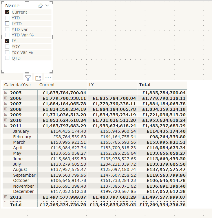
Now these time Intelligence measures can be created in Tabular Editor
currentYTDLast YTDYTD Var
Notice that you cant use another variable within a variable. So our Total year to date has to be re added within the last year to date measure.
If we were doing this without calculation groups in mind we would simply reference the year to date measure we had created
YTD Var %
Again, Notice how we cant reuse a variable within a variable. So LTYD needs the full DAX inside the SAMEPERIODLASTYEAR DAX.
And Year to Date variance requires both last year to date and total year to date. this makes your DAX more complex than simply using a measure already set up.
In the above instance I could take out TYTD Variable but honestly. Im leaving it there as a reminder of what the DAX is for Year to Date
YoY Var %LYYoYQTD
As you can see, each measure uses one base measure
And for the percentages I added format String Expression “0.00%”
Save the calculation group into the main desktop file
Lets see the calculated measure group in action using a matrix
Name from the time Intelligence group has been added to columns on the matrix.
Year and Month are in Rows
Total Sales, the base measure has been added to values
Name has also been added to a Slicer so you can turn off those you aren’t interested in.
To me, the big win of calculation groups is being able to create one measure and using it across multiple measures instead of creating the same measure over and over again.
And quickly switch to quantity by adding that measure to value
Issues with using calculation groups
formatting each item is much more difficult in tabular editor because you have to know the code. There is no help for creating these expressions.
Similarly, you cant develop DAX Here, you need to do it first within power BI Desktop
Your DAX has to become much more complex, rather than creating a measure and then referencing this measure within another measure. Like Year to Date and Last Year to Date
You cant create the matrix with Months in columns
This is using the measures created in the data set. As you can see, the Months are shown as columns and the measures are also displayed
You cant do this with column groups.
Lets have a look at some visuals already created with time Intelligence to see if we can recreate
Variance Waterfall chart
This is an example of a waterfall variance chart for year to date. If we didn’t have measures outside of a calculation group, could we still pull off the exact same solution?
Table: No you cant recreate the table. You would have to move to a matrix
With a filter on name to the measures you are interested in. It doesn’t appear that you can turn off grand totals though so we have some information there that we don’t need. the Total column.
So, ok but not great
Waterfall visual; there doesn’t appear to be any way you can recreate this. so to create my variance visuals there has to be a measure that can be used.
Conclusion
Calculation groups seem to only for for one visual. the Matrix. Where you can add the base measure to values and the Name to columns.
Even the matrix cant be fully configured to how it would normally be shown with months in columns and the measures underneath.
In order to use time intelligence for all other visuals, there still needs to be measures in your model to use.
It would be a great idea if you could fully get rid of your duplicated measures but you cant.
Because of this, I still don’t have the results I need to spend time creating calculation groups.
Other people seem to be seriously excited about this though so maybe I am missing something. Please let me know if I am, I would be very interested to get another point of view
We are looking at a Star Schema with a Date table connected to the Fact table by Order date Key
for these examples, the active relationship is the only one that matters
Lets have a look at all the issues arising from using the Date table without marking at a Date table
Date Slicer seems to remove the report filter flag for the last 3 years
Rolling 3 year flag= IF(DATEDIFF('Date'[Date].[Date],TODAY(),YEAR)<=3 && DATEDIFF('Date'[Date].[Date],TODAY(),YEAR)>=0,1,0)
This flag has been added to the entire report and set to 1 to make sure there is only information from these 3 years
If I add date as a table I get 2017 2018 2019 and 2020 as expected for a rolling flag.
However As soon as I change that table into a Slicer, all the years appear in the data set.
In this case from 2016. The filter stops being applied on the slicer
DAX FUNCTION SAMEPERIODLASTYEAR and the date hierarchy
We have some DAX to create SAMEPERIODLASTYEAR.
This is the DAX
LY Total = CALCULATE([Total],SAMEPERIODLASTYEAR('Date'[Date].[Date]))
Note the .[Date] at the end. Because we are using the date hierarchy to create the measure you can choose which level of the hierarchy to use. In this case we are saying we want the date level.
This will come back later
This is used in a visual and we have added Month Year which is a column in the date table.
As you can see, last year displays exactly the same as the current measure. This does not work
it works using the DateTime Hierarchy in the visual? However in this instance this date time hierarchy isn’t required. We don’t want the user to have to drill down to month from year every time.
In this example, the only field you can use for any measure that is date time specific is the date field
Mark as Date time
Always make sure you have a date table connected to a fact table
Note that the Date is now not connected to a back end hierarchy table.
Marking as Date table means that all your data within this table can be used for Date Measures
However lets look at the DAX that was created
All the Lat year measures are now erroring. this is because of the .[Date] at the end of the DAX
The date does not contain a hierarchy any more so if you have used .[Date] This needs removing. Its specifically related to the hierarchy.
A Year to day hierarchy has been created in the date table. This means that you have created a more compact data model and saved space.
And you can now use Month Year on the Axis
Date Table is Marked. How to work with it
This is part of the star schema in Power BI
Now the date table is marked as date, the Date hierarchy table is removed for Date within the Date table. this saves space and you can simply create your own date hierarchy to work with
The Active Join is on Received Date
All my measures so far are based on received date
Each Date in the fact table creates an extra date table to produce the hierarchy. So to save space, you should create inactive joins to the other dates and then remove the dates in the Fact table leaving just the keys. the model should then reduce in size
This works great for the measures. I can create measures based on the none active ones and simply choose to USERELATIONSHIP
LY Totals by Closed Date = CALCULATE([Total],USERELATIONSHIP('Complaint Metrics'[Closed Date Key],'Date'[Date Key]),SAMEPERIODLASTYEAR('Date'[Date]))
The above is an example of using the Closed Date None active join for Last years Totals
So i can have measures for Received this Year, Received Last year and Closed this year , Closed Last year (For Example)
This is all absolutely spot on. However there is more logic we need to think about. What about when the users want to create a drill through
This visual was created on the active relatioship so its recieved date
However your users may want to drill through to the following
how to do this?
Currently you may have the Active join on received date and Inactive on Start and Closed date
In my example, I have also kept the dates in the fact table along with the Date Keys for each Date.
Because they are in the fact table they all have date hierarchies.
Remove the Date Hierarchies across your entire dataset
You could keep them there and simply remove their hierarchies
File > Options and Settings > Options
You can turn off time intelligence for the specific report OR globally. the recommendation is to actually do this globally when you use a date table
This way you can use the dates in the fact table for drill down without creating unnecessary data with the date hierarchies
Role Play dimensions
If you want to drill down to all your dates on a regular basis, AND if there isn’t one main date and other dates that are not used as often.
In Power Query Editor go to your date table and create a reference table for each date
In this case the Date table has been referenced once and is named date created. date as been renamed to date Engagement
with this set up, there is only one join to each date key so no inactive relationships.
Any DAX you create can reference the correct date tables and your Dates can be removed from the fact table
the big downside is you have a much more complex schema with many more dimensions so only go for this if your dates are all frequently used.
In the example above, the user just wants to drill through and see all the dates so they can be left in the fact table in a Date Folder without their hierarchies
But this has been a really useful bit of research on marking the date table, Date Hierarchies and role playing
As ever with DAX, I tend to have to remind myself of the basic every so often, especially when i have bee concentrating on other topics.
We need to remember the following
Model Relationships propagate filters to other tables.
Product can be sold many times. (1 to many)
Have a look at the model in your Power BI desktop file
If you click on the join
You can see Cross Filter Direction (In this case Single) We can Filter the measure within the fact table by, for example, Product Name. But we cant Filter Product Name by, for example Sales amount within the fact table
When you are looking at Measures you basically filter a measure by either an implicit filter or an explicit filter within the DAX.
Confusing? How can the above information not be?
Lets take this a step backwards by Looking at implicit filtering
using the above example we have taken Color from the Product table and Order Quantity (The Metric) from the Fact table
We implicitly Filter Order Quantity by colour. No need to specify anything in DAX
Implicit – Suggested though not directly expressed
CALCULATE
Lets create a measure
Order Quanity of Yellow Products = CALCULATE(SUM(FactInternetSales[OrderQuantity]),DimProduct[Color]=”Yellow”)
So here CALCULATE evaluates the summed value of Order Quantity, against the explicit filter of color = Yellow. So in the above visual, it ignores the implicit value of the Color filter within the visual.
Here is a nice reminder
If you drag a field into your visual its an implicit filter
If you set the filter within your DAX its an explicit filter and it will override what is in your visual
CALCULATE allows you to calculate a value against a context (The filter modification).
Lets change this slightly
Order Quantity of Yellow Products = CALCULATE(SUM(FactInternetSales[OrderQuantity]),ALL(DimProduct))
Now instead of Colour = “Yellow” We are saying Calculate against all Products
This time, note the total matches the total. this is because we are ignoring the colour context and Getting the total of ALL products
* quick sanity check. The visual isn’t quite right. The totals should be the same on the rows and the total column. This must simply be an issue with the visual I used here.
FILTER
Filter basically returns a table that has been filtered. Lets have a look at a FILTER Function used in very much the Same way as CALCULATE above
TOTAL Order Quantity Yellow colour = CALCULATE(SUM(FactResellerSalesXL_CCI[Order Quantity]),FILTER(DimProduct,DimProduct[Color]="Yellow"))
We are again calculating the sum of Order Quantity, with a Filter of Color = yellow. Lets look at how the visual changes
This time, instead of seeing the total for yellow against every other colour quantity, we only as see the measure against yellow.
the great thing about FILTER is that you can have more than one Filter as an OR
TOTAL Order Quanity Yellow & Black = CALCULATE(SUM(FactResellerSalesXL_CCI[Order Quantity]),FILTER(DimProduct,DimProduct[Color]="Yellow"|| DimProduct[Color]="Black"))
Now we can see Yellow OR Black Quantities
how about if we want to see only yellow products in 2014. FILTER comes in useful for this
TOTAL Order Quanity Yellow & Black = CALCULATE(SUM(FactResellerSalesXL_CCI[Order Quantity]),FILTER(DimProduct,DimProduct[Color]="Yellow"),FILTER(DimDate,DimDate[CalendarYear] = 2014))
This time, Not only are we only seeing Yellow product Quantity but the Quantity sold in 2014
FILTER is obviously slower than CALCULATE so if you are only filtering on one thing, go for CALCULATE.
Bad Modelling 1: Single flat file table e.g. Salesextract
When people first start out using Power BI as their Analytics platform, there is a tendency to say, lets import all the data in one big flat file, like an Excel worksheet.
This way of working is just not well organised and doesn’t give you a friendly analytics structure.
Avoid Wide Tables
Narrow tables are much better to work with in Power BI. As the data volumes grows it will affect performance and bloat your model and become inefficient. then, when you create measures, things will start getting even more overly complex in the one long and wide table.
Not to mention the point when you have to add another table and create joins. You may be faced with the many to many join because of your wide table.
STAR SCHEMA are the recommended approach to modelling in Power BI
Stars with a few Snowflaked dimensions are also ok.
If you have a flat file wide table its always important to convert to an above data model with narrow dimension tables and a fact table in the middle with all your measures.
Remember, Chaos is a flat file.
Model Relationships propagate filters to other tables.
In this example the ProductID propagates down to the sales table. 1 Product can be sold many times. (1 to many)
With a snowflake you can add another level
CategoryA Propagates down to the Sales Fact table
Deliver the right number of tables with the right relationships in place.
Power BI was designed for the people who never had to think about the design of data warehouses. originally, this self service tool would allow any one with little or no knowledge of best practice to import data from their own sources, excel spreadsheets, databases etc without any knowledge of how they were set up.
This becomes an issue when the recommended Power BI model is the fact and dimension schemas as above.
Understanding OLAP models go a long way to helping you set up Power BI
Dimensions Filter and group
Facts Summarise measures
Bad Modelling 2: Direct Query your Transactional Database
When you connect up to OLTP and drag in all your tables ( there may be hundreds of them) using Direct Query there are lots of things to consider.
the overall performance depends on the underlying data source
When you have lots of users opening shared reports, lots of visuals are refreshed and queries are sent to the underlying source. This means that the source MUST handle these query loads for all your users AND maintain reasonable performance for those using the OLTP as they enter data.
You are not the most important person in this scenario. The person(s) using the database to add data is the most important person
OLTP is designed for speedy data input. OLAP is designed for speedy retrieval of data for analytics. These are to very different things.
With OLTP, you have row-Store indexes (Clustered Index, Non-Clustered Index) and these are slow for data analysis. They are perfect for OLTP style workloads. Data Warehouse queries, consume a huge amount of data, this is another reason why using OLTP as your direct query data source isn’t the best approach.
Also your Direct Query means you loose a fair amount of DAX functionality time time based DAX calculations, What if Parameters, etc.
I was chatting to someone about this on the forums and they gave me a fantastic analogy
When you connect into a transactional database with Direct Query, its like being in a busy restaurant and getting all the customers to go and get their food from the kitchen.
It slows down the customers because of the layout of the kitchen. They don’t know where anything is, and other customers are also milling around trying to find where their starter is.
the Kitchen staff who are now trying to prepare the food are having to fight for physical space. Look at the pastry chef, trying to work around 10 customers asking where their various desserts are?
So you set up a reporting area. This is where the food gets placed, someone shouts service and a waiter will go and speedily deliver the course to the correct table.
No one needs to go into the kitchen unless they are in food prep. Everything works in the most efficient way.
Model relationships Dos
Only 1 ID to One ID. If you have composite keys they need to be merged
No recursive Relationships (relationships that go back to the same table. the example always used for this is the managerID in the employer table
the Cardinality is 1 to many. 1 to 1. many to one. (Many to Many needs a specific approach in Power BI)
Cardinality determines whether it has filter group behavior or summarise behavior
There can only be one active path (relationship) Between two tables. All your other paths will be inactive (But you can set up DAX to use them)
In this example OrderDateKey is the active relationship because we use this the most and joins to DateKey
ShipdateKey and DueDateKey also join to DateKey in the date table and are inactive.
DAX Functions for Relationships to help with modelling decisions
RELATED
When creating calculated columns you can only include fields from the same table. Unless you use RELATED
For example, I’m adding the column Colour into the SalesOrderDetail table which has a Many to One join to Products •Colour = RELATED(Products[Colour])
RELATED allows you to use data from the one side in the many side of the join
RELATEDTABLE
RELATEDTABLE Uses data from the Many side of the Join
Modifies the filter direction Disables propagation. You can actually do this in the model by changing the filter to both directions instead of single. OR you can do it for a specific DAX query using CROSSFILTER
Our Unconnected Budgeted Data is in Year only and its not joined to our main model.
Here we connect up to Year in Date. then we can create a visal with Date from the Date dimension. Total sales from our connected data which is at daily level and Total Budget from our unconnected budgeted data at a different level of granularity.
PATH
Naturalise a recursive relationship with the PATH function
Getting your model right and understanding your data sources is the most important thing to get right with Power BI. make sure you don’t have lots of headaches six months into your project. Its better to spend the time now, than having to start again later.