After 14 years using Microsoft On Premise BI Tools (SQL Server, Reporting Services, Integration Services and Analysis Services) Its time to embrace Business Intelligence in the cloud.
I have a drill through in my crime reports so you can drill through to the data from the top level report. However, sometimes I am aware that users struggle with these cool Power BI Features.
A new feature is that if you have a drill through, you get a Right click to drill through message on the tooltip. Is that enough? for some people its not. Some people don’t understand the concept of drill through. They may need more visual help.
And its all about making sure the users are getting the full benefit of Power BI so its worth adding a few extras
How about creating a short video of the drill through in action that you can add to the visual.
To create a video of the drill through I am going to use ezvid as its free for this demo. Camtasia is the solution I want to move to because this will save the file as an animated jpg.
and I have simply converted and downloaded the file to a gif.
Back to Power BI
In the report, add a new page. I am calling in Drillthrough tooltip
Right click on the worksheet and hide the page
next in page format, go to page information and Set Tooltip as ON
Go to page size and set type as tooltip
Next in Page format go to page background and add image (I am adding the video that I created. make sure you have the location of the jpg to hand
Make sure that transparency is at 0% and the Image fit is Fit.
You should be able to see your gif moving in your tooltip page which is ready to be used in the top level report
Go back to the visual that will be using the drill through animation
In format for the visual go to Visual Header and scroll right down to Visual header tooltip icon
Tip. People are missing this is the list, note that there are two scroll bars and ensure you have scrolled down to the bottom with the inner scroll bar.
A little Question mark appears at the top of the visual
We now have a new option in the format list. Visual Header Tooltip, where you can add written instructions on your visual
but we want to do something fancier and have the video clip playing
Change the Report page from none to the tooltip page and now when you hover oper the question mark a how to video will play.
This is a great way of showing off some of the more involved concepts of how to use Power BI.
To start to have a look at these new visuals I have downloaded some crime stats for my local area
I want to try out some of the new visuals in Power BI in the October Release whilst also doing my first public upload of a report. the visuals in the XViz suite can be used for free, you can purchase them with full functionality. I am using the Free Versions of these visuals
Hierarchy Variance Table (xViz Visual)
Compare measures within a hierarchical table and see the variance.
the first thing I need is a hierarchy which I created using Crime and Status.
E.g. Possession of Weapons
Offender Fined
Court Result unavailable
Under Investigation
I went to the market place and selected the new hierarchy Variance table
to do that I simply dragged Outcome Status over category to create a hierarchy.
Crime is simply a metric I added 1 for each row in order to Sum
Time period is our date Column
Note all the information you get from this new visual. A spark line and an indicator along with the metrics that the visual creates for the visual
In Formatting you can also go into format Number formatting and switch on Semantic Formatting that colours the cells based on positive or negative values
You can also right click on the items in category and Get access to options like what to display, sort and rearrange the hierachy.
So what does this tell us? I’m going to look at Robbery.
the first thing to note is that if you have a Filter on Year, If you select a Year the data disappears and you are left with just Baseline. If you have a Year Filter, remember to ensure Interaction is off for this visual.
we have 9 records in total. It seems to be taking Baseline as the total for 2018
For target it seems to be taking the data from the first quarter of 2019. This doesnt make sense to pitch 2018 against 2019 First Quarter
Lets see if Vehicle Crime makes any more sense
Again baseline appears to be the total for 2018. target of 4 could be Quarter 1 and Quarter 2? Missing Quarter 3. So the question is, How does it arrive at the baseline and target?
Unfortunately as yet, there is nothing on line that explains how these metrics are calculated which means we have no way of knowing at the moment. Until this information is clearly provided I would say that this visual is not fit for purpose.
I certainly wouldn’t want to demo the visual for a customer to say, what does baseline and target relate too? At present I wouldn’t be able to answer that question. If you have an idea please let me know.
Linear Gauge Table (xViz Visual)
Compare a Value (resolved) to a target goal (% Number of Crimes) Ideally we want 95% of these Crimes resolved in the data set
This is very straightforward. For Actual value I want resolved crimes and the maximum value will be the number of Crimes.
I have also set Condition to On in formatting where under 60% is red. everything over 90% is blue and everything in between is amber.
Straight away we are in the red for number of crimes solved
Tag Cloud (xViz Visual)
I use the Wordcloud for Twitter data where I have already used an Azure text API to create me a table of Keywords. tag clouds are very similar to Wordclouds and allow you to look at tags of words in the data
Tag cloud takes advantage of extra-Miler tags within the data set (The words that mean more within your data set) tag cloud finds these ‘Keywords’ and displays them.
In this case I am using category of crime
category = category
Size Value = Crime (Metric)
Key Influencers
Its not new but I thought Key influencers would be a great visual for this report. I have added a conditional column against outcome to ensure we only had a few conditions to choose from
For No action taken, No suspect identified is the top influence. Further questions could be, why is this the case? Should we not be doing better on finding the person who committed the crime?
Publish to Web
I now have all the visuals I need to get the information out their. its not private data so I can publish to the web. I want to publish to this wordpress site
First of all, Lets publish to My Workspace in Power BI Service
then log in to check that the Report is in My Workspace
Publish to Web
Once there, go to File and Publish to Web
For the time being I have copied the Link and HTML
Install WordPress Plugin
You can install the WordPress plugin for PowerBI
However you need to be on the Business Plan to do this. I’m not on the Business plan. Its £20 per month.
So to end this post, here is the link to the public report
The Key Influencers isnt available in Publish to Web Format
You should always be aware when publishing to we that there is no security in place so never publish to web any information you are not happy for everyone to see
We are going to add some new information into the data set
In Power BI Service, Click Edit … against the #Taskmaster dataset
I’m actually going to add 7 more fields
Description, Sentiment and Name are Text
CreatedAt is a date
Count, Favorited and followersCount are Numbers. Click Done
Return to Microsoft Flow
Edit the flow and go to add rows to a dataset
Count is an Expression
It is simply set as 1
You can Test and Save
Any new data that comes through will contain these data items
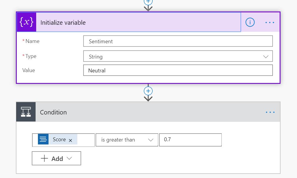
Creating sentiment is slightly more involved but lets go ahead and create sentiment
After Detect Sentiment update your flow with the following logic
Create Sentiment which is Neutral. If Score is over 0.7 then
Positive. If under 0.3 then negative
We can add this to our data set
We now have lots of new information to use in our streaming reports
Back in Power BI Service
I’ve attempted to add a new Custom Streaming Tile to the dashboard based on a Line chart to look at the count of records
Unfortunately this Streaming visual doesn’t seem to work and immediately I can see a fatal flaw with using streaming data set visuals for this kind of data
These visuals are for data that pulls through almost constant stream of data. They are not for data that has a feed that at some points doesn’t have much data coming through. You need to have lots of data in the time frame of the streaming dataset (For example 60 minutes).
I have the #Taskmaster Stream set up for Historical Data Analysis
when Historic data analysis is enabled, the dataset created becomes both a streaming dataset and a push dataset
A streaming dataset, has no underlying database
A Push data set
For a push dataset has a few limitations on how much data can be pushed in:
75 max columns
75 max tables
200,000 max rows stored per table in FIFO dataset
5,000,000 max rows stored per table in ‘none retention policy’ dataset
The data is then stored in Power BI and we can actually access it from Desktop.
This means I can create some really nice reports against my taskmaster data set
You cant create Hierarchies of calculated columns over the Push data set. Only Measures. You are very limited on what you can do. The Key Influencers visual is also unable to work with push data which is a shame because this is the perfect visual for analysing positive and negative tweets
I should have brought date across as a date in the first instance because Month is now just a number and I cant change this in Power BI. We have date but only against the very latest data
Time was already in the data set but this consists of date and Time which you cant reset to create a date hierarchy
I cant add day names to the day number(Taskmaster is on on Wednesday so I expect the levels to go up then)
So the push data set is fairly simple to set up but its incredibly limiting to what you can do
Our initial page by Month. I needed to Add Month Name into the Flow
Next I drill through on the 9th of October. the name of the day would be great because taskmaster is on a Wednesday
Finally we drill through to the hourly tweets.
As you can see, We have a few negatives in the data set which, on reading aren’t actually negative. The Cognitive API doesn’t recognise sarcasm for instance.
There you go, We started out with a streaming data set and ended up with a push data set.
The push data set doesn’t need a refresh which is them main reason to go for them.
One last quick thing about this push dataset. When I attempted to republish the report I got the following error
To get past this error I had to delete my report in Power BI Service before trying again. I have never seen this kind of conflict before and I’m assuming its an issue with the Push data set
I was logging into Power BI this morning when I saw this exciting new feature
we are always looking at new solutions to provide good data lineage so this is well worth a look
Data lineage includes the data origin, what happens to it and where it moves over time. Data lineage gives visibility while greatly simplifying the ability to trace errors back to the root cause in a data analytics process.
I have an App workspace set up for Adventureworks so lets have a look at Lineage using this project
Column 1 is my data source. I can see I’m using a local database and I’m also using an xlsx spreadsheet to bring in data.
In most of my projects I’m working on the ETL in Data factory, transforming data in Stored Procedures etc. for example, for a social media feed, I have a logic app that moves tweets to an Azure Data Storage NOSQL table. Data Factory then transfers this data across into a central Azure Data Warehouse. The Power BI Lineage would pick up at the data Warehouse stage. It wont take into account that there is a lot of work previous to this
Column 2 is the data set in Power BI
Column 3 provides Report information
Column 4 displays the Dashboards
You can click on a data flow node to drill down into more detail
Currently you cant go any further to look at the data items
Click on the Link icon to see the data flow for that item. In this case the Report.
This is a great start but there definitely needs to be more information here to make it something that you would want to use as a proper Data Lineage Tool
It would be good to see the fields in each Entity for the Data Sets
As an extra, it would be great to see what fields are being used in Measures and calculated Fields
Reports – For me, Id like to know for every page in my report
What field am I using from the data source
What calculated columns I have created (Even better with the DAX Logic)
Any Name changes from Data Source to Power BI
What measures I have created (Even better with the DAX Logic)
For the Dashboard, What items I am using in the dashboards (Fields, Measures, Calculated Columns
An Important part of data lineage is getting and understanding of the entire process. This includes data transformations pre Power BI. If you cant do that in here, it would be great to be able to extract all the information out so you can use it in some way with your other Linage information to provide the full story. for example:
Azure Data Catalogue
Azure Data Catalog is a fully managed cloud service. Users can discover and consume data sources via the catalog and is a single , central place for all the organisation to contribute and understand all your data sources.
I have already registered Our Data Catalog, and I have downloaded the desktop app
As an Example I want to connect to Azure Table Storage (Connect using Azure Account name and Access Key)
At this point I’m registering everything in the storage table. then I can view the information in the Azure Portal.
You can add a friendly Name, description, Add in expert (in this case me). Tags and management information
I have added Data Preview so you can view the data within the object. there is also documentation and Column information to look at
In the data catalog you can manually add lots of description to your tables along with documentation.
This is great for providing lots of information about your data . You can explore databases and open the information in other formats (Great if you need to supply information to another Data lineage package
I will be having a look at the Azure Data catalog in more detail later to see how it could help to provide full data lineage
Azure Data Factory
Data factory is the Azure ETL Orchestration tool. Go into Monitoring for Lineage Information. However, there doesn’t seem to be a way to export this information to use. Data Factory wont take into account the work done in, for example a stored Procedure
Again this is another area to look into more.
Stored Procedures
When you use Stored Procedures to transform you data, its harder to provide automated Linage on your code. There are automated data lineage tool for SQL out there, but it would be great if there was a specific Tool within Azure that creates Data Lineage information from your Stored Procedures
Azure Logic Apps
Data for my project is collected via Logic Apps before being Processed into an Azure Data Warehouse.
Essentially, we need out data lineage to capture everything all in one place.
And just as important. everything should be as automated as possible. If I quickly create a measure, the data lineage should reflect this with no manual input needed (Unless you want to add some description to the new measure as to why it was created)
RANKX – RANKX is an Iterator. It takes a table and an expression to evaluate. RANKX looks at each row in the table and running its evaluation which is to return the ranking for each row in the table argument. RANKX creates a row context because it’s an iterator
Row Context – Calculated at processing time instead of at run time. This is a calculated column rather than a measure because the data is set on each row. A good example of a Row context calculation is, Is this value greater than 100.If yes Set to True. If no set to False. This is applied on each row
CROSSJOIN – Cross join allows you to recreate a table from
all Tables and Columns in the cross join
ALL – Returns all the rows in the table, ignoring any applied filters
So essentially You are ranking against ALL months in the date and All groups within the other dimension table. We are ranking the Avg Fact measure
Now this works to some extent if you add in the table with the date filter set but no filter on the groups you want. Looking at January for example
However Later on in the data set the null values are set as
AND when I apply the filter of only having certain groupings in the table the RANKX fails even further
Note that the RANKX is still ranking every single value, even though we have applied a filter for the Group
This is because of the ALL. The Cross Join takes ALL month Values and ALL Group Values, and dismisses the fact that we have applied a filter
You need ALL because if you just ranked against the 1 value that the row context is on, all ranking would be 1.
ALLSELECTED is different to ALL because ALL calculates everything ignoring filters. ALLSelected Takes into account the filter on the visual. An important part of the solution is that we are slicing on Year and we are filtering for specific groups. As a consequence we need to use ALLSELECTED
Remember we are ranking the measure against each Group. What is the best Group this Month?
Next stop, ensuring we don’t rank against null values
I love the show Taskmaster and I really want to see how much other people love taskmaster and when people are tweeting about it.
I want to see everything happening real time in my Power BI report.
For this example, I am going to use a streaming data set. The data
will be pushed into the Power BI service, but Power BI will only store the data
in a temporary cache which expires. We can give it a window of time to look at.
There is no underlying database with a streaming data set so I
wont be able to use my usual report visuals. I will need to use the Streaming
visuals available in Power BI
There are other ways to do real time data such as Push Data sets
and PubNub streaming datasets but for this example I want to
concentrate on the Streaming data set
Click on Create in the right hand corner of the screen
Then click on Streaming dataset
Choose API to create an API endpoint
API “a set of functions and procedures that allow the creation of applications which access the features or data of an operating system, application, or other service.”
Our Streaming Dataset will contain these values.
Extra time dimension fields have
been created to use drill/down features.
The outcome of the sentiment analysis
is placed in the field ‘score’. From 0 to 1 Positive to Negative
Historical data set’ to ‘on’, if
you want to save the data for analysis later in time.
Power BI makes a JSON like format
(a REST Webservice on the background).
JSON – is an open-standard file
format that uses human-readable text to transmit data objects consisting of
attribute–value pairs and array data types
REST – ‘Representational State Transfer’. It is primarily used to build Web services that are lightweight, maintainable, and scalable. A service based on REST is called a RESTful service. REST is not dependent on any protocol, but almost every RESTful service uses HTTP as its underlying protocol.
Once you click done, you can
see that we have the new data set in our datasets list.
Microsoft Flow / Azure Logic App
The next stop is to create a
Microsoft Flow (You can use Azure Logic App if you prefer)
Microsoft Flow is a cloud-based software tool that allows employees to create and automate workflows across multiple applications and services without the need for developer help.
When you are in the Flow you create
New Steps to build up the logic required for your data. The Flow will create
the Twitter feed for your Reports.
The first step I have simply added #Taskmaster to the When a new tweet is posted
You will also need to log into your twitter account at this point to get access to tweets
Click on New Step and add an action
The next step is to add some sentiment Analysis. I have used Text Analytics to do this
I have searched for sentiment and
can then click on Text Analytics – Detect Sentiment
I have already logged into my Azure
Text Analytics
I used the Key, Name and Endpoint
details from Azure
You may need to set up your own
Cognitive Service in Azure before you do this section.
Next step is to search for Power BI
Select Power BI – Add Rows to a
Dataset
Next, add all the information about
the RealTimeData streaming dataset
Most of the details can be added from the Dynamic Content picker. As you can see Score comes from the Detect Sentiment group. All the twitter data comes from the very first step ‘When a new tweet is posted ’ Group
The following are the expressions
you need to add for the Time fields
Time formatDateTime(utcNow(),’MM/dd/yyyy
HH:mm:ss’)
Month formatDateTime(utcNow(),’MM’)
Day
dayOfMonth(utcNow())
Hour
formatDateTime(utcNow(),’HH’)
Minute
formatDateTime(utcNow(),’mm’)
Save your Workflow
Testing Service in Microsoft Flow
The real time analysis will be triggered by hashtags in
Twitter
This service only allows you to get current tweets. No
historical tweets can be generated at this point
The visualization tiles will only be kept for an hour so
this is the kind of service you need to monitor fast paced information.
In the Workflow you can save
Click Test and Create a tweet with one of the hashtags in
the workflow.
The service will run and you should get pass or fail
information.
We can now use this information to create a sentiment report
in PowerBI
Back to Power BI Service
We already found the dataset in the relevant workspace e.g. My
Workspace
For this example, click on Create report against the dataset
and add a table tile to the report pane. (The data may be refreshing at this
level)
Leave like this for the time being. Save your report and pin table visual to dashboard by clicking the pin
I created the table simply to create a report and then a dashboard.
Once at dashboard level Custom Streaming data tiles can be added. I am deleting
the table when the dashboard is created for simplicity
Click on +Add Tile
Then choose the Custom Streaming data
At present, there isn’t many visualisations to choose from
for this type of data
Click Next
The #Taskmaster dataset has been chosen
I am going to create a very simple bar chart to look at the
last hours data and see what the sentiment score is based on location
Now I can see the sentiment score by Location.
Azure has provided the Cognitive Text services to analyse
the data for a score.
It would be useful to understand what tweets are driving the sentiments by location.
I would also prefer to group on Positive neutral and negative Scores
In my next post I am going to look at how to create a sentiment description and add Description Name and Count into the Flow and streaming dataset
For being one of my go to’s for anything Power BI.
I had seen in the August power BI release that there was a new PowerApps visual in preview but its Guy in a Cube that gave me the confidence to try it out.
In the September 2019 release its become fully available and I have quite a lot of business logic that I could get off the ground and into my projects using PowerApps
My initial challenge to resolve for the business:
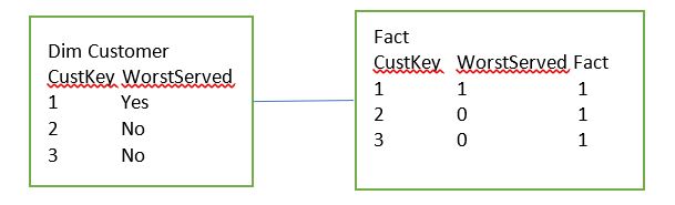
I have worst served customers in my Data
SELECT [Top 20 Worst Served] FROM [fact].[Fact]
Which is a 1 or 0
SELECT [Top 20 Worst Served] FROM [dim].[Customer]
Which is a true or false flag
I can then have reports for worst served customers filtered by the above
However, in some cases there may have been an investigation and its been deemed that the customer shouldn’t be in worst served. Note that this information isn’t capturing in the source data set.
They want to be able to immediately say this customer is
fine and the results will then update accordingly.
Every time the data is refreshed, these data items get fully
refreshed in case they are not worst served any more.
In the current Reports, Filters are set on the page for both the above columns in the dim and the fact
Where Dim Customer WorstServed = Yes
Where Fact WorstServed = 1
Question 1
Do the users want to see an immediate change to the report?
Or are they happy for it to come through on the next refresh?
The users want to see the report metrics change immediately based on them adding in information
Quick Steps to adding the POWERAPP into Power BI From Guy in a Cube
The Tables that are to be updated need to be in Direct Query Mode
The tables connected to these tables on the 1 side of the relationship, should be in Dual Mode (Which acts as Import or Direct Query)
Design your reports in the Desktop
Once designed DO NOT ADD THE POWER APP INTO THE PBIX FILE
Publish your report
In Power BI Service click on edit Report
Then in the Visualisations pane, If you don’t have already, Go to the Market Place and choose PowerApps
Add the POWERAPP into your report
Choose App (Or Create New App)
Add in the columns required to use the POWERAPP
In PowerApps give the people access who need to be able to update the data
Things to Consider
The users want to see the change immediately rather than on the next refresh
My report pages are already created and I have many tables (All Imported) and relationships in the model.
Dual Storage Mode, I have never used this before. How many tables would need this change in the data source?
The PowerApp will be a new enhancement to the reports
The PowerApp hasn’t been built yet
I am concerned about adding the visual into Power BI Service in Edit mode because the standard way to create reports is in Desktop. I have many more Updates to do after the power App has been added and I don’t know how adding visuals in Service only will work with the ongoing App amendments
Possible Data Solution 1
in the
PowerApp, the User Adds in the CustID, (And an automatic date is assigned)
these get inserted into the table Staging Worst Served Amendments
Then
Dim Customer and the fact table are checked through using the custID and the
items are set to ‘No’ and 0 as above (this is clearly the most difficult bits
because it’s an update based on the CustID
The next refresh will again change 153 to Worst Served Yes,
however an extra bit of script in the Stored Procedure that creates the table
will Check the Worst served Amendments table and if there, reset to No.
The above Staging table is only used for the overnight data refresh
Changing Import to Direct Query
To develop against the above resolution, both the fact table and the property table need to be changed to direct import. What do we lose if we do this?
All my DAX functions for time will be lost against my fact table (Year to Date, This time last month etc).
Therefore I really don’t want to lost these DAX queries by changing to Direct Query
Also currently I cant seem to change the setting from Import to direct Query in Properties. Unless this is a bug, It seems you would have to start again with the tables and re import them as direct Query.
Is there another way that the new logic can be added without setting both these tables to Direct Query?
Possible Data Solution 2
Filters in Power BI
Where Dim Customer WorstServed = Yes
Where Fact WorstServed = 1
And Staging Worst Served Amendments CustID is NULL
Issues with the Above Solution
You cant have a Filter for an empty customer ID because this is a Left Outer Join.
There may be other issues. What happens if the user accidentally adds in Multiple custIDs and the relationship changes to Many to Many?
Normally I would deal with this by merging the tables in a left join in Power Query Editor
As a consequence I need to think about another Solution to this problem
Patch – Modifies or creates one more record in a data
source, or merges records outside of a data source
Defaults – Use Patch with Defaults function to create
records (Insert a new record into a table)
Value() – This is converting a text value to a number
UpdateContext – Create a context variable to
temporarily hold a piece of information. In the above case we are calling it TimerStart
and setting it to true. We are basically starting the timer when we click
update because we have a timer hidden on the screen
Timer1
On Start we are going to use the Context Variable TimerStart
Hide the Timer because we don’t need to see it
Create a context variable called SuccessMessage and
set to true
Create the context variable SuccessMessage and reset it to False
Create another Context variable called TimerStart and set to False. TimerStart was started on Update and now on Time its being turned off again
UpdateContext – Create a context variable to
temporarily hold a piece of information. In the above case we are calling it TimerStart
and setting it to true. We are basically starting the timer when we click Delete
because we have a timer hidden on the screen in the same way as when we update
txtUpdateMsg
Visibility relates to SuccessMessage context variable. Its
visible on timer start (true) and disappears on timer end (False)
What appears when the timer is ON
This is a very basic Power App that will now allow the user to add and remove customers from this table. Save and then Publish the App so it can be used in Power BI
Add the table into Power BI
The new worst served table needs to be Imported into Power
BI as a Direct Import so any changes the User makes will reflect straight away
in the reports
Just to make sure that everything is OK I’m going to add one
Customer into the table before its added just to have a record to work with.
In your Power BI Desktop file, Edit Queries and Choose
recent sources if you have already connected to your data source.
Select the Worst Served Table
We can now have composite models where some tables are
import and others are direct query. The
new table is added in as a direct query
Close and Apply
Note the message regarding potential risks when you are
querying data at source and have other tables imported in memory
Next go into Edit Queries and Merge Table
And merge the customer table with the direct Query table
Click OK.
this connect the table so grab customer ID
This will be added to your customer dimension
Note that so far, DimCustomer hasn’t been automatically changed to Dual Mode after being merged with the direct Query table so we dont need to worry about Dual mode in order to create our new logic.
Close and Apply
back in the desktop, go to Marketplace and grab the Power Apps Visual
The how to guide states to not add the Power App within your Desktop report so Publish the report and lets move to the Power BI Service
Power BI Service, Edit report and Add in PowerApps Visual
On the report you want to update Click Edit Report
The Power App visual will now be available in Visualisations because it was added in the desktop file
Add the Power App in power BI service
In order to test out the new service I’m adding in a blank page
Click on the power App visual and add it to the new blank
page
I want to add the CustID and the Date from the worst served
new staging table
Then I can choose App rather than create new because I have
already published an App
Im choosing my Worst served App and click Add
Ive clicked go to power Apps Studio which opens the PowerApp
in Studio and you also have the powerApp in Power BI Service
The very first issue I have is a formatting issue. My Power App is Tiny and unreadable. Time to go back to the power App Studio and change the Settings
PowerApps studio
App Settings – changing the App to Default size 16.9. For
the time being Im not going to think about making the app look good. I just
want to be able to see the text on the power BI page
Save and publish the PowerApp
Go back to the Power BI service
Power BI service
I had to delete and readd the PowerApp to get it to refresh.
Its also worth noting that if you dont create your visual to the right size before adding your App, the App will have scroll bars etc and you cant change the size of the PowerApp, only the size of the visual that holds it
The Power App doesn’t look great but it will do to test.
First of all we want to see if it works so add a table with the Worst served Data items
Add a CustID and click Update
It works. Now delete the item just added. Again it works. This is part one done. Part 2 is that we want
it to update worst served Customers from the customers table
How does the Updates Affect the pbix file?
Click Save in power BI service and go back to the power BI
Desktop file
The new visuals aren’t there. This is as expected, because
they were not created in Desktop.
Imagine that you have created your Power BI App Visual and
you still have a list of updates, changes and bug fixes that you want to do within
Power BI Desktop
If you update and rebublish you lose the PowerApp Visual
Currently this options is only viable if the PowerApp is the
very last thing you do and you don’t need to update the pbix file at all.
As a consequence I don’t think that Editing your reports within Power BI Service is a good idea.
having chatted to a few people on the forums, Editing reports in service is normally done when you need something quickly and you intend to go back and update the pbix file with the amendment.
What happens when you add the PowerApp in Desktop
In Desktop Add the PowerApp and the table to check its
working. Then Publish into the Service.
Note the change in how it works. If you Update or Delete, the table doesn’t change until you Click Refresh. If you add it in Service you don’t need to click refresh.
For the time being I’m going to accept this as it’s the only
way to move forward and keep working with the pbix file.
I have a Direct Query table in a composite model, all the other tables are Imported into Power BI
The whole reason for the Direct Query table is to use it
with a PowerApp. The PowerApp can be used to update the data in this table from
the PowerApp and the update should appear in the report straight away
However, I need to use it against an imported table, so the
report will remove records that are in the Direct Import table. Here is the
example
I need to join the tables together to ensure that the customer
in the direct Query table is not only updated here, but pulls out the record
from the Customer Table
Joining doesn’t work because it needs to be a left outer
join. You can’t filter for a NULL value in the staging table if you join the
tables.
Therefore, one of the best way of dealing with this would be to merge the tables in Power Query Editor using a Left outer Join
This blog post is to look at what happens when you merge a direct
query and an Imported table
Only one way to find out. Go into Edit Queries Mode
First of all, I click
on the main Customer table, Then merge Queries
Straight away, I notice that the record I have just added isn’t in the direct query table within Merge Query
Now add in the customer number of the direct query table and there it is, with the latest Customer ID linked to the Imported Data set
the CustomerID is back and we also have our Null values because a left join has been used
Could this work? Back in my test page (After closing and
applying)
It certainly seems to. Adding the filter removes this
customer from the table.
If I remove another using the PowerApp, will it work?
I have to refresh in the desktop to see what happens.
Well this is good news. You can have a direct Query table working with a PowerApp and use it to Merge with another table so you can manipulate this without it being in Direct Query mode
Your Power BI Data Model contains multiple tables that need to be joined in the Relationship Pane.
Cardinality is well understood (1 to many, many to many etc) But what does the Cross filter direction mean?
Example using Azure SQL Database Adventureworks Data Warehouse
You can Create a SQL data warehouse in Azure.
Note that Sample
Source has been chosen which opens up the AdventureWorksDW option
DimProduct
DimProductCategory
DimProductSubCategory
FactResellerSales
In Power BI Get Data and Azure Data Warehouse
Please note. If you are using the Warehouse to do a quick demo against, always remember to either Delete the Warehouse or Pause the Warehouse unless you want to create unnecessary costs within Azure
Login to your Server in SQL
Server Management Studio with the Username and Password set up in Azure
Note, if there are issues you may need to go to the SQL Server in Azure and add your IP address to the firewall configuration.
Choose the Dims and
Fact table(s) and then click OK
Then Close and Apply (Power Query Editor)
Next, In Power BI Desktop go to the relationships pane
The relationships are already set up with Cross filtering
set to single.
Create a Report to test the Filtering
Add a Slicer and then go to DimProductCategory and Choose EnglishProductCategoryName
for the Slicer Value
Add Slicer 2 and then go to DimProduct and Choose EnglishProductName for the Slicer Value
Now you can select a Product Category and only those Products in that Product category will be shown
In this example I have chosen Accessories and
EnglishProductName only displays Accessories
If you unselect the Category ALL products are then available
in Slicer 2
If I then, for example, Choose Cable Lock from the list,
Nothing happens to slicer 1. Everything is still visible
How do you enable cross filtering?
Enable Cross Filtering
Go back to the Relationships pane and click on Manage Relationshipsedit the Relationship between DimProduct and DimProductSubCategory
Set the Cross Filter Direction to Both (And tick apply security filter in both directions)
You can now select an English Product Name and Slicer 1 will
only show the Category that the Product Name Belongs to
Conclusion
Cross Filtering, in the case of Slicers allows you to not
only move top down but also from bottom up of the hierarchy
This is great when the reports created need Multiple slicers
to select the data for the Reports