After 14 years using Microsoft On Premise BI Tools (SQL Server, Reporting Services, Integration Services and Analysis Services) Its time to embrace Business Intelligence in the cloud.
Part 1 will be an introduction to Scanner APIs and how you delegate permissions in order to now have to use the power BI Admin Account
Power BI Scanner APIs are fairly new and there have been a lot of updates happening in the September October 21 Power BI Updates.
These scanner APIS scan, catalog and report on all the metadata of your organisations Power BI artifacts.
Scanner APIs are the Admin REST APIs that can extract tenant level meta data that support the Power PI good Governance Pillar of Discoverability and Monitoring
So the scanner APIs are a set of Admin REST APIs.
What is an API?
“API is the acronym for Application Programming Interface, which is a software intermediary that allows two applications to talk to each other”
What is a REST API?
“an application programming interface that conforms to the constraints of REST. REST = Representational state transfer“
Scanner APIs
When you look at the list of Power BI APIs these are the ones specific to the Scanner API group
And as usual I’m extremely thankful to everyone providing such fantastic information.
Service Principal support for read-only Admin APIs
Service Principal Support to the Scanner admin APIS became available September 21.
“Service Principal is an authentication method that can be used to let an Azure AD applications access Power BI APIs. This removes the need to maintain a service account with an admin role. To allow your app to use the admin API’s, you need to provide your approval once as part of the tenant settings configuration.”
The Scanner API’s and Service Principal Support could well be a game changer for governance if everything is actually in place.
So we are able to delegate permissions to use the APIs
Later we will look at how to set up the Scanner API in a data factory, But in the meantime, Here is a possible error you can get when attempting to work with the Service Principal
Operation on target Post WorkspaceInfo failed: GetSpnAuthenticationToken: Failed while processing request for access token with error: Failed to get access token by using service principal. Error: unauthorized_client, Error Message: AADSTS700016: Application with identifier 'IDENTIFIER DETAILS' was not found in the directory 'Peak Indicators'. This can happen if the application has not been installed by the administrator of the tenant or consented to by any user in the tenant. You may have sent your authentication request to the wrong tenant.
After closer inspection, I had missed the last number from the Application /Client ID so this was a quick fix.
When you use the Scanner APIs in Data factory you use all 4 in sequence. Lots more to think about here. The data factory Set up. How you switch modified workspaces to only take updates after a certain time.
We have sold specific quantities of products. Can we look at a week for a year in a slicer and see the percentage of items sold for each day. Which days do we sell the most products overall?
We have the following model (Just the parts that will be required for this exercise
And thanks to the Power BI Forums for giving me some help on figuring this out.
What we want to end up with is:
A year Slicer
Product category on rows of a matrix
The Day Name from Date on the Columns of the Matrix
And % Quantity for that day based on all the days of the week as the value
Power Query Editor
At first I believed that I needed to add some kind of Ranking order for the DAX to use and as this will be a column its better to do in Power Query Editor (Or in the Sort DB)
To speed things up I created a Year Week Column in SQL DB consisting of the following examples
202101
202102
202135
So the weeks 1 to 9 was padded out with a zero. I then formatted this to a number field and called it Year Week. Every seven rows within that week in the date table will have the same Year Week Number Applied
Measure
I can now create the measure. Lets have a look at it in a bit more detail
Order Quantity by Week % = Var varOrderQtyWeek = CALCULATE(SUM(FactResellerSales[Order Quantity]), FILTER(ALL(DimDate), DimDate[Year Week]))
RETURN DIVIDE(SUM(FactResellerSales[Order Quantity]), varOrderQtyWeek)
And this measure is then set as a percentage.
First of all we create a variable. It gets the Sum of Order Quantity and it filters by using an ALL on the column Year Week we just created in the Date Table
“ALL Returns all the rows in a table, or all the values in a column, ignoring any filters that might have been applied (On Year Week).”
And we return the sum of order Quantity (Which in the context is just for, for example Friday and Accessories by the Sum of Order Quantity
This appears to work
We have Implicitly filtered by Product Category and Day Name of Week.
the question here is, did we even need to set ALL on Year Week column in date. Could we have just said use the entire date
Order Quantity by Week % = Var
varOrderQtyWeek = CALCULATE(SUM(FactResellerSales[Order Quantity]), ALL(DimDate))

RETURN DIVIDE(SUM(FactResellerSales[Order Quantity]), varOrderQtyWeek)
This is working in the same way and makes sense to me. We are using all the dates in the date table. And removing the Filter will create a faster DAX query.
Its looking at the entire data set and we can see that everything totals to 100%. So for us, taking into account all years Thursdays look like a good day especially for accessories.
However we don’t want to analyse the full data set and when we add in a year slicer the logic fails
As you can see, the story is still true but its telling the wrong story. Now for Accessories we have 31% of sales happening in 2021, attributing to smaller percentages across the days.
So we want to change the DAX to accept the Year Slicer
Order Quantity by Week % =

Var VarALLEXCEPT = CALCULATE(SUM(FactResellerSales[Order Quantity]), ALLEXCEPT(DimDate,DimDate[CalendarYear]))

RETURN
DIVIDE(SUM(FactResellerSales[Order Quantity]), VarALLEXCEPT)
And this appears to now work just taking the year 2012 into consideration because we are using ALLEXCEPT
Thursday is definitely a good day.
“ELLEXCEPT Removes all context filters in the table except filters that have been applied to the specified columns.”
So we create a variable to get the Sum or Order Quantity with ALLEXCEPT our Date Slicer which in this case is the calendar year slicer
So we are using 2012 from the date Dimension in the slicer. And Bikes from Product and Thursday as the Week Name from date in the Matrix
We Divide the Sum of Quantity which has all the filters applied. Bikes. Thursday. 2021
By the Sum Of Quantity with all, Exceptwe do apply the Calendar Year.
DIVIDE(50/100)
50 is Bikes on a Thursday in 2012
100 is Bikes in 2012
DAX is something I do struggle with a little. You think you understand it. Turn your head from the screen and its gone again.
But hopefully this goes a little way to understanding how this DAX in this specific context has been approached
And now we also have smart narratives to work with. Many companies want to create report that includes text in regards to the report they are looking at to help the user understand the key takeaways. This usually involves someone manually adding in text to the reports.
Not great for interactive reports that update on a regular basis. this is where smart narratives come in. Smart narratives create the text in an interactive way for you.
If its good, it should eliminate the need to add in information manually for your users, which is a huge win.
Lets have a look at it in action on the Adventureworks Report
At the most basic level you can simply drag smart narratives into your report
Smart narratives describes your data to you. This is all really good information. what happens when I select a data point on the report like select 2011 in Sales amount and order quantity
The narrative updates to tell you about just 2011 so our smart narrative is even better, It updates with every click the user makes.
For my Top 10 Products table, I want a smart narrative that just gives me information on this visual and not every visual on the page so I right click on the visual and choose Summarize
And again, we are getting good information for that specific visual. You need to think whether the visual can tell this story on its own or if narrative would help. I tend to see smart narratives as something that sits on a page to tell a story across all the visuals.
Changing the Summary
This is great but there will be times when you do want specific information in your smart narrative. I am going to remove the smart narrative for the visual, and replace with one for the entire products report page.
Click on the smart narrative and then +Value to add a value
I want it to tell me how many items have been sold of top value products. the red line tells me that it doesn’t know what sold means and we need to define this item .
Click on Sold and then Define Sold
Here I go to Field Synonyms in the Q&A Setup to define a new synonym for order quantity because order quantity can be expressed as quantity sold. I have added quantity sold as this is what has been searched for.
Back in Teach Q&A I ask the question again
And this time it understands what I mean. I submit this to train the Q&A. and this time we find this specific query because its in Q&A. I can now format the question to get an answer for the smart narrative
After saving, the number simply appears in the smart narrative. I deleted it and moved the cursor to the beginning on the smart narrative. then I wrote.
The quantity sold of top value products is:
And then clicked review, found the item and + to insert item to place it exactly where I want it
from this I can see that I can use the Q&A tool to format questions that I can then add into the smart narrative, adding synonyms where necessary to create even more easy to understand questions.
There have been some new API updates (September October Power BI 2021) and I thought I would see what they were all about and how you can use them starting with the API mentioned in the October updates.
I haven’t used these APIs before and I thought it would be interesting to see how the documentation holds up.
So this API returns all the artifacts for a given user which I imagine would be really useful when someone leaves the company and you need to assess the objects that they may own.
To use the API you need to be Power BI admin or Global Admin. I have the Power BI admin so I am good to go.
Delegated permissions are supported. I imagine this needs a lot more investigation as to why and how you would set this up.
There are some limitations, For example you can only make 200 requests per hour. You can click on Try it to try out the API from this URL by logging into your account
But this API’s need you to get the userGraphId. my first question is, What is a userGraphID and how can I get it?
It is mentioned in the documentation. ‘The graph ID of user’
And to be honest that is unhelpful. I have no idea how to get this information to run the API. Its just assumed. I have also asked on the forums and no one else seems to know either.
So to just get an idea of how you would use these APIs, I’m working with one that doesn’t need the userGraphIDhttps://docs.microsoft.com/en-us/rest/api/power-bi/admin/groups-get-groups-as-admin#code-try-0
This will get me out all the objects in power BI and for the time being I just want the top 10.
I added the $expand name and value by creating the name and value and hitting the +
But what if I want to automate this and, for example create a json file from it once a month?
And what if I don’t want to have to run it as the Power BI Admin?
Back to the original question regarding userGraphId
It seems that many other people have asked this question. I got a possible answer on the Power BI Issues forum saying that the userGraphID is the users Object ID that you can find in azure Active Directory – Users.
So I went into Azure – Azure Active Directory – Users and took my Object ID
I added the Object ID and got the results back that I was hoping for.
Great. This gives all the artifacts that I own. Can I now do this in Powershell like the previous API? Open Powershell again.
powershell_ise.exe
Can I reuse the Previous Script.
Open my previous Script. InvokePowerBIRESTMethos.ps1
 Param(
    #commented out the other API
    #[string]$url = 'https://api.powerbi.com/v1.0/myorg/admin/groups?           %24top=10&%24expand=users%2Creports%2Cdashboards%2Cdatasets'

    [string]$url = 'https://api.powerbi.com/v1.0/myorg/admin/users/objectID/artifactAccess'

   )

login-PowerBI


$result = Invoke-PowerBIRestMethod -Url $url -Method Get

$workspaceContents = $result | convertFrom-Json

$firstworkspace = $workspacecontents.value[1]
$firstworkspace
And this works. I get back all my objects
So this is just the initial investigation. To do
How to Delegate Permissions for this API?
How to Automate the Powershell script and create a dataset to work with?
And even further research
can we automate checking between a list of users from Yesterday and today to see who has gone to automate the process even further?
Is it possible that Azure can handle use cases where we know the user is leaving and have assigned a leave date in Azure Active Directory?
Then Feed this loop into the API to generate this list so we know what reports need to have their ownership taken over
And for the reports we never use we can either use the measure above with a filter
Or explicitly add a filter into a new measure
# Reports Never Used = CALCULATE([# reports],DimReport[neverusedFlag]=true)
# Datasets Never Used = CALCULATE([# Datasets],DimDataset[neverusedFlag]=true)
Notice that I set Edit Interactions to off between the date slicer and the two cards because the cards are simply telling me how many reports and dashboards have never been used
So this part of the process is all fine.
Our Next Business Question is
Show me the reports and datasets used in September by date
This is another straight forward request
And both interact with the Date Filter.
And now to the question
Show me the reports and datasets NOT used in September
So we use our date slicer and we want to see items outside of that date slicer. We need to create a more complex measure to do what we need
Is Not in the Date Filter Flag =
// assumes a slicer on DimDate[ActivityDateKey] and there is an implicit filter on the visual
VAR VActivityDates = SELECTCOLUMNS(DimDate,"Dates", DimDate[DateKey])
VAR VDates = CALENDAR(MINX(DimDate,DimDate[DateKey]),MAXX(DimDate,DimDate[DateKey]))
Lets break the above down a little to understand what is happening
SELECTCOLUMNS
VAR VActivityDates = SELECTCOLUMNS(DimDate,”Dates”, DimDate[DateKey])
First of all create a variable. SELECTCOLUMNS
“Adds calculated columns to the given table or table expression.”
We start with the table they come from. then we give the name to the column in SELECTCOLUMNS “ColumnName”, Next comes the expression which in this case is the column reference.
CALENDAR
VAR VDates = CALENDAR(MINX(DimDate,DimDate[DateKey]),MAXX(DimDate,DimDate[DateKey]))
Next comes the VDates Variable. Calendar Returns a table with a single column named “Date” and it contains a contiguous set of dates. We need to provide the range of dates. In this case MINX finds the earliest date and MAXX finds the Maximum date in our date dimension
Now this should work with our slicer. In this case Min 01/09/2021 Max 30/09/2021
INTERSECT
INTERSECT(VActivityDates,VDates)
And now we get to the measure that will be RETURNED
“INTERSECT A table that contains all the rows in table_expression1 that are also in table_expression2”
COUNTROWS
COUNTROWS simply counts the number of rows within a table or an expression
So here we can see the intersect and if working together. If there are rows counted (True – There are rows then 0 else 1.
Still Struggling to understand? Me too. Lets draw it
Here is where I am a little confused. I’m not sure which part of the DAX works with the slicer. SELECTCOLUMNS or CALENDAR MINX MAXX? I’m making the assumption that CALENDAR takes the min and max of the slicer but its incredibly difficult to test so if anyone has any more insight on this that would be fantastic.
And we can now look at everything together in a report
We have used Is Not =1 in the ‘Is not in the Date Filter’ as out value and its always ever 0 or 1
But now we are asked another business question
How MANY reports did we not view in the current date slicer?
with the measure as it stands. It needs the Report Name or the Data set name to provide details
We can’t use what we have in a card because we cant add the implicit filter (Report Name etc).
So How can we do this one?
We can solve it using variables
Total Reports not in date Filter =
//Clear all filters which are applied to the specified table.ALLCROSSFILTERED
var VAllReports =CALCULATE([# reports],ALLCROSSFILTERED(DimDate))
//Total within the date filtervar
VInFilter = [# reports]
//All reports - Reports inside the slicer
Return VAllReports-VInFilter
Using ALLCROSSFILTERED brings back the total reports 4 as it removes all the filters
then we get back the total of reports in the date slicer and finally take in filter away from all the reports.
Out # reports is a measure made from distinct report IDs already. We now have everything we need to create these reports thanks to DAX.
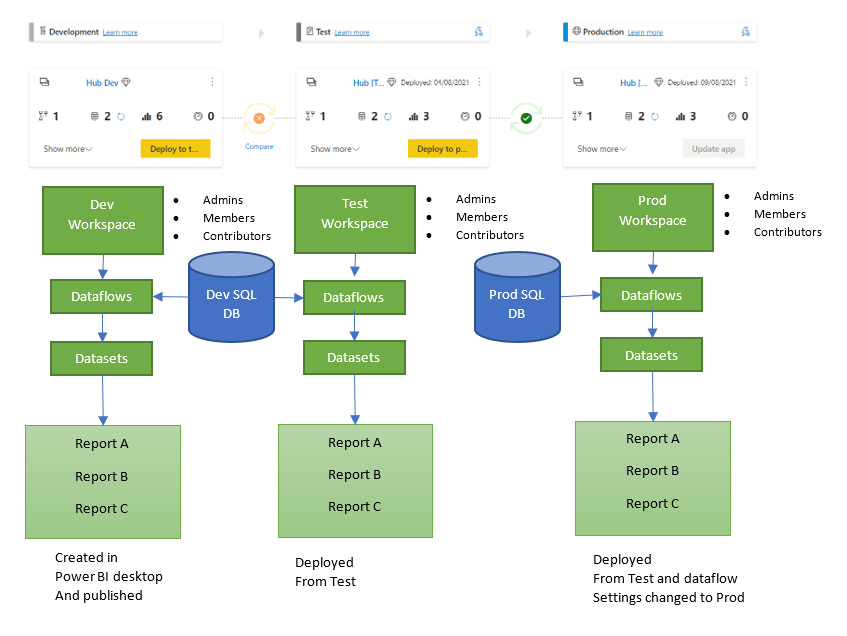
I wanted to have a look at a specific set up we have in regards to our Power BI Workspaces and apps
We have Power BI Premium P1 Node
We use dataflows
We use a Deployment Pipeline for Dev Test and Production Premium Workspaces
We have a scenario where we have a sub workspace with a smaller number of reports than the main reports
Deployment Pipelines
Lets have a look at the master Workspace that contains all our dataflows, datasets and reports live connected to the dataset
And for all three areas there is also an app to test usability for Viewers (and for the viewers of all the reports in Prod
Current issues with Deployment Pipelines and dataflows
The great thing about pipelines is that we don’t have to keep copies of Test and Prod reports. There are just Dev Pbix files. However, for Production. How do you know that your Production reports are using the dataflows connected to the Production SQL database?
The issue at the moment is that there is a bug that leaves the development data source in with the Production data source for the data flow. You can see this if you go into Lineage View
In the Prod Pipeline we have set the reports to use Prod dataflow and updated the user and password but from here how do you know that this has worked?
The best way I have found to do this is to export the dataflow Json … Export to Json
And look at the file in Notepad and check the source Source = Sql.Database(\”prd-
Its showing as production so I can be happy that the production reports are against the production database
The Sub Workspace
So we have a model for a production app to sit on where users can view all the reports.
However we have another cohort who can only see the reports B and not report A or C.
We can only have one app per workspace so we cant create another app with just one report.
The answer here is to create a sub workspace and republish the Production report across to this new workspace.
The question here is….. Can the sub workspace be a none premium workspace if we are live connected to a dataset in a Premium workspace?
Lets find out by first assessing the situation we want to set up
Process to move the production reports in the deployment pipeline to another workspace
We want to publish the production report to a new workspace (With just the one report in it)
And as a further complication, We want to live connect to a dataset in a Premium workspace and recreate a report in a Pro Workspace.
Not only that, but the Pbix file is set to dev not Prod and there is no production pbix file.
First of all in your Production Workspace go to your report (content) Click … and Save a copy
And Here is the Lineage in Power BI
So how do we check that this report is connected to Dev data flow not prod dataflow
At this point I would probably recommend having something in SQL to connect to like a view or a table containing the datasource name to test with. This would be really handy.
We have to assume that this is the case because it comes from Production workspace which is definitely connected to Prod its good. Also, You could check the data between dev and Prod at this point too.
To test, an app was published and the data was exactly the same as the report in the master workspace.
The good thing about this set up, you only have one copy of the data in master. You don’t have to have the same data duplicated in another workspace, taking up more space in the Power BI Premium Node.
And because its such a small workspace, we don’t have to create it in Premium so we don’t need our Power BI Admin to set it up as a Premium workspace
Licensing
Now you have to think about Licensing. Everyone who needs access to the report in the Pro workspace now needs a Pro account themselves. Great if you have a P3 License which gives everyone free Pro accounts.
But what if you don’t have everyone on Power BI Pro licenses. Or you have external users and you haven’t given them a Pro license?
Lots to think about here with this Mix of Premium and Pro. this might then be a case of going to your Power BI Admin and asking them to switch the Workspace to Premium simply due to the Licenses against the report viewers.
Imagine the scenario. You are dealing with two dates. date A and B. You create an active and an inactive relationship to your date table.
You can create Dax with USERELATIONSHIP for any measures that use the inactive join. Great for the bar charts, line charts etc.
But what if you have a slicer for Year on the report? At the moment that slicer is connected to Date A because you simple drag year from the date table.
This report needs to be sliced against Date B. Is there a way to do this?
Lets look at one of our measures that uses USERELATIONSHIP
YTD Measure =
CALCULATE(TOTALYTD([Number of Records],’Date'[Date]), USERELATIONSHIP(Metrics[DateKeyB],’Date'[DateKey]))
The USERELATIONSHIP can only be used with CALCULATE,CALCULATETABLE, CLOSINGBALANCEMONTH, CLOSINGBALANCEQUARTER, CLOSINGBALANCEYEAR, OPENINGBALANCEMONTH, OPENINGBALANCEQUARTER, OPENINGBALANCEYEAR, TOTALMTD, TOTALQTD and TOTALYTD
From this it is clear you can only use it in a measure with a metric.
And you cannot use a Measure in a slicer. Slicers have to be created from a column.
Which means that our inactive dates can’t be used in a slicer. And this is problematic because if you have a page of time based visuals all using the USERELATIONSHIP then its a fair shout that you are going to have a slicer too for example ‘Year’
So can we come up with a workaround?
Workaround 1. Adding date information to the fact table
Out model rules are
DateKeys in the Fact table. I also hold the dates hidden just in case
The dateKey Joins to the date Dimension which contains Year, Day, Month etc
So what I am going to do in this case is add my relationship B details into the fact table just for the time being.
s.[DateB] AS [Date B],
--Workaround 1
DATEPART(Year,s.[DateB]) AS [Year B],
DATENAME(Month,s.[DateB]) AS [Month B],
DATEPart(Month,s.[DateB]) AS [Month No B],
[staging].[fnQuarter](s.[DateB]) AS [Quarter B],
I have created a Quarter function with the specific quarter logic which is use for every Quarter period.
This is then refreshed into the Power BI Dataflow
And then refreshed into my data set.
All ready to work with. What I decided to do in Power BI was create a table containing those values.
Support End Date (For Slicers) =
SUMMARIZE ( 'GrowthHubMetrics',
GrowthHubMetrics[SupportDateKey],
'GrowthHubMetrics'[Support End Quarter],
'GrowthHubMetrics'[Support End Month],
'GrowthHubMetrics'[Support End Month No],
'GrowthHubMetrics'[Support End Year],
'GrowthHubMetrics'[Support End Date])
The dates in the fact table were then hidden leaving the above Slicer table.
And then I remembered that Date time Measures don’t work without a continuous date table and DateB isn’t continuous.
But then I remembered that I had already put in a lot of work creating all the date time measures on the inactive join to the date table using USERELATIONSHIP so actually all the date time measure are fine.
Would I go back and create a date table for dateA and a date table for DateB so I can have slicers and drill down to the date. Its very possible but that renders the use of USERELATIONSHIP Pretty null and void, unless you still want to slice these visuals against DateA.
Connect the DAX table to the model.
the date Table for Slicers is connected up to Dimdate in the model and we are ready to go
So all the measures are still connected to the date table through the inactive join
But the slicer can be set up over the new DAX table
I’m hoping to get a better way of doing this as we go because it seems that you should be able to do this without having to create another table.
Update
In the end, this became so complex and issue heavy (Drill throughs not working properly etc) I gave up. Created a reference of the date table for Date B. Connected this up. removed the DAX table and changed all my measures to get rid of USERRELATIONSHIP.
So Pages 1 to2 use DateA and Pages 3 and 4 use DATEB.
As a conclusion, if you are wanting to use Drill through and Drill down I think I would recommend role playing dimensions. the complexity of the USERELATIONSHIP with just seems incredibly complex at the moment.
Its a shame because I love the idea of switching to a none active join but in practice its proved unworkable.
The recommended approach to Power BI as an enterprise solution is to have your ‘shared data set in a pbix file where you can just create test visuals to check everything is ok.
Then create the real reports in a separate pbix file live connected to the dataset.
But what happens if you create great reports, including Bookmarks etc in the shared data set before deciding to move everything?
Changing the data source
Instead of creating a new pbix file and copying all the visuals in (this wont really work if you have bookmarks and more complex reporting set up)
First, save your ‘Shared pbix’ file with another name which will becomes the reporting pbix file. The original pbix file complete with the original reports can be left as is.
You could change the data sources over to the ones in the data set. However this creates an issue.
The Data set pbix file sits on dataflows.
If you currently try and change to data sets, Data sets aren’t offered.
So what do you do?
Remove Queries
In this example all the M Code for the Query should be done in the Dataflow within service. the only M Code in the shared data set should be the connection to the data flow.
All the Queries should be deleted. If you make sure your dataflow queries have the name you want in the dataflow, Re adding them back will be fairly straight forward
Close and Apply your Query
Back in Power BI all your visuals show as having issues. There is no data.
Go to Get Data and now you can choose datasets
Find the data set and select. This should then load in Live data from the data set and your visuals will be displayed again.
Publish this back up to service.
At this point you can look at Lineage to view that you are using the power BI recommended approach
The App
When I create the app for Viewing I simply hide the Dev reports from the users.
This appears to be the speediest way of moving your reports to their own file, if you have already done a lot of reporting work in the ‘shared data set’
This is the 6th year of Power BI. Power BI has always been about driving data culture and has been rapidly evolving throughout its data journey.
Power BI is top of the Gartner Magic Quadrant and growing exponentially across users and business. Lets have a look at where we have come from and where we are going.
The Power BI Journey
Power BI started by wanting to empower Business Analysts. The next step was to empower IT departments
At the beginning of the journey the two targeted user groups wanted different things.
Business Analysis want quick BI with no red tape. IT wants governance, control and repeatability. By 2018 Microsoft was starting to think about both of these user groups and how Power Bi could work with each use case.
These use cases split into Enterprise and Self Service BI.
Microsoft moved to bring both Enterprise and Self Service together. Power BI was proving so popular it seems the best development was to bring enterprise reporting and semantic models into power BI
The following licensing was created to allow for this economic disruption
Built on Azure and deployed in over 50 data centers. Power BI used the cloud to bring about economic disruption
The cloud also offers a great economic model (Economies of Scale). Originally we had free and Pro for our business analysts. Premium became available in 2017 as an enterprise solution.
Enterprise And Self Service Converged
By 2018 with power BI, Microsoft aimed to
Empower every individual
Empower every team
Empower every organisation
Moving on to 2019 and 2020
Power BI increases its market share considerably and with every month of development comes huge changes to the product. Its now becoming a game changer for both self service and enterprise use.
AI Capabilities
Information workers need more, and power BI gave us more with inbuilt AI capabilities.
Key Driver Analysis
Key influences Visual
A great visual to look at the influences on your data. I have used this, for example to look at what drives negative tweets for a company. It also segments your data into understandable groupings
Smart Narratives
This visual provides textual analysis of your whole report or specific visuals. It will update the narrative dependant upon what the user selects.
This is a great visual for users who need to see descriptions along with the visuals to get a better understanding of the narrative.
Root cause Analysis
This is fantastic for users who want to create their own journey through the data. Select a metric and then allow the user to choose how they want to slice and dice the information. AI will find you categories with the lowest and highest values against the metric
Q&A
Q&A allows users to ask natural language questions, and Power BI will bring back the best visual that answers that question. developers can put together lists of possible questions for the user to choose from.
Powerpoint for Data
To make Power BI easy to use Microsoft decided to match experiences where ever possible to Powerpoint and Excel. This leads to massive adoption because people find it easy to use. they have already seen and used the ribbon in lots of other Microsoft products, take up is therefor a good option.
Moving to 2021
2021 brings to the table a new licence that gives smaller businesses the ability to buy in Premium licenses at a user level rather than pay for a Premium node.
This can work out much cheaper for smaller companies so you don’t have to miss out on Premium services.
AI Capabilities for Business Analysts
Again, our information workers require more from the service
Power BI has the most complete AI capabilities in any BI product. Along with the visuals mentioned above, the Business Application Summit introduced us to Sentiment Analysis and Key phrase extraction in more detail.
Sentiment Analysis
Azure has given us cognitive services for a while. For example, I used Azure to get tweets via Logic Apps and assign sentiment scores to each tweet.
With Premium, we can do this within Power BI. You will now be able to run data items in Power BI through sentiment analysis and assign scores. Are those reviews coming through from your customers positive, negative or neutral?
Key Phrase Extraction
Another fantastic cognitive service that I used to do pre moving the data into Power BI. Now you can get a list of key phrases from your data, and put them into a word cloud. All available within power BI
Automated Insights (Coming Soon)
Brand new Automated Insights are coming…
Automate insights will give you Anomalies, KPI Analysis and Trends out of the box.
Anomaly Detection will automatically find anomalies in time series data and also attempt to explain these anomalies. Along with this you can also see trends in your data and get explanations on these trends. Trends and anomality’s gives you a holistic overview of your data
And KPIS look at our Goals which is new in Premium. We will look at this new feature later.
Automated insights proactively prompt us for time critical information, but you can get insights without being prompted by clicking the Automated insights button.
It works without any set up or configuration (Apart from KPIs because this needs Goals to work with.
AI for Data Scientists
Extend with Azure ML
Create ML Models
Python and R Integration
Explore Predictions
Going beyond on the power BI Journey (What is coming)
Insight to Action through Power Platform
Power Apps has been available for some time to embed into a Power BI Report but there has been a lot of work done in this area to make it work better within the power BI suite.
I have used a Power Apps Visual to allow users to send data back to a database, which would then display within Power BI as it was a direct connection.
New features include Power Automate within Power BI. You can now add a button in Power BI that will trigger Power Automate. I cant wait to look at some use cases for this new service.
One question I have is regarding Logic Apps within Azure. Logic Apps is the same service as Power Automate and I want to know why the decision has been made to call the same product two different things. And if Logic Apps can stand in for Power Automate in this situation.
Performance management
Power BI Goals is in Public Preview and available for Premium users
Goals is a new Power BI artefact that you can set up on your metrics that matter the most to you. You can assign data from reports to update your goals and users can drill through into your reports for further analysis.
Another fantastic new service, its a shame its only offered to Premium users. Thankfully Premium per user allows buy in to these new services for smaller companies.
My one concern is if you are using Premium Pipelines to host Development, Test and Production workspaces.
We are still waiting for dataflows to be added to this feature, its doubtful whether goals will be included when introduced.
This would mean that you cant move your goals from dev through to production so hopefully I am wrong about this.
Real Time Analytics
Power BI Streaming Dataflows
Streaming dataflows should be coming later in 2021 as preview.
Streaming dataflows is a brand new concept in power BI, and for the first time will offer the ability to combine multiple data sources into a streaming dataflow.
This is again another Premium feature
Front line workers
Insights on the Move
There have been significant improvements to the mobile apps which are getting great reviews from both Apple and Google stores.
Empowering Every Team with Teams
Great Teams use data and we can embed Power reports in teams channels so we can add Power BI reports to meetings and provide links within chat.
Microsoft have put a lot of work into bringing the Power BI Service into Teams for much better collaboration. They want Power BI to be as fundamental to what you do as your calendar, meetings or chat.
It’s recommended to make sure that you make sure the Power BI App is always available in your tools panel
One issue I have with Power BI in teams is having to navigate away when you are using chat. If I am looking at a document in Teams and I see that someone is chatting to me, it can be annoying to have to leave the document to see what else is happening. Hopefully they sort this functionality out.
Power BI In the real world with HoloLens
Straight out of science fiction. The HoloLens 2 allows you to augment Power BI Analytics over your real life journeys. This gives you Analytics where ever you go.
I would need to think about how and when you would need this but they gave a great example of walking through an office and having virtual tv points up on the walls.
New Announcements for Power BI analytics
In part two there was lots of exciting announcements of new features coming to Power BI
Drill down and drill through on the tooltip
Power BI has given us a few ways to do drill down and drill through.
For drill through, You could right click on a visual or even create a button to click to drill through on the highlighted item.
Drill down was available as an icon at the top of a visual
But very soon it should be even easier to establish that these options are available. Power BI Will soon have both Drill through and Drill down available on the tooltip.
Paginated report within your Power BI reports. Vertical Headers. etc
Build a Paginated report table in report builder with vertical headers, grouping, nesting etc and then add this visual to your Power BI report
New Standard Table visual in Power BI
These new options will be added to the table visual. This is the current experience
But soon we will be able to add sparklines within the table, both column and line sparklines.
This is one of the biggest requested additions so its great to see that we will soon have sparklines on the standard table visual.
Buttons Bookmarks and Navigations
I have been using Power BI for a few years now and the one thing I have always disliked is the workaround feel of creating button navigation. Having to layer buttons or visuals over the top of other eachother and hiding and unhiding where appropriate. It was time consuming and overly complex.
Microsoft are working on new navigator features to set up new custom navigation. This is one of my favourite new features.
Have a few bookmarks on a page and want to switch to different bookmarks. Then use Bookmark navigation. Just drag it in and you will get configurable navigation on all your bookmarks.
How about Page Navigation. Same again. Simply drag page navigation onto your pages.
This is fantastic and you can even use custom navigation so users can only navigate to specific pages . It would be great if you could add images to these buttons too but lets see how things develop.
Other Announcements
Paginated reports inside Power BI.
Smart Narratives going into General Availability
Anomaly Detection going into General Availability
Automated Insights is shipping later this year
Data set hub to recommend promoted and certified datasets
Excel – Connect to data sets using Get Data in Excel
Coming soon, the ability to create Power BI Apps and turn it into a Teams App, bringing Teams and Power BI together
Quick Create from Sharepoint lists
Live connected to the datasets in order to connect to multiple datasets being updated.
Governance and Scalability
Microsoft Information Protection
MIP is becoming an even more important part of security in Power BI and across all Microsoft services. This is a complex area and requires much more research. Including what Information protection service is best for you. We will look at this in more detail in another post.
Its important to note that there are additional costs per month to this service.
Scalability
No matter what the data volume is, your queries should always run fast
Automatic Aggregations
Based on the existing aggregations feature. If a user happens to drill down to detailed reports the system will automatically reverts to direct query, rather than the imported data.
Previously, this had to be set up by the developer but moving forwards the aggregations will be created for you.
Coming later this year and brings together Power BI and Azure Synapse Analytics (If using the Azure Warehouse as the underlying database)
Large Models Feature
Another Premium feature. Used with incremental refresh a dataset can grow up to 80% of the premium capacities total memory.
Hybrid Tables
Used for fast real time analysis.
Partitions are created by year and your current year will be set against real time data. This is such an exciting announcement. I cant wait to get started with it. (Premium only)
Streaming Dataflows
Azure Stream Analytics is used for this. (See Power BI Streaming Dataflows)
(Premium only)
Conclusion
The Microsoft Business Applications summit was again, full of really exciting new innovations.
However, Its becoming really clear that those on pro licenses are now really missing out on features like Goals, streaming dataflows, machine learning, etc.
At the beginning of this journey, the big factor for moving to Premium was simply to give viewing access to many more people, along with the security that power BI provides. This is simply not the case any more.
Thankfully Premium per user licenses gives smaller companies a way to move to Premium at lower cost. the barrier to entry has been significantly lowered and it seems that Microsoft expect us to move to those licenses if we don’t want to get left behind.
it should also be noted that those that have Power BI Premium through their E5 licences can simply pay the difference and move up to the Premium per user licenses.
Another slight negative was the fact that there are issues with features already available that were not dealt with at the conference. The big one for us at the moment is the fact that Premium Pipelines simply don’t work with dataflows.
When the recommendation has been to use dataflows to separate this job out from the pbix file, it seems a real shame that they have not acted accordingly to get this into Pipelines (Maintain Development, Test and Production areas)
Another feature of Power BI that is lacking is source control. there are hopefully some new features coming to configure with DevOps. It is to be assumed that any changes to this will be Premium only.
With this in mind, its still exciting to see all the new updates, and the fact that they are tying Power BI in much more strongly with the other Power Platform offerings.
What was your favourite announcement from the Microsoft Business Applications Summit this year. I would love to hear your thoughts.