After 14 years using Microsoft On Premise BI Tools (SQL Server, Reporting Services, Integration Services and Analysis Services) Its time to embrace Business Intelligence in the cloud.
One of the great new features is you can now hover over a
table and see the Storage mode and last refresh date.
All the tables in the current report are set as Import. The data is imported into power BI memory and we have full functionality using the Vertipaq engine.
Dual mode can be Import OR direct query (BUT) the functionality for both is at direct Query level. You will lose some functionality if you move to Dual mode. for example, time period DAX cant be used in this mode.
Once you change to Dual Mode, its irreversible. Best to
check on a test copy before you go for it
Why Use Dual Storage?
Firstly, the new Composite storage mode allows you to set different types of storage per table. You don’t have to have the entire model set as Import or Direct Query.
With Dual Storage set Power Bi chooses which way to go, although you lose full functionality of Import mode if you are set to Dual storage.
Dual Tables are only ever on the One side of a many to many relationship
For example, If you are taking advantage of aggregation, and you were to run a query against the higher level aggregated Fact table (Import) with Date (Dual) and Product (Dual) Date and Product would be used as a direct import so the join is done in Power Query
if you then run a query that you cant use the aggregated table for and the Main Fact table at the lowest level of granularity is used , the Dual Table runs as Direct Query so the joins between the fact and dim are set at source level (In SQL) This is much more viable than trying to query data in SQL database and data in the in memory vertipaq engine.
Personally, I’m still unsure of Direct Query and Dual mode because you lose so much functionality. the time functionality is always my first go to’s when I create any report. Any measures and calculated columns that are too complex for SQL aren’t included and for me, these are the most powerful.
For this example, add a Table in Direct Query mode from SQL Server. Here I’m using my AdventureWorks DB from my local database
Add another file (any Excel file you have) Direct Query is not available for Excel. Before Composite models was available, you couldn’t add Excel if your other table was direct query. Everything had to be the same import mode
Close and Apply
Now Composite model is available you can mix storage models.
However you need to be aware that the Direct Query will have actual data within
the query (SQL) rather than all the querying being done within Power BI
You can hover over the tables to see what table storage is
set for each table
Note that we can see the data for Excel which can only be Imported data
However we cant see the data in the data pane for the Direct
Query Fact table
We can go to the model view and connect the tables together
To show this I’m going to add Dim date from the SQL Data base as an Imported table (Remember the fact is a direct query)
A composite model is one where tables have different Storage types. there are now three storage types.
import – the Best way to use Power BI because everything is cached in memory
Direct Query – As above Power BI will query your data source and your measures and calculated columns will be created within SQL if you are connecting to a SQL database
Dual – can be both Import or Direct query. We will look at this in more detail later
live Query is only available using analysis services as a data source. In this case you can only use SSAS and no other data source.
In many situations there is a business need to look at forecasts of, for example sales.
The following table shows example data of measures created to use for a Sales Forecasting measure
Creating some Key Measures
Using DAX
We have a Sales Table that contains Quantity and a Products table that contains Price
The following is a calculated column to get the total sales from Quantity and Current Price for each row
Add a filter to your report page for the year in order to
see the above table
To create the data for the table above, create a table and
drag Date (Date table joined to sales)
Next create a new measure
This becomes column 2 of the above table. At each date it
looks at the Totals Sales at that point last year
Create your 2 years ago measure
Next is the 3 years ago measure
These become the next columns in the table above
Creating the Sales Forecast using variables
Or, instead of creating three different measures to use for forecasting we can use variables (The 3 measures are basically set inside the forecast measure instead of creating all 4 measures
We can improve on this. We want our forecast to show a 5% growth rate
If you look at the sales forecast in a bar chart by day it would show you how much money you need to earn every day over the year based on the previous years data
Showing the cumulative Sales Forecast
Forecasts can now be derived by anything in your model.
Product name etc
Another forecasting example using Power BI Analytics
Now if you go into the analytics pane
Scroll all the way to the bottom you will see forecasting. The following are the forecasting defaults
Add: Forecast 1
Forecast Length: 10 Points (10 days into the
future because we are using day)
Ignore Last: 0 points
Confidence: interval 95%
Seasonality: Auto Points
Change Forecast Length to 12 months (Into the future)
Seasonality: Change to 365 points because there are 365 days in the year and this now takes you to a full forecasting year
this is a great way of playing with the Forecasting to see the effects of any change in the forecasting defaults
Currently you can only forecast on a line chart. Hopefully there will be lots more Forecasting updates in the future.
Columns vs Measures is a particularly misunderstood concept
in Power BI.
Often a user tries to create a Measure and realizes that the data item they want to use isn’t available and its hard to understand why. After a few times of this happening the user switches to using calculated measures all the time, losing the functionality of the measure.
The evaluation context is important to note for both of these column creation methods. This is the environment under which the formula is evaluated.
Calculated Columns
The evaluation context for the calculated column is
performed for each row
Example 1, I need to create an Order Total from Unit Price and Order Qty
This is correct for the Calculated column as the order total
is created for every row.
Misunderstanding the measure and trying to do the same thing as a measure causes issues
Note that Unit Price not in the list. It is not available to
the measure.
We will answer Why later
Calculated column data is stored in xVelocity in-memory
database. The calculation is made before the model is queried by the user. Calculated columns are good because there is
a smaller virtual memory requirement when the user is interacting with the
reports. However they take up more
storage in the database.
There are other advantages to the calculated column
Slicers
The cost bucket allows us to create a slicer in Power BI based on Low medium or high values. The DAX looks at each row and the new column is set before the model is queried.
Measures
Measures are used to calculated aggregates like Sum or
Average.
Measures are created at the time of the query so they are
not stored in the database.
Why could we not see Unit Price when we changed the 1st
Example to a measure? Because Unit Price is at row level. The measure needs to
be applied to aggregated values.
Example 2 – Get the order total of the low value items
First of all, notice the Sum around Order Total. The Sum
aggregates the order total and allows this item to be available to the DAX
query
Cost bucket is available because all Low cost buckets are
grouped first in order to find all the Low values.
Next Notice that the Sum of Low orders is not available in the data view pane because it doesn’t exist in the data in the way a calculated column does. We can see the Measure under fields to use within reports
Measures are evaluated in this specific way:
The evaluation context is examined. DAX is
selecting Low Priced items
The evaluation context is evaluated against the
table. Order Total is being filtered on Low Prices
The Aggregation is applied SUM
Results are returned
What to use when
Calculated columns can be used when each row needs
evaluating
And we have 3 toggles moving to 3 hidden visuals, with pie
as the starting point
And we have a grouping of Toggles on and Toggles off with
toggles hidden based on what bookmark we are on
But say we wanted to add another panel on the page with
three other visuals. First of all we
need to update the page and our Bookmarks and selections
We need to make space for the 2nd panel. Move the
grouped toggles, Text and make each visual smaller:
With Pie Bookmark selected, Move Toggle on group and Toggle
Off group. Move the toggle text
You don’t need to update the bookmark because we haven’t yet
amended anything in the selection
Click on Funnel . The toggles are already done so make the
funnel visual smaller
Do the same with Map
Now we are ready to make some changes to the selections.
Toggle On Rename to Panel 1 Toggles on. Toggle 2. Toggle off Rename to Panel 1
Toggles Off
Lets group the Visuals for Panel 1 also. With CTRL held down
select the 3 visuals. Then right click on the pie chart and select group. Rename
to panel 1 visuals
Open up this grouping and note that the correct visuals are
still hidden when you select each bookmark
Finally lets rename the bookmarks we have to include Panel 1
We are now ready to implement panel 2
Ive added 3 new visuals. Line chart, Tree Map and a card. We
will start with the line chart. Next Tree Map and Finally the Card
In Selection Order them and Renamed them Line Chart and Tree
Map. Next put them on top of one another.
I have then selected all three by holding down the ctrl key.
Clicked on the visual and chose Group, Ive renamed it Panel 2 visuals
Note if you move things in the selection pane with your groupings open, then seem to get added to the grouping above them. If you move objects, close the groupings first.
Next we want to add 3 more bookmarks. Call them Panel 2 Line
Chart, Panel 2 Tree Map, Panel 2 Card
Within Bookmarks … Line Chart should have data ticked, the
other 2 should have data unticked as per our previous bookmarks
Next we want the 6 toggles (3 On and 3 Off) Lets add the On
ones first. The same images from part 1 of this post will be used
Call the 3 On buttons, Line On Img, Tree Map On Img, Card On
Img
Again we can group then Panel 2 Toggles On
Next add the 3 Off buttons over the On buttons. At this point
its really good to get the images in exactly the same place and size as the on
buttons.
Call the 3 Off buttons, Line Off Img, Tree Map Off Img, Card
Off Img
Select, Group and call them Panel 2 Toggles Off.
Finally add your panel 2 text box
You now have everything you need to get started to show and hide bookmarks.
However, you only want to show and hide visuals for panel against the panel 1 bookmarks. You don’t want any changes you make in panel 2 to affect panel 1.
We now need to change every single bookmark from All Visuals
to Selected Visuals
Lets go through each bookmark and Ensure that the right information
is set
Click on Panel 1 Pie bookmark. The only Selection groups that matter are Panel 1 Groupings. Close all the Panel 2 groupings in the selection pane
Note that all the right visuals are hidden because we have
already sorted out this visual
Close all Panel 1 Groups
With CTRL held down select Panel 1 Groupings containing all the visuals. Then Select … against Panel 1 Pie Bookmark and Update Visuals. Because its now Against Selected Visuals only Panel 1 Groupings will be affected
Open up Panel 1 Panes and Move to Panel 1 Funnel
Note that you now have to recreate shown and hidden visuals
for Funnel. Again with The Panel 1 groups selected Update the Bookmark
(Selected Visuals Update)
Next Click on Panel 1 Map. Again, Note that you have to recreate
all the selections
And again with Panel 1 Groupings selected Click on Save
You can now click on each bookmark and note that panel 1
changes. Panel 1 is working.
Time to move to Panel 2. Close all Panel 1 groupings under
Selection and Open Panel 2
The First setting for the Line Chart. On Toggles hidden for Tree Map and Card. Off
Toggle Hidden for Line Chart. Tree map and Card visuals hidden.
With Panel 2 groups selected. Update Panel 2 Line Chart
Bookmark
Now Set up Panel 2 Tree Map Bookmark
And Finally Panel 2 Card Bookmark
Finally, We need to make sure that all our Buttons are active.
This is relevant for everything in Toggles Off panel.
We know that all our Panel 1 off buttons go to the right place
because we set this up in the last blog so lets do Panel 2 Toggles Off
We have the Line Chart Bookmark selected so for both Off
None hidden visuals, set the action to the appropriate Bookmark.
We need to move to another bookmark to do line because its
off. Move to Panel 2 Tree Map. From here, click on Line Chart Off Img and Set
the Action in Format to Panel 2 Line Chart.
Note. If you forgot to save at any time. Simply, Highlight the panels. Ensure the correct images are shown and hidden and then update. Always update with the Correct Groups selected
Before Publishing, lets move to the bookmarks we want as our
top bookmarks. Click on Panel 1 Pie Bookmark
Click on Panel 2 Line Chart
And Publish
Go to Power BI Service and check that its all working
Great, we now have two toggle panels. Both Work.
Just remember, Add eveything into groups
Panel 1 Off Images
Panel 1 On Images
Panel 2 Off Images
Panel 2 On Images
Panel 1 Visuals
Panel 2 Visuals
Ensure Selected Visuals is selected in Each Bookmark.
Ensure Actions are set on the correct visuals to move to the selected Bookmark
When ever you update, ensure the groupings are Selected.
You can show and hide visuals on a report by using bookmarks buttons and toggles.
Grouping your toggle buttons can simplify your Selections. This example shows how it works with a quick demo
What you need
Two images for on and off (For the toggle bar) I have used
the following visuals
I have saved both these visuals to use later
You also need a data set in Power BI just to create this
report. I created the following table within the Power BI Report (Enter Data)
Next, We simply need 3 visuals that we can place on top of each other to show and hide dependent upon the selected bookmark
Time to create the 3 bookmarks. Go to View and select Bookmark
pane and Selection Pane
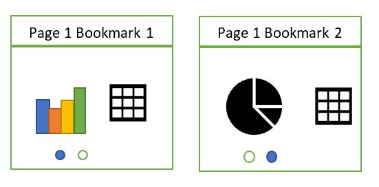
Lets just start to set up the report before we change how the bookmarks work. First of all, Place the visuals on top of one another ready to show and hide. Pie will be our initial start up bookmark.
And now we need the initial toggles to show the pie on and funnel and map off. From Home Click Image and add in the visuals for On Off and Off. You can also add Text for each option (Pie Funnel and Map)
At this point it makes sense to change the name of the
images in the Selection pane so you know what each image is for. Also feel free
to move the selection order around for it to make sense with what is on the
page
Each toggle can either be on or off. Add 3 more visuals, Off On and On and slide them under the toggle images you already have (And rename in reorder in the selection pane.)
Note, the 2nd Pie off img and Funnel off img are incorrect and and then set to on later. So we have an off and an on image.
Now its time to show and hide the visuals dependent upon the
selected bookmark. However, you now have 6 toggles to look after for every
single bookmark which is increasing complexity. Each toggle needs to be shown
and hidden depending upon the bookmark.
Grouping should hopefully make things a lot easier. First of
all set the bookmarks for funnel and map to not update data. We are updating
data in the Pie Bookmark
Lets hide the visuals for each bookmark first. In selection
pane hide the visual and then Click on the bookmark and update (Don’t forget to
update the bookmark after you have hidden visuals)
And now its time for the toggles. We now want to group the
images for on and off.
Select all the off images within the selection pane and then click on the visual (As they have already been selected and click Group)
Rename Group 1 ‘Toggles off’. Do the same with the on images and rename to Toggles on. Each group has the toggles within
And now we can show / hide the buttons within each bookmark separately and
then update each bookmark.
As you can see, for each bookmark, the corresponding on button is shown and off button hidden. The other two off visuals shown
How its time to set actions on the buttons to go to the correct
bookmark
If a visual is shown in the Group you can set the Action under format. It is the off buttons that provide the action to the other bookmarks. For example Pie is on, meaning we are on that bookmark and we can travel to either funnel or map.
Again, click on the bookmark, set the actions for the off images
and then update the bookmarks before moving onto the next
When you go to Funnel Bookmark, you will need to set the Off pie visual because it hasn’t been done yet but map already has the action set from the previous bookmark and you always want to go to Map from this image.
When you get to funnel all the actions for the off buttons
have been created. This is a much easier way of looking after your toggles to
show and hide visuals. Time to Publish your new report to check that its
working in the expected way. For this report I am simply publishing to My
Workspace.
If you check how to create the same functionality without grouping your buttons first, you can see that its much more complex. This is a great update and will make things so much easier in future.
I have created lots of reports with multiple bookmarks. Each
bookmark contains visuals that are either hidden or displayed dependent upon which
bookmark is being viewed.
You need to drag the reports over each other so they are in the same place. If you have more than 2 bookmarks, as you can imagine this can get quite fiddly to look after.
This is really useful if, for example there are a couple of
visuals you want to toggle, but the other visuals remain the same.
The toggle buttons contain an action that flicks to the
corresponding bookmark
The other way of doing is having two pages rather than one page
This means that you don’t have to hide visuals and is clearly much easier to maintain. So why would you decide to go with option 1?
When you drill through to the next level of detail (The
above is just a simple example, instead of hitting on page that you can toggle
through visuals, you are given drillthrough to both pages.
This is not what we want. We just want one drill through for the user
This is where you would definitely want to use multiple
bookmarks on a page, showing and hiding the visuals dependent upon what is
selected.
And the next question is, why cant you just use a slicer?
A slicer is great when the visuals and the fields remain the same, you are just changing a category (For example, your visual contains year and you have a slicer to select a year)
You cant use a slicer if you are changing visuals AND fields.
Just a little something to keep in mind when you are designing using toggles and bookmarks
The JSON file is easy to understand. We can see that the dataColors will be the colours of the bar charts (Etc)
Background, foreground and table accents have also been
provided.
The foreground relates to textbox text, KPI Goal Text, Multi
Row card text, Card values, Gauge call out text, Vertical slicer text, Table
and Matrix total and text.
Background relates to button fill and combo chart labels.
I first wanted to look at the colours provided before I attempt
to update the style
Is a great way of checking and creating the colours that you want
The first thing I do is check each data colour to make sure
that Im happy with the Colours
Data Colours
Background Foreground & Table Accent
Once I’m happy, its time to change the Theme. I go back to Power BI Desktop > Switch
Theme > Import Theme and choose the new theme.
Before
After
I don’t like the way all my headers have turned black. This
needs resolving and I don’t want to have to change everything by hand
Lets revert back to standard and try and work out how best
to deal with this issue
Looking at my button I can see which colour I chose from ‘Theme colours’
Switch Theme > Import Theme and choose the new theme.
Its clear from this that the colour is in the same place in the grid. It is the 5th column in the list. This doesnt match the JSON file. If I can move theme 3 (Red) to theme 5 (Grey) this will resolve.
Does the Json File relate to the theme colours at all?
Starting from the Left, this actually does match the Theme grid
leaving the White and Black (Columns 1 and 2). Therefore if we move the colours
around slightly in the JSON file, We could get the red in the column 5 instead.
And thankfully this resolves the issue. Our headers are red
instead of black. No need to change everything manually to match the JSON colours.
If you add in a JSON file after you have created your reports, be aware that you need the order of colours to work with the colours that have already been selected.