After 14 years using Microsoft On Premise BI Tools (SQL Server, Reporting Services, Integration Services and Analysis Services) Its time to embrace Business Intelligence in the cloud.
In Part 10 we created the reporting and Project PBIP file. In Part 11 we looked at new Task flows and added our items into a medallion architecture.
Its now time to do some small tweaks to the project so far. One thing I discovered is the Pyspark broadcast function.
This function is used to optimise the performance of spark jobs by reducing data shuffling.
Broadcast is really good for join operations. And we have a lot of joins in the the notebooks. can we make the code better?
First of all. What is data shuffling?
Data Shuffling
In Distributed data processing its about redistributing data across partitions or nodes in a cluster. It happens when the data gets re-organised.
Joins
Aggregations
Groupings
So, data is distributed in partitions to allow for parallel processing
When you join two partitions together you get data shuffling (During transformation)
Shuffling is expensive and creates network overhead.
These are the stages of shuffling.
Map Stage – When the data is processed in partitions
Shuffle Stage – Shuffling and exchanging
Reduce Stage – Further processing after shuffling
We want to try and avoid unnecessary shuffling by using broadcast. Lets go back to our notebooks
Taskmaster transformed Notebook
# Join the extra contestant information
dfcont = dfc.join(dfp, dfc["Name"] == dfp["contestant"], "left_outer").drop(dfp.contestantID)\
.drop(dfp.contestant).drop(dfp.team).drop(dfp.team_label).drop(dfp.champion)\
.drop(dfp.TMI)

# The resulting DataFrame 'joined_df' contains all rows from dftask and matching rows from dfob
display(dfcont)
This is the original Join. Clicking run, it takes 6 seconds.
If you run it again it takes two seconds. Why is it quicker?
File caching
The second run will benefit from better data distribution and partitioning
JVM warmup. (Java Virtual Machine) has optimized on the second run
How do you get it to have time of run 1?
spark.catalog.clearCache()
Clears the memory before trying again.
Working with Broadcast on a join
You need to Broadcast the smaller table. In the above instance we can create a quick check of sizes on the two data sets.
dfcrow_count = dfc.count()
dfprow_count = dfp.count()

print(f"Number of rows in the dfc DataFrame: {dfcrow_count}")
print(f"Number of rows in the dfp DataFrame: {dfprow_count}")
Immediately we can see which dataframe is to be broadcast. dfc
from pyspark.sql import SparkSession, functions as F

df_small = F.broadcast(dfc)

# Join the extra contestant information
dfcont = df_small.join(dfp, df_small["Name"] == dfp["contestant"], "left_outer").drop(dfp.contestantID)\
.drop(dfp.contestant).drop(dfp.team).drop(dfp.team_label).drop(dfp.champion)\
.drop(dfp.TMI)

# The resulting DataFrame 'joined_df' contains all rows from dftask and matching rows from dfob
display(dfcont)

dfcont.explain()
Explain allows us to see the plan.
This took 1 second to run as opposed to the 6 seconds previously. if you are working with a lot of data this could really change things considerably with your runs.
Lets remove the original join and lock this one in.
The Execution Plan
Gives you more detail on how the command is being executed.
Conclusion
With this in mind, we can go through all the code and update anything where we can with a broadcast which should really help with the processing.
In Part 11 we created Power BI reporting and changed the usual PBIX to a PBIP Project file.
Before moving on, lets have a quick look at a new feature in Fabric. Task Flows
Back in the Fabric Workspace
We can now build a task flow. But what is it?
Its a new workspace feature to visualise the collection of processes for an end to end solution.
There are specific types of tasks that we will look at later
There are two ways of going about this.
You have started a brand new project and you have your initial Task flow set up to start adding in tasks. This helps you work with your architecture,
You have already created tasks (Like this project) and want to assign them to a task flow.
Lets begin
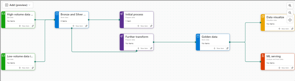
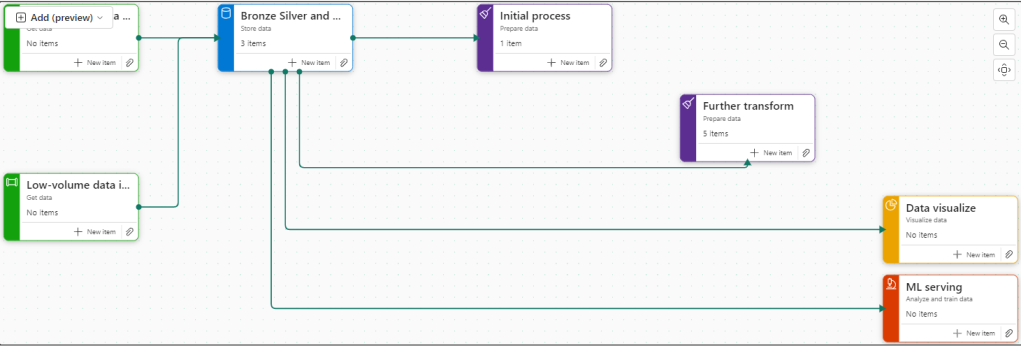
There are 8 flows available at the moment. Throughout the Fabric journey, the medallion architecture has been championed so lets go with this.
Colouring
Green Items are Get data
Blue Items are Store Data
Purple items are Prepare data
Yellow items are Visualise data
Red Items are Analyse and train Data
Creating new Tasks
If you haven’t yet started. When you set up your board. you need to assign items to each task.
There are no Data Engineering steps in this development project for getting data so lets start with the green tasks.
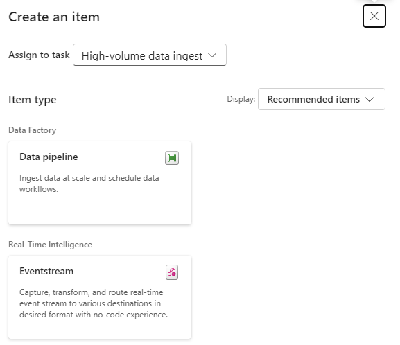
Click New Item
And we get options of what to create for Low Volume data. Great. We have recommended items (which we can change to all) So if you wanted to go Low code a Data Factory Dataflow Gen2 might be the way to go.
lets have a look at high volume data
Here, a Data Pipeline would probably be used for this project.
Data Factory was previously the go to for copying files across into the Data lake so as the data engineer, I would possibly pick pipelines for both types of data processing.
Already this is a great way of working. We know we need to do all these processes but the amount of possibilities can be bewildering. So let Fabric give you recommendations every step of the way.
Assigning Items to a Task
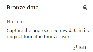
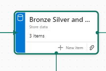
Bronze Data
If we quickly click new item to check the recommendations
We have already set up a Lakehouse for Taskmaster.
Click the little paper clip icon to attach a task
And Select the Lakehouse
Now we have 3 items at Bronze Data Level
DebbiesFabricLakehouse Top Level
The SQL Analytics Endpoint
The semantic Model (default) This wasn’t used because there were issues with errors occurring whilst developing.
Selecting the Bronze data Task shows you the objects in that task.
Lets move on to
Initial process
We have a Data Engineering notebook set up that Creates our initial transformed Silver layer. This can be added here
One current real issue for me is the vertical bar on Fabric and Power BI
You have to go to the end to scroll down. And you can’t see your items. Extremely annoying when working on smaller screens. This is actually a large screen but you cant make the box any bigger. You have to manually make the columns smaller each time .
I hope they sort this out soon
What happens when you accidentally assign an item to the wrong task flow
I have added the Lake house to the initial Process accidentally.
Hover over the tasks and select the ones you want to remove
And Unassign from all Tasks which appears
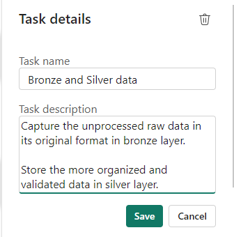
Silver Data
In this case the Lakehouse contains bronze and silver layer, so this is for both.
What happens when we assign the lakehouse to silver?
Well, you can’t do this. An item can only be for a single task. So how do we relate this to our medallion architecture above?
For the time being, go to Bronze Data and edit
Assign the Lakehouse
Click on Silver Data
Delete. We don’t need this
This leaves a gap in our flow
Connecting Tasks
Click the edge of the starting task and join to the end task
Further transformation
We have Notebooks that prep the dims and facts. Lets add them
Golden Data
Another Data Store and again our golden data is in Delta Parquet in the Lakehouse. Looks like we can edit the initial Store data again
Mini gripe. You can’t see all of the information so you cant tell its bronze silver and gold.
Delete Golden Data
Personally I would prefer to have all three on the pane and share the Data lake between all three tasks.
But where do we add the semantic model?
The Semantic model comes before visualising the data. But we have nowhere for this.
Creating paginated reports and semantic models from a task isn’t supported.
Well this is a real shame. it feels like this needs to be added before its a really usable solution.
Data Visualise
Our report is in a PBIX File.
We don’t have any Dashboards
Lets publish the Content from Pbix to the Fabric Workspace.
Then go back to the workspace
Interestingly these are now uncommitted items and show up in source control.
In Part 10 we did a lot of work getting the PBIX file into source control. What will this do? we will look at this later.
Back to Data Visualize
We add the reporting
The Semantic Model has also been added here, Hopefully a new task will be added soon specifically for the semantic model, there are currently no items types for semantic modelling.
There is no ML Service so we could get rid of this task.
Old Notebooks not being used (Filters).
There are a few Notebooks from the old version not part of this, can we see them?
Another issue. Selecting Not Specific for Task doesn’t filter the Tasks without a Task Specified. Something else that needs to be ironed out.
Conclusion.
There are currently a fair few issues with this but it is new and hopefully they will get ironed out.
I still don’t like scrolling in any of the Power BI / Fabric Service solutions because it doesn’t automatically resize to page size. This has been an annoyance for a long time now. I really wish it would get sorted.
Semantic modelling needs to be added. Filtering needs to be much better,
And I genuinely wish you could have an item in multiple tasks, especially store data. But overall I really love this feature and can’t wait to see if get some more development
So far we have created our Delta PARQUET files in the Delta Lake using Notebooks with Pyspark.
We have created a Semantic Model – Storage mode Direct Lake in fabric
Its time to create some visuals. but the question is. Do we create them in Fabric. or in a bpix file?
Reporting Fabric or Pbix File?
Fabric – Centrally managed
Pbix – offline Development and version controlling available for the files with .pbip (Project file)
For this project we are going to go for the hybrid approach. The semantic model in Fabric. And reports developed in Desktop with Devops Version controlling which are published into Fabric.
This gives us better opportunities for version control and collaboration.
Get Data
In Power BI Desktop
Power BI Reporting
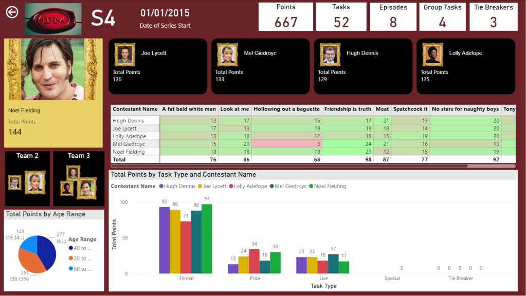
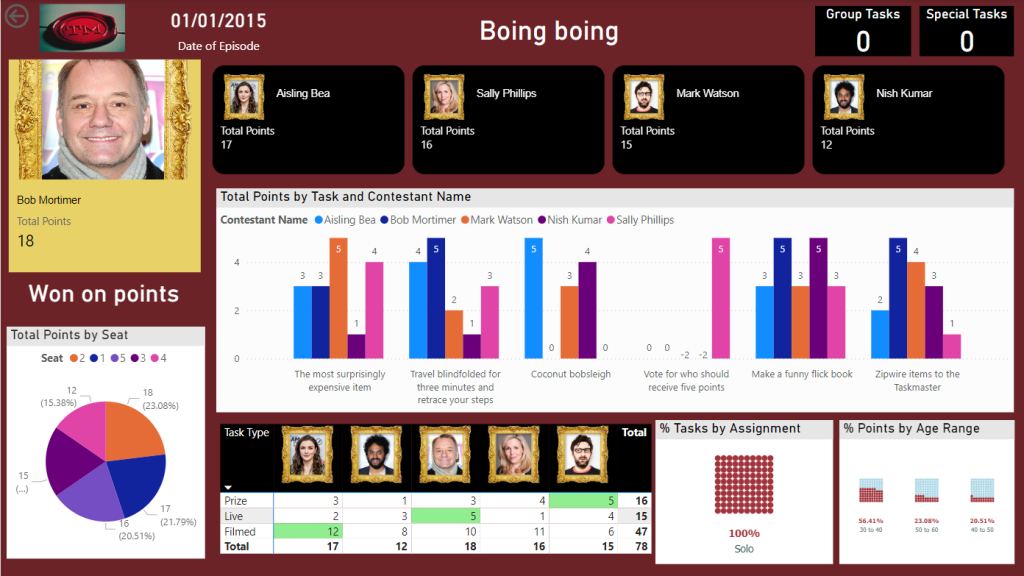
Our front end reporting wont be gone into too much detail here. We are more interested in other areas of Fabric. So here are the basic pages
Drill through to Series
And Drill through to Episode
We now have a pbix Report we can publish through to our Fabric Workspace
Create the Power BI Project (PBIP)
Instead of simply saving as a pbix (black box) file, lets save as a project file instead and see how this can really change how we work with others in Power BI. We should see benefits like:
Items are stored in JSON format instead of being unreadable in one file
JSON text files are readable and contain the semantic model and report meta data
Source Control. Finally real source control for Power BI
Amendable by more than one person at a time?
The possibility of using (CI/CD) Continuous Integration and Continuous Delivery with Power BI
Saving as a project is in preview so lets turn it on.
Options and Settings / Options
TMDL
This was mentioned in the Power BI June 2024 Updates.
TMDL is the improvement to PBIP as the semantic model file format for the Power BI Project files.
Our Semantic model has been created within Fabric. we might look at this in more detail later.
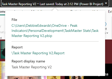
And now we can Save as
And we can see that its a project in the title.
Clicking on the title shows us file paths of the objects. we only have the report because the semantic model has been created within Fabric.
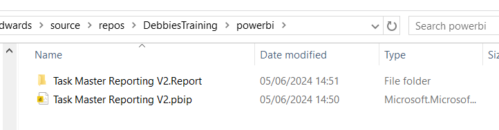
Lets have a look at what we have created in Explorer
The main project file
The reporting folder
Our objects within the reporting folder.
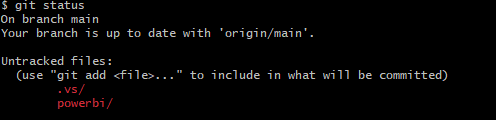
Currently this is in One Drive. We want to get this added into Devops and GIT so it can be added into our full source control process along with all the Fabric code.
Azure DevOps build pipelines for continuous integration
First of all we need to make sure Fabric is connected to Azure Devops which it is
And cloned to a local drive. This was done using Visual Studio but there are other ways you can clone.
It would have been better to have saved into this cloned local project, But we can create a folder and move instead.
Created a Power BI Folder.
And Moved all the objects mentioned above into this folder
Create and Complete merge. (If you don’t use the reviewing process in Development)
We can see the page is in with lots of work added into this part of the JSON script.
Where is the Semantic Model?
The Semantic model has been created in Fabric.
It says synced on GIT Status.
And here is is in Devops.
Conclusion
The above can be done in Power BI Pro as well as Fabric. Which is good news.
However, my worry about this is that someone creating Pbix Reporting won’t take to the whole GIT process. I suspect that when it comes down to it, it simply wont be done properly.
If you were to go the pbix file route, this would need a lot of governance work to get people to use GIT. At Enterprise level this would be doable but I doubt this would become a real part of the process at self service level.
I did start to question the process. after doing some more reading. It feels like if you created the reporting inside of Fabric, The GIT Process would be simplified. Even though the documentation states that for full GIT control use PBIX. I will be really interested in creating a Power BI Report inside of Fabric to see how this would work in the process at some point.
In the next blogs we are going to look at some new features of Fabric. We can also look at using this feature along with with Devops Pipelines later. (Premium and Fabric only)
moving straight on from Part 8. We were in the SQL Analytics Endpoint.
At the bottom of the screen we have a model view. This is the Default Model view
This takes us to the Semantic Model
Semantic Modelling in Fabric
Lets update the default semantic model. Set the relationships. Hide Keys, set up Orders, hierarchies etc.
Direct lake
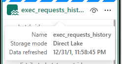
Notice the Storage model is Direct Lake. this has greatly reduced the amount of copies of the data we have. Power BI is using the PARQUET files in the same way it would Import into the Columnar Power BI data Store.
Direct lake is only available with Microsoft Fabric and Delta PARQUET tables
Unfortunately I have hit a problem.
The Semantic Model isn’t working. After every change we hit
‘We cannot access source column ‘<ccon>series</ccon>’ from delta table ‘<ccon>dimepisode</ccon>
However, checking the Data and series is available.
Also the directions on the join are incorrect (Before the changes are removed)
After looking at some of these issues online, it would appear that currently the ‘default’ semantic model is very glitchy and many people are having issues with it.
People are using work arounds by creating their own semantic models rather than using the default. This seems very disappointing, and I hope its rectified soon (As at 30/05/2024)
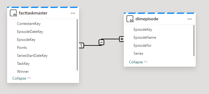
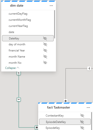
Immediately we see an issue. the many should be on the fact side.
Time to go back to the SQL analytics endpoint to quickly check what is happening.
Going back to My Queries and the Taskmaster data checks file.
SELECT f.TaskKey AS FactTaskKey, COUNT(*)
FROM [DebbiesFabricLakehouse].[dbo].[facttaskmaster] f
GROUP BY f.TaskKey

SELECT t.TaskKey AS DimTaskKey, COUNT(*)
FROM [DebbiesFabricLakehouse].[dbo].[dimtask] t
GROUP BY t.TaskKey
Having COUNT(*) > 1

SELECT Task, TaskOrder, COUNT(*) FROM [DebbiesFabricLakehouse].[dbo].[dimtask]
GROUP BY Task, TaskOrder
HAVING COUNT(*) > 1
it would seem that from running the above queries. Everything is correct. 1 Task to Many. In Power BI desktop this would automatically create the correct relationship for you,
So in this instance, go into the relationship and reset. (is this an issue in Fabric at the moment?)
Relationships and hiding keys
Friendly Names
Now I want to set up Friendly names for the columns and tables. If we change a table name in Data, how does this affect the DELTA PARQUET table? Lets check.
it doesn’t affect Delta PARQUET file so lets add Friendly names into the model for the dims
E.g.
Add Sort orders and hide
This has been repeated on :
Dim Date Quarter / Quarter No
Dim Episode Episode Name / Episode No
Dim Task Task / Task Order
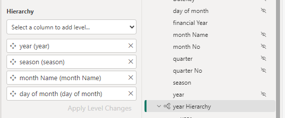
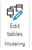
Hierarchies
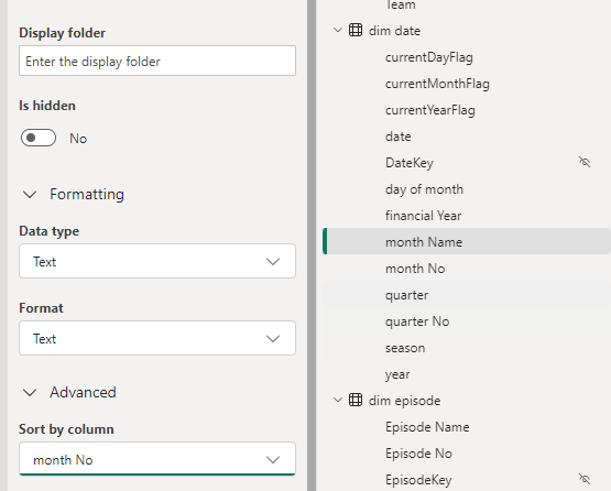
Dim Date
Hide the original fields outside of the hierarchy so not to confuse the user.
For this project, Lets not use Quarter and hide it for the time being
Lets also hide financial year
Dim episode
Don’t forget to click Apply level changes
DAX
Now we can start to add the DAX. The question here is, In power BI Desktop we can create DAX and then immediately create a visual to check its looking good. how do we do this in the Semantic model in Fabric?
Points
Total Points = SUM(‘fact Taskmaster'[Points])
And hide the base metric
And add the new DAX to a Folder
So how do we quickly check this
Using the new report we can quickly create a test report.
No need to save this report. it is just a tester.
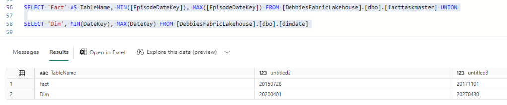
There is something wrong with the Date connection. We can go back to the SQL analytics Endpoint to quickly check (After checking the relationships)
Our Date Dimension starts in 2020, and we are only at 2017 so the Date Delta PARQUET needs an update.
Dim Date NoteBook
Back in Dim Date. All we need to do here is to reconfigure these Start and End Dates
# Define your start and end dates
start_date = '2015-01-01'
end_date = '2027-12-21'
And rerun the entire notebook
then go back to the Query just jun.
And after a refresh on the report
Great. this issue has now been resolved.
Week
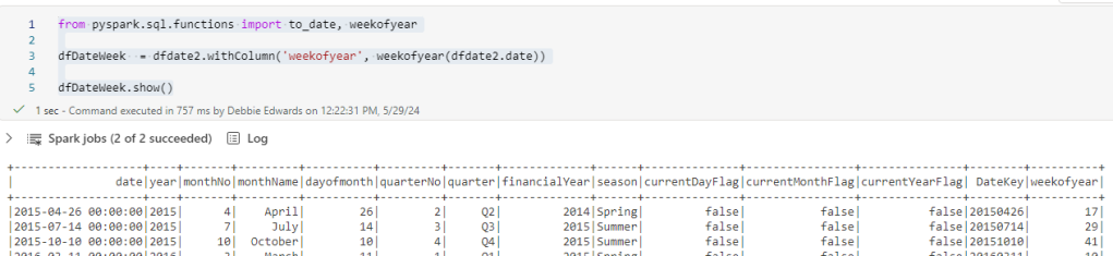
And whilst in Dim Date Dimension. there is one thing that we havent added and thats week.
Week is really important because each Each episode is once a week. Its more important than day. So lets quickly update to bring in a Week column and we can update the hierarchy and hide day.
from pyspark.sql.functions import to_date, weekofyear

dfDateWeek  = dfdate2.withColumn('weekofyear', weekofyear(dfdate2.date))

dfDateWeek.show()
And Update the Creation of the files to use this dataframe
Update the date Hierarchy
Once set lets go back to the semantic model
Right click and Refresh
This didn’t work. Week of year isn’t appearing in the model.
Clicking this seems to have worked.
We don’t want to sum up the weeks so in Properties / Advanced, set summarize by to None.
Update the hierarchy
Also, Don’t forget to set as Date table
Back to the DAX.
Base Metrics
Total Contestants = DISTINCTCOUNT('dim contestant'[Contestant Name])

Total Episodes = DISTINCTCOUNT('fact Taskmaster'[EpisodeKey])

Total Points = SUM('fact Taskmaster'[Points])

Max Points Scored (ALL Contestant Images) = MAXX(
                    ALL( 'dim contestant'[Image]),[Total Points])

Points for Group Tasks = CALCULATE(SUM('fact Taskmaster'[Points]),'dim   task'[Assignment] = "Group")

Points for Special Tasks = CALCULATE(SUM('fact Taskmaster'[Points]),'dim task'[Assignment] = "Special")

Total Series = CALCULATE(DISTINCTCOUNT('dim episode'[Series]), 'dim episode'[Series] <> "NA")

Total Tasks = DISTINCTCOUNT('fact Taskmaster'[TaskKey])

DAX with variables
% Tasks = [Total Tasks]/ CALCULATE([Total Tasks], ALL('dim task'[Assignment]))*100

% Tasks by Series = [Total Tasks]/ CALCULATE([Total Tasks], ALL('dim episode'[Series]))*100

% Tasks by Type = [Total Tasks]/ CALCULATE([Total Tasks], ALL('dim task'[Task Type]))*100
And each one is added to a display folder. E.g. Measures\Tie Breaker to give us a sub folder under Measures
Highlighting Metrics By Colour will be used later in the reporting.
Highlight Max Points Scored(ALL Contestant Images) =
Var MaxPoints = MAXX(
ALL( 'dim contestant'[Image]),[Total Points])
Var Check = IF([Total Points] = MaxPoints, "Light Green","White")
Return Check
Highlight Max Points Scored (ALL Episodes) =
Var MaxPoints = MAXX(
ALL('dim episode'[Episode Name]),[Total Points])
Var Check = IF([Total Points] = MaxPoints, "Light Green","White")
Return Check
Highlight Max Points Scored By Episode =
Var MaxPoints = MAXX(
ALL('dim episode'[Episode Name]), [Total Points])
Var Check = IF([Total Points] = MaxPoints, "Light Green","White")
Return Check
Highlight Min Points Scored (ALL Contestant Images) =
Var MaxPoints = MINX(
ALL('dim contestant'[Image]), [Total Points])
Var Check = IF([Total Points] = MaxPoints, "Light Red","White")
Return Check
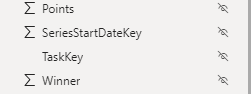
Hide original fact data
With Everything hidden in the table. we get out fact icon, establishing that this is a fact table
Final Updates
Have Thousands separators set for numbers (Measures)
Make sure percentages are also set correctly
Set Image as Image URL in Properties > Advanced
Our Semantic model is complete. Or at least ready for us to start creating reports.
The other thing to note about this semantic model is there is no need to publish. It autosaves and we simply need to refresh our data source for the reporting to bring through changes.
Lets move on to creating the visuals in the next post.