A Previous Project we worked on had a specific requirement.
Project Requirement
Create reporting once a month and allow us to tell the story in narrative via text boxes. The narrative must show against the reports.
The narrative must be formattable. Bold, italic.
- Bullet point, etc.
Our users don’t want to go to Power BI service. They want the information emailed as PowerPoint slides to the report viewers.
The License is Power BI Pro and we couldn’t use, for example SQL DB for the project to have the transformations before going to Power BI.
There are a lot of slicers in the reports, so there were numerous PowerPoint slides needed based on the specific slicers
There were immediate restrictions based on the requirements.
Restrictions
- With a SQL Database we could have used a visual that allowed us to add narrative to each page because it could have been recorded to a database but this was too complex and we didn’t have that option. Also the user might not have been able to format the text enough on the page.
- We tried to use the Storytelling in PowerPoint. But, at the time this was live only. You couldn’t snapshot the data. And there were issues in the amount of sub slicers and the users needing to have paginated reporting.
April 2024
As At April. It seems that there have been changes to Storytelling with PowerPoint. And its of interest to see if this could have worked with the above requirements. Based on very basic data.
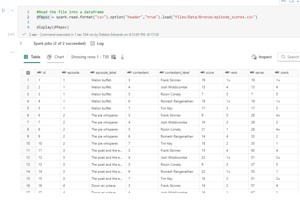
I am going to use TV shows watched as an example for this.
We start off with a couple of records in excel

Which is imported into Power BI.
A Couple of measures have been created.
Show Episodes Watched = COUNT(Shows[Show])Total Shows Watched = DISTINCTCOUNT(Shows[Show])
And a Few Basic Visuals have been created

Just enough for us to play with
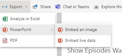
Lets publish to Service

Then Click on the ellipses and Select Share and Open in PowerPoint

And Now. We go across to a new PowerPoint

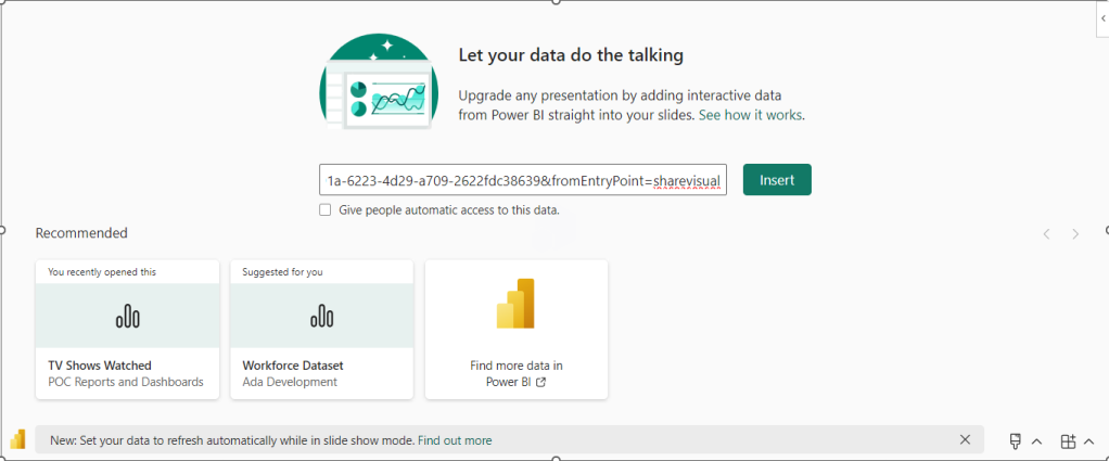
Click Insert
Lets choose a few more Visuals and add some text explaining that day.

Lets save this PowerPoint
Now we are moving into another day and adding more data.

Save and Close XLSX. Lets see how this looks in Power BI after a refresh.

So now lets open PowerPoint again.
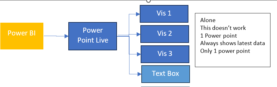
What we are hoping for is a PowerPoint snapshot for each point in time
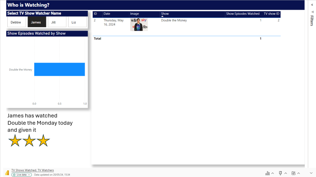
So What we have is Live Reporting which now doesn’t match the text added. What we need is to have Business Logic that allows us to Snapshot the Power point.

Each of the 3 Visuals has options and currently we are on Live data.
There are two other options.
Snapshot
Show and image of Power BI data to people with existing access.
so, these are people who can view the reporting in Power BI service,.
Public Snapshot.
Show an image of Power BI data for people with access to this deck
Essentially, a public snapshot allows you to share a static image representation of your Power BI data with a broader audience, even those who don’t have direct access to the report.
We can chose snapshot for this exercise but what will the business process be? How will this work?
The Business Logic
Essentially we want to have a template in place of Power BI visuals and Text.
We want to make a copy of the PowerPoint and send this to users.
The Next day after a Refresh we want to do the same thing and build up PowerPoint Snapshots where the text tells the story on that day
So what happens if we change all three to Snapshot in the slide deck?
Remember, this slide deck will have many visuals and be much more complex.
Lets make a copy of the PowerPoint slide deck and see.
The text has been updated for the current 2 day data source

Every Visual has had to be manually changed to Snapshot.
This could be really problematic if you had to do this every single time you want to create a snapshot.
lets add another days worth of data into Power BI and refresh
Our Live PowerPoint shows the latest.

Our Snapshot still shows

So now we have a problem. We could do this

BUT. Imagine we have a lot of pages and a lot of visuals. This involves manual updates for every PowerPoint snapshot to move each visual from Live to Snapshot.
Do you want to add this in as a process?
Could your team handle this as ongoing business logic?
This change is really great. But because there are manual aspects to it. its still not that efficient and could be error prone. So we are not quite there yet.
The test needs a manual update every month in the PowerPoint and it does need saving manually.
Changing from individual visuals to a full report
Could we simplify from individual visuals to a full report?
For this, the excel data will be taken back to day 1
There are two possibilities here.
We don’t want to embed an image because that will be snapshot data and the users don’t want to go in and do this every month.
We want to try and Embed Live Data and then change to snapshot. After a few tweaks to the Power BI Page.
Embed live Data and copy the link.

You only need to move from Live to Snapshot once instead of three times for an entire report page.
You can leave gaps on the Power BI report to add in a textbox in PowerPoint.
The question is
Would the users be happy with the look of this?
If yes, we can we now have new manual business logic.

Complications in the Logic.
We have made the decision to do a whole page as one but lets complicate the logic and add some more data.
We want a page in PowerPoint for every TV Watcher

Shows

TV Watchers
We are on Day 1. Lets Update Power BI with a new page
First up all, Power Query is refreshed with the new data set and the updated data set.

Not a Star Schema but this is about the end product. the PowerPoint so we can relax on this point for the time being.
Logic – Pull in an entire report page. not just visuals.
After refreshing and publishing. we need to add the new page into our live PowerPoint Embed Live Data.
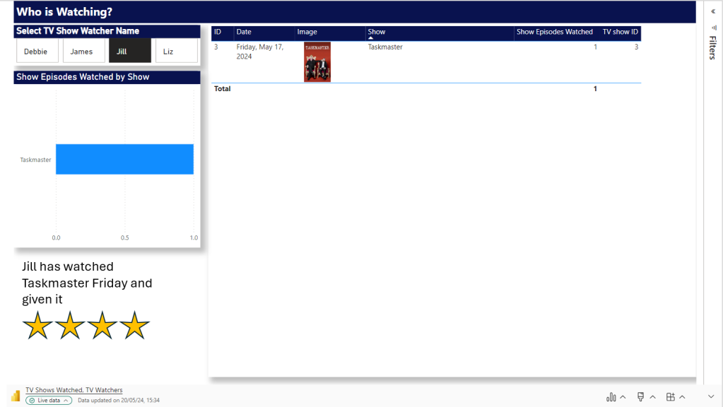
At this point in time there are only two TV watchers. So we can load in the data twice and set the Slicer. now we have a Page for each Person. including some personal text for the specific person.


Next Step.
To Load in more data. Which means more people could potentially be watching.
How would be logically deal with this?
And will the Slicers stay correct for each page?
So
- Add in another days worth of data to the xlsx and refresh
- In Power BI, we manually need to check if we have more watchers. Which we do. there are two. this means, manually another two pages need adding.
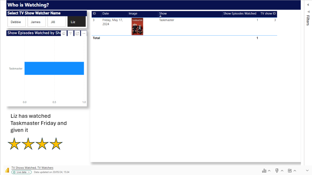
- Open the Live PowerPoint. After A refresh. the good news is the filters have held.
- Manually create two new Pages and filter to the two new people
Question. Why can’t we just have one page and allow the user to flick through TV watchers?
Because a manager will come and add unique text for each slicer. And without saving this text somewhere that can’t be added dynamically, we cannot do this.
Question. Will the Business Owners be able to add this into the process every snapshot because its a manual process to use the reports to see if there are new users and then add them as pages.
- Set all pages to Snapshot and Save File as Snapshot. Keeping the Live File as the template.
After a Second test this works. there are certain Manual points to the process. But the user gets what they wanted an a template of Live visuals with room for text.
That can be Saved to Snapshot PPTX.
And have filters set for the sub reports. each watcher gets their own page. We just have to manually understand when we need to add new pages. So we couldn’t do this if we have thousands of watchers with new ones adding every snapshot at a great amount.
Report Builder
Another specific Rule for this project is that there will be alot of tables used and these tables will go over pages (1 to Many)
Because of this. As we go we have to go for the Paginated Option of report Builder.
Question. Would this work with Report Builder Objects?
Using Power BI Report Builder
Add the Data Source as the TV Show Semantic Model created above
Then a Data set


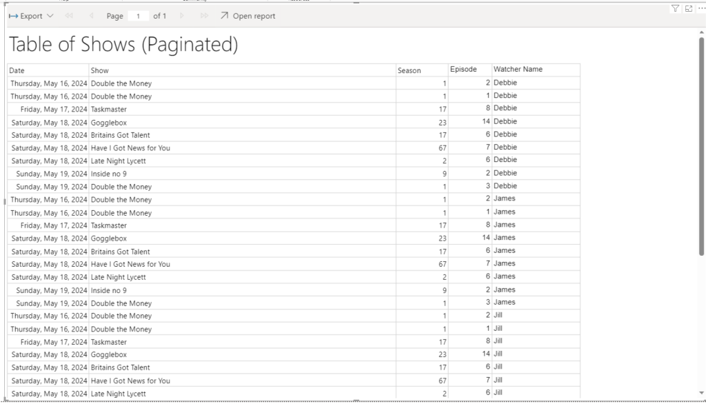
Really nothing fancy here. We just need a table that will go over Pages
The paginated report is saved to Service.
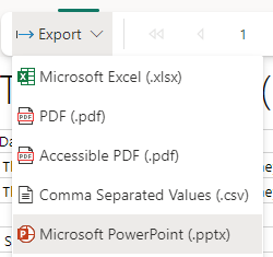
And you can see that immediately we have only Microsoft PowerPoint option. It opens in its own file so can’t be added to the PowerPoint containing Power BI visuals
This doesn’t appear to update. It seems to be a simple Snapshot.
Can we do this another way?
We have created and published the Paginated Report.
In Power BI Desktop


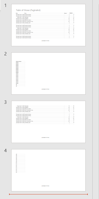
We now have the paginated reporting in Power BI. But its not doing the one thing we needed to use Report Builder for in the first place. Its not paginating the table.
We now can either connect to Live or Snapshot data which is good

But the table is not paginated. It is scrollable. So no need to add in Paginated reporting really. we could stick to the table in Power BI for this functionality
Conclusion
The new Snapshot functionality is super helpful when you don’t want your PowerPoint to simply be one object pointing to the latest data.
we can now create snapshots of information via a live PowerPoint quite quickly. The text manually added into each snapshot PowerPoint will always be specific to that point in time. It needs some manual intervention. But for those users who want to keep things simple. This could be just what is required for this kind of logic.
The PowerPoint even holds the slicer you select on a page.
The problem lies in the extra complexity, if the user requires large tables over many PowerPoint pages.
There are questions here of course. Why do you need large tables? If you do need tables. Would the user be happy to scroll through on a slide?
Note that if you select Public Snapshot. because you are sending out to people without licenses, all functionality is lost because you just get images, So if you have tables with sliders you will lose the additional records. Something to think about when setting up a project like this.
If so, Paginated report can be bypassed, and you have licenses for all viewers. Great. But, if this is a requirement. The new functionality will not work for you.
Lots to think about here. As always every month poses lots of questions for current and past projects.