Lessons learned whilst working with Microsoft Fabric – Part 2: Power BI and Semantic Modelling

In part 1 of our initial lessons learned in Fabric blog, we looked at Data Engineering components. Our transformed dimensions and fact tables are now stored in Delta Parquet format within the Fabric Gold Lakehouse.

Now its time to look at what we can do with the Power BI Fabric functionality. Lets build our Semantic model and Reports.

The Semantic Model

Previously, the semantic model was created in Power BI Desktop. We could then create another desktop file and connect to the semantic model that had been published to the power BI Service.

With Fabric. You create the semantic model in the Fabric workspace.

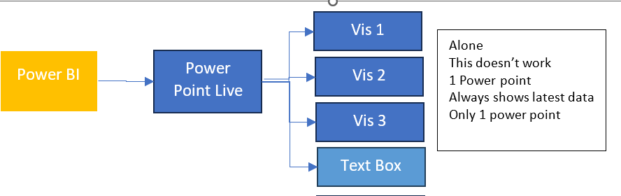
We are going to use Direct Lake connection to the Delta Parquet files. As a consequence we don’t need to create dataflows. Lets look at how this looked previously.

Without the SQL DB, with Power BI Premium. Data flows can get complex, as usually the transformations happen within the SQL database. Here they are used to simply store the data centrally before being imported into the semantic model.

You can use the data flows in multiple semantic models. For example, your date dimension could be reused in many models.

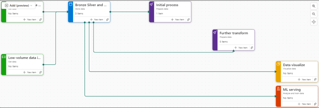
Now, we are looking at the following logic.

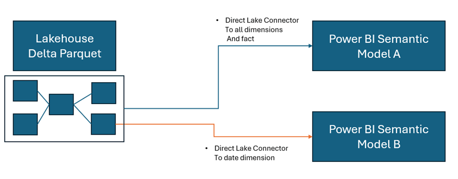
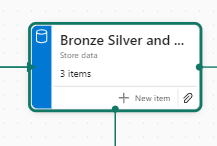
As a consequence, this project has been simplified to Delta Parquet and Semantic model.

In the Lakehouse, go to SQL analytics endpoint

At the bottom of the screen we have a model view. This is the Default Model view

This takes us to the Semantic Model. However, when trying to update the default model we get hit with errors

After looking at some of these issues online, it would appear that currently the ‘default’ semantic model is quite glitchy and many people are having issues with it.

People are using work arounds by creating their own semantic models rather than using the default semantic model. So currently, the default is left alone and a new semantic model is created.

Back in the Lakehouse

Choose New Semantic Model

And work in the same way as you would within your Power BI desktop file. Note that we don’t have to publish. The model auto saves.

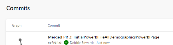
And you can then commit your model changes to your GIT repository. Eventually creating versions of your model.  You can quickly create a new report in Fabric to check your DAX as you go.  This is a real change from how we used to work. Where the power BI PBIX file was simply a black box file, with no opportunities to store the code in GIT.

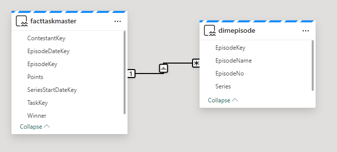
Notice the connections on each object

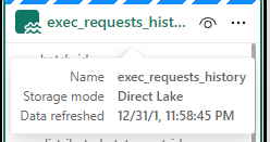
Direct Lake. Power BI directly connects to the Delta Parquet file. Just like Power BI, the file is a columnar data store, and we do not lose any DAX functionality.

Power BI Reporting

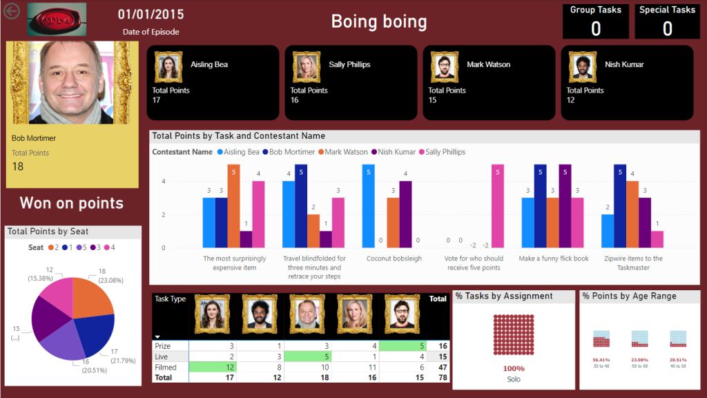
As we have seen. You can create reports directly in Fabric. A big question is, is Power BI desktop still the best thing to use?

Again I think the answer to this question is definitely yes. Although the Fabric reports can be good for quick data model testing.

  • Desktop allows for Offline development
  • Power BI Desktop can be more responsive that working on the cloud
  • Power BI reporting allows for better version control. You can save locally and publish to the service when ready.
  • Desktop integration with other external tools and services
  • Desktop provides more options and flexibility that reporting within Fabric.

With this in mind. Another update we can take advantage of is the Power BI PBIP (Project) desktop files. PBIP allows for version control and collaboration. Finally, Our Power BI files are broken up and code can be stored in out GIT repositories.

PBIP (the Power BI Project File)

Get Data

In Power BI Desktop you can access your Power BI semantic models

Create reports from the Semantic model(s) in Fabric.

Create the Power BI Project (PBIP)

Instead of simply saving as a pbix (black box) file, Save as a project file and see how this can really change how you work. We should see benefits like:

  • Items are stored in JSON format instead of being unreadable in one file
  • JSON text files are readable and contain the semantic model and report meta data
  • Source Control. Finally real source control for Power BI
  • Amendable by more than one person at a time
  • The possibility of using (CI/CD) Continuous Integration and Continuous Delivery with Power BI

Saving as a project is (Currently) in preview so lets turn it on.

Options and Settings / Options

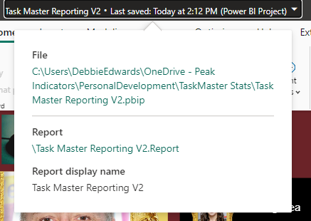
And now we can Save as report.pbip

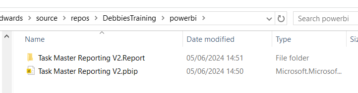
After saving, the project is stated in the title.  Lets have a look at what has been created in Explorer

The main project file

The reporting folder

The objects within the reporting folder.

For the initial test. The pbip was save to One Drive. It needs to get added into Devops so it can be added into the full source control process along with all the Fabric code.

Azure DevOps: build pipelines for continuous integration

Ensure Fabric is already connected to Azure Devops And cloned to a local drive.

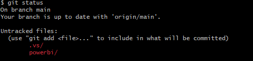
Add a powerbi folder in the local repository and all the Power BI Objects are moved here.

PBIP is in local but not yet in the cloud.

Git Bash is installed locally to work with https://git-scm.com/downloads

Using GIT Bash you can push the powerBI files up to the central repository by creating a new branch to work on

Add and commit the changes. Then Push to the cloud

Back in DevOps

We can see the Power BI Items. If you have pushed to a branch, you can then create a pull request to pull the new power BI files over into main.

To work with the file again, remember to open the (PBIP) project file from your local repository. Then you can work in Git Bash to once again. Create a new branch. Add, Commit and Push the changes.

For self service Power BI developers, this may be something that takes time to embed itself, since the process is more complex and you need to have some understanding of version control but it is really worthwhile to train your developers and build this into your standard procedures. Especially with the Silver and Gold standard (Promoted and Certified) content.

The Fabric Capacity Metrics App

Finally, lets take a quick look at the Fabric Capacity Metrics app. You need to be an admin to install and view the report.

Why is the Fabric capacity app important?

  • It provides insights into how the capacity is being used.
  • Monitoring usage patterns helps to identify how to scale resources up and down.
  • High usage items can be quickly identified

Installing the App

Go into your Fabric Workspace and click on the settings cog at the top right of the screen and select the governance and insights Admin Portal

I am the admin for the Fabric capacity so ensure you know who your Fabric Capacity Admin is

Click on the capacity and get the capacity ID from the URL

You can use the ID for the Capacity Metric App

In the Fabric Workspace. Go to your Power BI experience at the bottom left of the screen

Click on Apps and Get Apps

Search for the Fabric capacity App and Get it Now to install

Connect to start working with the app

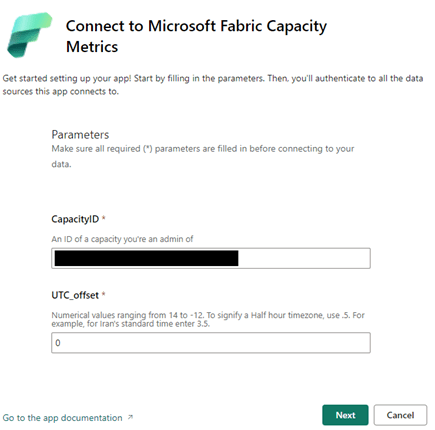
The screen is where you can use the capacity ID, copied from the Admin Portal. You then need to sign in and connect.

Here is where the Fabric experience falls down for me slightly currently.

The capacity app doesn’t show financial costs (Although part of the license fee. There are still costs to running spark jobs). Also, only the Fabric admin can see this information.

As a none admin user, I still want the power to be able to see my utilisation as I work with fabric.

Conclusion

The more you learn with Fabric the more exciting it gets. The next goals are to work with the Data Warehouse and the real time capabilities.

There are so many opportunities to use the Delta Lake or SQL DW as our transformation (Staging area) with Direct Lake Power BI connection. I can see Delta Lake being the option of choice to quickly to build up smaller solution projects.

As a SQL Developer, I am now a big fan of Pyspark. These two make a great tool set for the Fabric analytics engineer.

And as always with Power BI, there are exciting updates every month to look forward too. You never stop learning as an Analytics Engineer.

As at time of adding this blog. I am working towards the Fabric Engineer Certification after getting my Azure Engineer Associate some time ago. So lots more to think about. My current excitement is the real time analytics within Fabric. I.m really looking forward to trying to implement a project with this.

The Microsoft data Journey so far. From SQL Server, Azure to Fabric

Having lived and breathed Microsoft for over 20 years, it is important to sometimes stop and think about all the changes over those years and all the growth and learning gained from each change to the analytics space.

I started working with on premises Microsoft Products. We had a large room full of Microsoft 2000 servers and a long journey to finally upgrade to 2008 R2.

Integration Services was the orchestration tool of choice and Reporting services (SSRS) was the server based reporting tool.

We were starting to move from basic management reporting into business intelligence, especially with the introduction of SQL Server Analysis Services that became part of the environment when we finally pushed to 2008 R2.

We have come along way since those days.

On Premises Analytics

One of the biggest issues with On Premises was the upgrading to new Servers. We had a lot of servers and applications tied to those servers. Upgrading to the latest release was never easy and sometimes couldn’t be done because of the system it supported.

This led to a real disparity of servers. Some still at 2000. Some 2008 R2. A few lucky ones moving to later versions.

Another big issue specially for the analytics team was the use of the servers. Spinning up a new database needed a lot of work to make sure that whatever was required wouldn’t run out of space or memory. Because there was only a certain amount of these resources for all services.

There were examples of simply not being able to work on a project because of these restrictions.

There is nothing more frustrating as a developer to know there are later releases out there but you are stuck on an old version. Or knowing that you could do so much more with a bit more compute power or space allocation.  There was no room to grow. You had to understand your full limit and work from there. 

Reporting Services (SSRS)

Its interesting to look back on SSRS, Microsoft’s Paginated reporting original solution after using Power BI for so long now.

Yes it delivered fairly basic paginated reporting but it didn’t quite deliver the experience we really wanted to go with for our new Business Intelligence vision.

On Premises to Azure

A career move presented me with the opportunity to start using Azure and Power BI.

Finally, the floodgates seemed to open and new possibilities seemed to be endless. Here are just a few examples of the changes happening at this point

  • Azure allowing us to always be on the latest version. No more wishing that you could use SQL Server 2014 whilst stuck on 2008 R2.
  • Power Bi, interactive data visualisation. The complete gamechanger. We will look at that more later
  • Azure SQL Databases. Here we can now spin up small cheap solutions for development work. Scaling up as we go. Never needing to pay for more than we use. Even having the advantages of upping compute during peak loading times. Always being on the latest version, and so many possibilities of choice.  
  • Serverless SQL DB for example. Great for Dev and UAT. Only unpausing compute resources when you need them.
    • We can still work with our SQL Skills building stored procedures to transform data.
  • Azure Data Lake. Secure Cloud storage for structured and unstructured data. A landing area for our data that also creates opportunities for our Data Science experts.
  • Azure Data Warehouse (Which upgraded to Synapse in 2019) was the offering that allows for MPP Massively parallel processing for big scale data. Along with the serverless SQL Pools (Synapse) to finally give us the chance to do analysis and transformations on the data pre the SQL Database load.
  • Data Factory. The Azure Data Orchestration tool. Another big gamechanger, offering so much more flexibility than Integration Services. Having a solution that can access Cloud resources and on premises resources. So much connectivity.

Power BI

Power BI is Microsoft’s modern analytics platform that gives the user the opportunity to shape their own data experience.

  • To drill through to new detail.
  • Drill down into hierarchies.
  • Filter data.
  • Use AI visuals to gain more insight.
  • Better visuals

And at the heart of everything. The Power BI Tabular storage model. The Vertipaq engine, Creating reporting that can span over multiple users all interacting with these report pages. Each user sending queries to the engine at speed.

I have worked with Analysis Services in the past, along with SSRS. Creating Star Schemas sat in columnar storage without needing to set up Analysis Services was a huge win for me as it was a much easier process.

Of course, you can’t talk about Power BI without understanding how different each license experience is. From the Power BI Pro Self Service environment, through to Power BI Premium Enterprise Level License.

There has been a lot of changes and Premium continues to create fantastic additional functionality. Premium sits on top of the Gen 2 Capacity offering larger model sizes. More compute. Etc.

As a take away. When working with Pro, you should always work with additional Azure resources, like Azure SQL DB, Integration Services etc to get the best end product.

With Azure and Power BI we have worked with the recommended architectures and produced quality analytics services time and time again. But, there were still some issues and pain points along the way.

And this is where Fabric comes in.

Fabric

Fabric is the (SaaS) Software as a Service Solution, pulling together all the resources needed for analytics, data science and real time reporting.  Fabric concentrates on these key areas to provide an all in one solution.

On the whole, for an analytics project, working with customers, our (basic) architecture for analytics projects was as follows:

  • Extract data into a Data Lake using Integration Services on a Schedule
  • Load the data into SQL Server Database
  • Transform the data into STAR schema (Facts and Dimensions) for Power BI analytics
  • Load the data into Power BI (Import mode where ever possible. But obviously there are opportunities for Direct Query, and Composite modelling for larger data sets)

We can see here that the data is held in multiple areas.

Synapse starts to address this with the Serverless SQL Pools. We can now create Notebooks of code to transform our data on the file itself. Rather than in the SQL Database on the fully structured data.

Fabric has completely changed the game. Lets look into how in a little more detail.

Medallion architecture

First of all, we need to understand the architectures we are working with. The medallion architecture gives us specific layers

  • Gold –  Our landing area. The data is added to the lake. As is. No Processing
  • Silver – The Data is transformed and Processed
  • Gold – the data is structured in a way that can be used for Analytics. The Star schema for Power BI.

Fabric allows us to work with the medallion architecture seamlessly. And as announced at Microsoft build in May of this year. We now have Task Flows to organise and relate resources. The Medallion architecture is one of the Flows that you can immediately spin up to use.

Delta Lake

The Delta lake enhances Data Lake performance by providing ACID transactional processes.

A – Atomicity, transactions either succeed or fail completely.

C – Consistency, Ensuring that data remains valid during reads and writes

I – Isolation, running transactions don’t interfere with each other

D – Durability, committed changes are permanent. Uses cloud storage for files and transaction logs

Delta Lake is the perfect storage for our Parquet files.

Notebooks

Used to develop Apache Spark jobs so we can now utilise code such as Pyspark and transform the data before adding into a new file ready to load.

Delta Parquet

Here is where it gets really interesting. In the past our data has been held as CSV’s, txt etc. Now we can add in Parquet files into our architecture.

Parquet is an open source, columnar storage file format.

The Power BI data model is also a columnar data store. This creates really exciting opportunities to work with larger models and have the full suite of Power BI DAX and functionality available to us.

But Fabric also allows us to create our Parquet Files as Delta Parquet, adhering to the ACID guarantees.

The Delta is and additional layer over Parquet that allows us to do such things as time travel with the transaction log. We can hold versions of the data and run VACUUM to remove old historical files not required anymore.

Direct Lake Mode

Along with Parquet we get a new Power BI Import mode to work with. Direct Lake allows us to connect directly to Delta Parquet Files and use this columnar data store instead of the Power BI Import mode columnar model.

This gives us a few advantages:

  1. Removes an extra layer of data
  2. Our data can be partitioned into multiple files. And Power BI can use certain partitions. Meaning we can have a much bigger model.
  3. Direct Query, running on top of a SQL DB is only as quick as the SQL DB. And you can’t use some of the best Power BI Capabilities like DAX Time Intelligence. With Direct Lake you get all the functionality of an Import model.

SQL Analytics Endpoints

If you are a SQL obsessive, like myself you can analyse the data using the SQL analytics endpoint within a file. No need to process into a structured SQL Database

Data Warehouse

Another one for SQL obsessives and for Big Data reporting needs. There will be times when you still want to serve via a structured Data Warehouse.

Conclusion

Obviously this is just a very brief introduction to Fabric and there is so much more to understand and work with. However  using the Medallion architecture we can see a really substantial change in the amount of data layers we have to work with.

And the less we have of data copies, the better our architecture will be.  There are still a lot of uses for the Data Warehouse but for many smaller projects, this offers us so much more.

Its been a long journey and knowing Microsoft, there will be plenty more fantastic new updates coming. Along the way, I would say that these three ‘jumps’ were the biggest game changes for me, and I can’t wait to see what Fabric can offer.

And remember, always use a STAR schema.

*first published on TPXImpact Website

Microsoft Fabric Part 13. Changing Structure of Lakehouses

Before continuing on with this project, lets look at an amendment to the lake house structure. mostly because we decided we wanted to keep the structure of the Task Flow. Instead of having one Lakehouse for Gold Silver and Bronze. We want three lake houses. One each for Bronze Silver and Gold.

3 new lakehouses are created

And now, the Notebooks need updating

Taskmaster Transformed

In the notebook.

Bronze is the main lakehouse that we are pulling the data from. But you can also add another Lakehouse.

And use the arrows to switch between the two.

The only Code that needs to be changed is when we create the Silver PARQET file (Its not Delta PARQUET at this point.

From

To

To get the ABFS path to move from Default Data Lake to another Delta Lake, right click on the destination lake and Copy ABFS Path

dftm_cleaned.write.mode("overwrite").parquet('abfss://986472b4-7316-485c-aa22-128e1cb29544@onelake.dfs.fabric.microsoft.com/ee31b1a4-16bf-4aae-aaab-f130bd4d53c6/Files/Data/Silver/taskmasterTransformed.parquet')

And we can go further, by parameterising the workspace ID and the lakehouse ID

f has been added to allow us to add parameters into the location string.

So we can now use this when we want to create a PARQET file in a different Lakehouse to the default one.

And we have introduced parameters.

Now we want to know how to do with with a Delta Parquet file moving it into the Gold Lakehouse

Silver to Gold lakehouse Delta Parquet

To

from delta.tables import DeltaTable


#You can also add the none default data lake by clicking +Lakehouse
aliased_df.write.mode("overwrite").option("overwriteSchema", "true").format("delta").saveAsTable("GoldDebbiesTraininglh.dimContestant")

And again, we clicked + and Added the Gold Lakehouse as the none default.

How can you tell which is the default?

Hover over the Lakehouse Name to get the list.

Conclusion

We have now transformed the architecture of the Lakehouse to have three Lakehouses. gold. Silver and Bronze. instead of One Lakehouse with 3 folders for Gold Silver and Bronze,

This has allowed us to see how the code changes when creating files in none default Lakehouses. And has allowed us to set up our first parameters. and it also means we can use the medallion task flow as is without having to do any amendments.

It also feels right to have more separation of the three areas.

Microsoft Fabric Part 11. Taskmaster Project. New Fabric Feature, Task Flows

In Part 11 we created Power BI reporting and changed the usual PBIX to a PBIP Project file.

Before moving on, lets have a quick look at a new feature in Fabric. Task Flows

Back in the Fabric Workspace

We can now build a task flow. But what is it?

Its a new workspace feature to visualise the collection of processes for an end to end solution.

There are specific types of tasks that we will look at later

There are two ways of going about this.

  1. You have started a brand new project and you have your initial Task flow set up to start adding in tasks. This helps you work with your architecture,
  2. You have already created tasks (Like this project) and want to assign them to a task flow.

Lets begin

There are 8 flows available at the moment. Throughout the Fabric journey, the medallion architecture has been championed so lets go with this.

Colouring

  • Green Items are Get data
  • Blue Items are Store Data
  • Purple items are Prepare data
  • Yellow items are Visualise data
  • Red Items are Analyse and train Data

Creating new Tasks

If you haven’t yet started. When you set up your board. you need to assign items to each task.

There are no Data Engineering steps in this development project for getting data so lets start with the green tasks.

Click New Item

And we get options of what to create for Low Volume data. Great. We have recommended items (which we can change to all) So if you wanted to go Low code a Data Factory Dataflow Gen2 might be the way to go.

lets have a look at high volume data

Here, a Data Pipeline would probably be used for this project.

Data Factory was previously the go to for copying files across into the Data lake so as the data engineer, I would possibly pick pipelines for both types of data processing.

Already this is a great way of working. We know we need to do all these processes but the amount of possibilities can be bewildering. So let Fabric give you recommendations every step of the way.

Assigning Items to a Task

Bronze Data

If we quickly click new item to check the recommendations

We have already set up a Lakehouse for Taskmaster.

Click the little paper clip icon to attach a task

And Select the Lakehouse

Now we have 3 items at Bronze Data Level

  • DebbiesFabricLakehouse Top Level
    • The SQL Analytics Endpoint
    • The semantic Model (default) This wasn’t used because there were issues with errors occurring whilst developing.

Selecting the Bronze data Task shows you the objects in that task.

Lets move on to

Initial process

We have a Data Engineering notebook set up that Creates our initial transformed Silver layer. This can be added here

One current real issue for me is the vertical bar on Fabric and Power BI

You have to go to the end to scroll down. And you can’t see your items. Extremely annoying when working on smaller screens. This is actually a large screen but you cant make the box any bigger. You have to manually make the columns smaller each time .

I hope they sort this out soon

What happens when you accidentally assign an item to the wrong task flow

I have added the Lake house to the initial Process accidentally.

Hover over the tasks and select the ones you want to remove

And Unassign from all Tasks which appears

Silver Data

In this case the Lakehouse contains bronze and silver layer, so this is for both.

What happens when we assign the lakehouse to silver?

Well, you can’t do this. An item can only be for a single task. So how do we relate this to our medallion architecture above?

For the time being, go to Bronze Data and edit

Assign the Lakehouse

Click on Silver Data

Delete. We don’t need this

This leaves a gap in our flow

Connecting Tasks

Click the edge of the starting task and join to the end task

Further transformation

We have Notebooks that prep the dims and facts. Lets add them

Golden Data

Another Data Store and again our golden data is in Delta Parquet in the Lakehouse. Looks like we can edit the initial Store data again

Mini gripe. You can’t see all of the information so you cant tell its bronze silver and gold.

Delete Golden Data

Personally I would prefer to have all three on the pane and share the Data lake between all three tasks.

But where do we add the semantic model?

The Semantic model comes before visualising the data. But we have nowhere for this.

Creating paginated reports and semantic models from a task isn’t supported.

https://learn.microsoft.com/en-us/fabric/get-started/task-flow-overview

Well this is a real shame. it feels like this needs to be added before its a really usable solution.

Data Visualise

Our report is in a PBIX File.

We don’t have any Dashboards

Lets publish the Content from Pbix to the Fabric Workspace.

Then go back to the workspace

Interestingly these are now uncommitted items and show up in source control.

In Part 10 we did a lot of work getting the PBIX file into source control. What will this do? we will look at this later.

Back to Data Visualize

We add the reporting

The Semantic Model has also been added here, Hopefully a new task will be added soon specifically for the semantic model, there are currently no items types for semantic modelling.

There is no ML Service so we could get rid of this task.

Old Notebooks not being used (Filters).

There are a few Notebooks from the old version not part of this, can we see them?

Another issue. Selecting Not Specific for Task doesn’t filter the Tasks without a Task Specified. Something else that needs to be ironed out.

Conclusion.

There are currently a fair few issues with this but it is new and hopefully they will get ironed out.

I still don’t like scrolling in any of the Power BI / Fabric Service solutions because it doesn’t automatically resize to page size. This has been an annoyance for a long time now. I really wish it would get sorted.

Semantic modelling needs to be added. Filtering needs to be much better,

And I genuinely wish you could have an item in multiple tasks, especially store data. But overall I really love this feature and can’t wait to see if get some more development

Microsoft Fabric Part 10. Taskmaster Project. Creating the Reporting and the Project File (PBIP)

So far we have created our Delta PARQUET files in the Delta Lake using Notebooks with Pyspark.

We have created a Semantic Model – Storage mode Direct Lake in fabric

Its time to create some visuals. but the question is. Do we create them in Fabric. or in a bpix file?

Reporting Fabric or Pbix File?

Fabric – Centrally managed

Pbix – offline Development and version controlling available for the files with .pbip (Project file)

For this project we are going to go for the hybrid approach. The semantic model in Fabric. And reports developed in Desktop with Devops Version controlling which are published into Fabric.

This gives us better opportunities for version control and collaboration.

Get Data

In Power BI Desktop

Power BI Reporting

Our front end reporting wont be gone into too much detail here. We are more interested in other areas of Fabric. So here are the basic pages

Drill through to Series

And Drill through to Episode

We now have a pbix Report we can publish through to our Fabric Workspace

Create the Power BI Project (PBIP)

Instead of simply saving as a pbix (black box) file, lets save as a project file instead and see how this can really change how we work with others in Power BI. We should see benefits like:

  • Items are stored in JSON format instead of being unreadable in one file
  • JSON text files are readable and contain the semantic model and report meta data
  • Source Control. Finally real source control for Power BI
  • Amendable by more than one person at a time?
  • The possibility of using (CI/CD) Continuous Integration and Continuous Delivery with Power BI

Saving as a project is in preview so lets turn it on.

Options and Settings / Options

TMDL

This was mentioned in the Power BI June 2024 Updates.

TMDL is the improvement to PBIP as the semantic model file format for the Power BI Project files.

Our Semantic model has been created within Fabric. we might look at this in more detail later.

And now we can Save as

And we can see that its a project in the title.

Clicking on the title shows us file paths of the objects. we only have the report because the semantic model has been created within Fabric.

Lets have a look at what we have created in Explorer

The main project file

The reporting folder

Our objects within the reporting folder.

Currently this is in One Drive. We want to get this added into Devops and GIT so it can be added into our full source control process along with all the Fabric code.

Azure DevOps build pipelines for continuous integration

First of all we need to make sure Fabric is connected to Azure Devops which it is

And cloned to a local drive. This was done using Visual Studio but there are other ways you can clone.

It would have been better to have saved into this cloned local project, But we can create a folder and move instead.

Created a Power BI Folder.

And Moved all the objects mentioned above into this folder

Its in local but not yet in the cloud.

I have installed Git Bash to work with https://git-scm.com/downloads

In GIT Bash I change directory to the correct GIT Directory (Local) and us ls to list the information in there

cd source/repos/DebbiesTraining
ls
git status

We can see we have powerbi code that is uncommitted and needs pushing to the central GIT repository.

We don’t really want to work on the main branch. A better cleaner process is to create a feature branch. InitialPowerBIFile

git add .
The . in git add . is a wildcard that represents all files and directories. basically telling GIT to stage all changes.

git add powerbi

just adds the power BI folder. We dont really want to do anything with fabric as this is taken care of already.

git commit -m "InitialPowerBIFile"

-m flag is allowing you to provide a commit message in the command. And our command is committing changes

So far we have added the files to the staging area and committed them. Time to Push to the cloud

git push --set-upstream origin InitialPowerBIFile

You will initially get a log in screen to authenticate the push

And this is the line you want to see. We know that we have pushed it to devops

Back in DevOps

Remember to change to the correct branch. You wont see it in Main.

We can see the Power BI Items.

Create a Pull Request

Very simple. We are in Dev and don’t have any reviewers or work on Boards to connect to

Create and Complete

Power BI Files are now in Main

How do you now work with the power BI Project file?

Open the project file from your local source control

lets create a new quick report page for Demographics

And save

Back to GIT

git checkout -b "InitialPowerBIFileAllDemographicsPowerBIPage"
git status
We can see we have modifications
git add .
git commit -m "InitialPowerBIFileAllDemographicsPowerBIPage"
git push --set-upstream origin InitialPowerBIFileAllDemographicsPowerBIPage

Back in Devops

Create and Complete merge. (If you don’t use the reviewing process in Development)

We can see the page is in with lots of work added into this part of the JSON script.

Where is the Semantic Model?

The Semantic model has been created in Fabric.

It says synced on GIT Status.

And here is is in Devops.

Conclusion

The above can be done in Power BI Pro as well as Fabric. Which is good news.

However, my worry about this is that someone creating Pbix Reporting won’t take to the whole GIT process. I suspect that when it comes down to it, it simply wont be done properly.

If you were to go the pbix file route, this would need a lot of governance work to get people to use GIT. At Enterprise level this would be doable but I doubt this would become a real part of the process at self service level.

I did start to question the process. after doing some more reading. It feels like if you created the reporting inside of Fabric, The GIT Process would be simplified. Even though the documentation states that for full GIT control use PBIX. I will be really interested in creating a Power BI Report inside of Fabric to see how this would work in the process at some point.

In the next blogs we are going to look at some new features of Fabric. We can also look at using this feature along with with Devops Pipelines later. (Premium and Fabric only)

Microsoft Fabric Part 9. Taskmaster Project. Creating the Semantic Model

The Semantic Model

moving straight on from Part 8. We were in the SQL Analytics Endpoint.

At the bottom of the screen we have a model view. This is the Default Model view

This takes us to the Semantic Model

Semantic Modelling in Fabric

Lets update the default semantic model. Set the relationships. Hide Keys, set up Orders, hierarchies etc.

Direct lake

Notice the Storage model is Direct Lake. this has greatly reduced the amount of copies of the data we have. Power BI is using the PARQUET files in the same way it would Import into the Columnar Power BI data Store.

Direct lake is only available with Microsoft Fabric and Delta PARQUET tables

Unfortunately I have hit a problem.

The Semantic Model isn’t working. After every change we hit

 ‘We cannot access source column ‘<ccon>series</ccon>’ from delta table ‘<ccon>dimepisode</ccon>

However, checking the Data and series is available.

Also the directions on the join are incorrect (Before the changes are removed)

After looking at some of these issues online, it would appear that currently the ‘default’ semantic model is very glitchy and many people are having issues with it.

People are using work arounds by creating their own semantic models rather than using the default. This seems very disappointing, and I hope its rectified soon (As at 30/05/2024)

https://powerbi.microsoft.com/en-gb/blog/improvements-for-creating-new-direct-lake-semantic-models/

Create a Semantic Model

Back in the Lakehouse

Choose New Semantic Model

Select All

Join Dim Episode to Episode Key

Immediately we see an issue. the many should be on the fact side.

Time to go back to the SQL analytics endpoint to quickly check what is happening.

Going back to My Queries and the Taskmaster data checks file.

SELECT f.TaskKey AS FactTaskKey, COUNT(*)
FROM [DebbiesFabricLakehouse].[dbo].[facttaskmaster] f
GROUP BY f.TaskKey

SELECT t.TaskKey AS DimTaskKey, COUNT(*)
FROM [DebbiesFabricLakehouse].[dbo].[dimtask] t
GROUP BY t.TaskKey
Having COUNT(*) > 1

SELECT Task, TaskOrder, COUNT(*) FROM [DebbiesFabricLakehouse].[dbo].[dimtask] 
GROUP BY Task, TaskOrder
HAVING COUNT(*) > 1

it would seem that from running the above queries. Everything is correct. 1 Task to Many. In Power BI desktop this would automatically create the correct relationship for you,

So in this instance, go into the relationship and reset. (is this an issue in Fabric at the moment?)

Relationships and hiding keys

Friendly Names

Now I want to set up Friendly names for the columns and tables. If we change a table name in Data, how does this affect the DELTA PARQUET table? Lets check.

it doesn’t affect Delta PARQUET file so lets add Friendly names into the model for the dims

E.g.

Add Sort orders and hide

This has been repeated on :

  • Dim Date Quarter / Quarter No
  • Dim Episode Episode Name / Episode No
  • Dim Task Task / Task Order

Hierarchies

Dim Date

Hide the original fields outside of the hierarchy so not to confuse the user.

For this project, Lets not use Quarter and hide it for the time being

Lets also hide financial year

Dim episode

Don’t forget to click Apply level changes

DAX

Now we can start to add the DAX. The question here is, In power BI Desktop we can create DAX and then immediately create a visual to check its looking good. how do we do this in the Semantic model in Fabric?

Points

Total Points = SUM(‘fact Taskmaster'[Points])

And hide the base metric

And add the new DAX to a Folder

So how do we quickly check this

Using the new report we can quickly create a test report.

No need to save this report. it is just a tester.

There is something wrong with the Date connection. We can go back to the SQL analytics Endpoint to quickly check (After checking the relationships)

Our Date Dimension starts in 2020, and we are only at 2017 so the Date Delta PARQUET needs an update.

Dim Date NoteBook

Back in Dim Date. All we need to do here is to reconfigure these Start and End Dates

# Define your start and end dates
start_date = '2015-01-01'
end_date = '2027-12-21'

And rerun the entire notebook

then go back to the Query just jun.

And after a refresh on the report

Great. this issue has now been resolved.

Week

And whilst in Dim Date Dimension. there is one thing that we havent added and thats week.

Week is really important because each Each episode is once a week. Its more important than day. So lets quickly update to bring in a Week column and we can update the hierarchy and hide day.

from pyspark.sql.functions import to_date, weekofyear

dfDateWeek  = dfdate2.withColumn('weekofyear', weekofyear(dfdate2.date))

dfDateWeek.show()

And Update the Creation of the files to use this dataframe

Update the date Hierarchy

Once set lets go back to the semantic model

Right click and Refresh

This didn’t work. Week of year isn’t appearing in the model.

Clicking this seems to have worked.

We don’t want to sum up the weeks so in Properties / Advanced, set summarize by to None.

Update the hierarchy

Also, Don’t forget to set as Date table

Back to the DAX.

Base Metrics

Total Contestants = DISTINCTCOUNT('dim contestant'[Contestant Name])

Total Episodes = DISTINCTCOUNT('fact Taskmaster'[EpisodeKey])

Total Points = SUM('fact Taskmaster'[Points])

Max Points Scored (ALL Contestant Images) = MAXX(
                    ALL( 'dim contestant'[Image]),[Total Points])

Points for Group Tasks = CALCULATE(SUM('fact Taskmaster'[Points]),'dim   task'[Assignment] = "Group")

Points for Special Tasks = CALCULATE(SUM('fact Taskmaster'[Points]),'dim task'[Assignment] = "Special")

Total Series = CALCULATE(DISTINCTCOUNT('dim episode'[Series]), 'dim episode'[Series] <> "NA")

Total Tasks = DISTINCTCOUNT('fact Taskmaster'[TaskKey])

DAX with variables
Winner + Tiebreaker = 
var tiewin = CALCULATE(SUM('fact Taskmaster'[Winner]),FILTER('dim task','dim task'[Task Type] = "Tie Breaker"))

RETURN  [Total Points]+tiewin

DAX using If

Group Tasks = IF(CALCULATE(DISTINCTCOUNT('fact Taskmaster'[SeriesStartDateKey]),'dim task'[Assignment] = "Group") = BLANK(), 0,
              CALCULATE(DISTINCTCOUNT('fact Taskmaster'[TaskKey]),'dim task'[Assignment] = "Group"))

Special Tasks = IF(CALCULATE(DISTINCTCOUNT('fact Taskmaster'[SeriesStartDateKey]),'dim task'[Assignment] = "Special") = BLANK(), 0,              CALCULATE(DISTINCTCOUNT('fact Taskmaster'[TaskKey]),'dim task'[Assignment] = "Special"))

Tie Breaker = IF( CALCULATE(DISTINCTCOUNT('fact Taskmaster'[TaskKey]),'Dim Task'[Task Type] = "Tie Breaker") = BLANK(), 0,              CALCULATE(DISTINCTCOUNT('fact Taskmaster'[TaskKey]),'Dim Task'[Task  Type] = "Tie Breaker"))

Tie Breaker episode ? = IF([Tie Breaker]>=1 , "Tie Breaker", "Won on points")

Percentages

% Tasks = [Total Tasks]/ CALCULATE([Total Tasks], ALL('dim task'[Assignment]))*100

% Tasks by Series = [Total Tasks]/ CALCULATE([Total Tasks], ALL('dim episode'[Series]))*100

% Tasks by Type = [Total Tasks]/ CALCULATE([Total Tasks], ALL('dim task'[Task Type]))*100

And each one is added to a display folder. E.g. Measures\Tie Breaker to give us a sub folder under Measures

Highlighting Metrics By Colour will be used later in the reporting.

Highlight Max Points Scored (ALL Contestant Images) = 
Var MaxPoints = MAXX(
                    ALL( 'dim contestant'[Image]),[Total Points])


Var Check = IF([Total Points] = MaxPoints, "Light Green","White")

Return Check

Highlight Max Points Scored (ALL Episodes) = 
Var MaxPoints = MAXX(
                    ALL('dim episode'[Episode Name]),[Total Points])


Var Check = IF([Total Points] = MaxPoints, "Light Green","White")

Return Check

Highlight Max Points Scored By Episode = 
Var MaxPoints = MAXX(
                    ALL('dim episode'[Episode Name]), [Total Points])


Var Check = IF([Total Points] = MaxPoints, "Light Green","White")

Return Check

Highlight Min Points Scored (ALL Contestant Images) = 
Var MaxPoints = MINX(
                    ALL('dim contestant'[Image]), [Total Points])


Var Check = IF([Total Points] = MaxPoints, "Light Red","White")

Return Check

Hide original fact data

With Everything hidden in the table. we get out fact icon, establishing that this is a fact table

Final Updates

Have Thousands separators set for numbers (Measures)

Make sure percentages are also set correctly

Set Image as Image URL in Properties > Advanced

Our Semantic model is complete. Or at least ready for us to start creating reports.

The other thing to note about this semantic model is there is no need to publish. It autosaves and we simply need to refresh our data source for the reporting to bring through changes.

Lets move on to creating the visuals in the next post.

Power BI Story Telling in PowerPoint. New Enhancements April 2024

A Previous Project we worked on had a specific requirement.

Project Requirement

Create reporting once a month and allow us to tell the story in narrative via text boxes. The narrative must show against the reports.

The narrative must be formattable. Bold, italic.

  • Bullet point, etc.

Our users don’t want to go to Power BI service. They want the information emailed as PowerPoint slides to the report viewers.

The License is Power BI Pro and we couldn’t use, for example SQL DB for the project to have the transformations before going to Power BI.

There are a lot of slicers in the reports, so there were numerous PowerPoint slides needed based on the specific slicers

There were immediate restrictions based on the requirements.

Restrictions

  1. With a SQL Database we could have used a visual that allowed us to add narrative to each page because it could have been recorded to a database but this was too complex and we didn’t have that option. Also the user might not have been able to format the text enough on the page.
  2. We tried to use the Storytelling in PowerPoint. But, at the time this was live only. You couldn’t snapshot the data. And there were issues in the amount of sub slicers and the users needing to have paginated reporting.

April 2024

As At April. It seems that there have been changes to Storytelling with PowerPoint. And its of interest to see if this could have worked with the above requirements. Based on very basic data.

I am going to use TV shows watched as an example for this.

We start off with a couple of records in excel

Which is imported into Power BI.

A Couple of measures have been created.

Show Episodes Watched = COUNT(Shows[Show])

Total Shows Watched = DISTINCTCOUNT(Shows[Show])

And a Few Basic Visuals have been created

Just enough for us to play with

Lets publish to Service

Then Click on the ellipses and Select Share and Open in PowerPoint

And Now. We go across to a new PowerPoint

Click Insert

Lets choose a few more Visuals and add some text explaining that day.

Lets save this PowerPoint

Now we are moving into another day and adding more data.

Save and Close XLSX. Lets see how this looks in Power BI after a refresh.

So now lets open PowerPoint again.

What we are hoping for is a PowerPoint snapshot for each point in time

So What we have is Live Reporting which now doesn’t match the text added. What we need is to have Business Logic that allows us to Snapshot the Power point.

Each of the 3 Visuals has options and currently we are on Live data.

There are two other options.

Snapshot

Show and image of Power BI data to people with existing access.

so, these are people who can view the reporting in Power BI service,.

Public Snapshot.

Show an image of Power BI data for people with access to this deck

Essentially, a public snapshot allows you to share a static image representation of your Power BI data with a broader audience, even those who don’t have direct access to the report.

We can chose snapshot for this exercise but what will the business process be? How will this work?

The Business Logic

Essentially we want to have a template in place of Power BI visuals and Text.

We want to make a copy of the PowerPoint and send this to users.

The Next day after a Refresh we want to do the same thing and build up PowerPoint Snapshots where the text tells the story on that day

So what happens if we change all three to Snapshot in the slide deck?

Remember, this slide deck will have many visuals and be much more complex.

Lets make a copy of the PowerPoint slide deck and see.

The text has been updated for the current 2 day data source

Every Visual has had to be manually changed to Snapshot.

This could be really problematic if you had to do this every single time you want to create a snapshot.

lets add another days worth of data into Power BI and refresh

Our Live PowerPoint shows the latest.

Our Snapshot still shows

So now we have a problem. We could do this

BUT. Imagine we have a lot of pages and a lot of visuals. This involves manual updates for every PowerPoint snapshot to move each visual from Live to Snapshot.

Do you want to add this in as a process?

Could your team handle this as ongoing business logic?

This change is really great. But because there are manual aspects to it. its still not that efficient and could be error prone. So we are not quite there yet.

The test needs a manual update every month in the PowerPoint and it does need saving manually.

Changing from individual visuals to a full report

Could we simplify from individual visuals to a full report?

For this, the excel data will be taken back to day 1

There are two possibilities here.

We don’t want to embed an image because that will be snapshot data and the users don’t want to go in and do this every month.

We want to try and Embed Live Data and then change to snapshot. After a few tweaks to the Power BI Page.

Embed live Data and copy the link.

You only need to move from Live to Snapshot once instead of three times for an entire report page.

You can leave gaps on the Power BI report to add in a textbox in PowerPoint.

The question is

Would the users be happy with the look of this?

If yes, we can we now have new manual business logic.

Complications in the Logic.

We have made the decision to do a whole page as one but lets complicate the logic and add some more data.

We want a page in PowerPoint for every TV Watcher

Shows

TV Watchers

We are on Day 1. Lets Update Power BI with a new page

First up all, Power Query is refreshed with the new data set and the updated data set.

Not a Star Schema but this is about the end product. the PowerPoint so we can relax on this point for the time being.

Logic – Pull in an entire report page. not just visuals.

After refreshing and publishing. we need to add the new page into our live PowerPoint Embed Live Data.

At this point in time there are only two TV watchers. So we can load in the data twice and set the Slicer. now we have a Page for each Person. including some personal text for the specific person.

Next Step.

To Load in more data. Which means more people could potentially be watching.

How would be logically deal with this?

And will the Slicers stay correct for each page?

So

  • Add in another days worth of data to the xlsx and refresh
  • In Power BI, we manually need to check if we have more watchers. Which we do. there are two. this means, manually another two pages need adding.
  • Open the Live PowerPoint. After A refresh. the good news is the filters have held.
  • Manually create two new Pages and filter to the two new people

Question. Why can’t we just have one page and allow the user to flick through TV watchers?

Because a manager will come and add unique text for each slicer. And without saving this text somewhere that can’t be added dynamically, we cannot do this.

Question. Will the Business Owners be able to add this into the process every snapshot because its a manual process to use the reports to see if there are new users and then add them as pages.

  • Set all pages to Snapshot and Save File as Snapshot. Keeping the Live File as the template.

After a Second test this works. there are certain Manual points to the process. But the user gets what they wanted an a template of Live visuals with room for text.

That can be Saved to Snapshot PPTX.

And have filters set for the sub reports. each watcher gets their own page. We just have to manually understand when we need to add new pages. So we couldn’t do this if we have thousands of watchers with new ones adding every snapshot at a great amount.

Report Builder

Another specific Rule for this project is that there will be alot of tables used and these tables will go over pages (1 to Many)

Because of this. As we go we have to go for the Paginated Option of report Builder.

Question. Would this work with Report Builder Objects?

Using Power BI Report Builder

Add the Data Source as the TV Show Semantic Model created above

Then a Data set

Really nothing fancy here. We just need a table that will go over Pages

The paginated report is saved to Service.

And you can see that immediately we have only Microsoft PowerPoint option. It opens in its own file so can’t be added to the PowerPoint containing Power BI visuals

This doesn’t appear to update. It seems to be a simple Snapshot.

Can we do this another way?

We have created and published the Paginated Report.

In Power BI Desktop

We now have the paginated reporting in Power BI. But its not doing the one thing we needed to use Report Builder for in the first place. Its not paginating the table.

We now can either connect to Live or Snapshot data which is good

But the table is not paginated. It is scrollable. So no need to add in Paginated reporting really. we could stick to the table in Power BI for this functionality

Conclusion

The new Snapshot functionality is super helpful when you don’t want your PowerPoint to simply be one object pointing to the latest data.

we can now create snapshots of information via a live PowerPoint quite quickly. The text manually added into each snapshot PowerPoint will always be specific to that point in time. It needs some manual intervention. But for those users who want to keep things simple. This could be just what is required for this kind of logic.

The PowerPoint even holds the slicer you select on a page.

The problem lies in the extra complexity, if the user requires large tables over many PowerPoint pages.

There are questions here of course. Why do you need large tables? If you do need tables. Would the user be happy to scroll through on a slide?

Note that if you select Public Snapshot. because you are sending out to people without licenses, all functionality is lost because you just get images, So if you have tables with sliders you will lose the additional records. Something to think about when setting up a project like this.

If so, Paginated report can be bypassed, and you have licenses for all viewers. Great. But, if this is a requirement. The new functionality will not work for you.

Lots to think about here. As always every month poses lots of questions for current and past projects.

Power Query Editor – Avoiding the creation of all the helper Queries and Folders in power BI

A current project being worked on starts with a folder in Sharepoint with multiple files that need to be imported together (All with the same Spec)

There are lots of groups of files to import into Power BI

  • We need the File Name – it will be used to create the file snapshot date
  • There is a header over the columns – this needs removing and then the headers promoting

Get Data > Folder creates helper folders that clutter up the back end and aren’t the best solution.

This is the code that gets created

let

    Source = Folder.Files("C:\Users\Name\Company\Project\Data"),

    #"Filtered Rows" = Table.SelectRows(Source, each Text.Contains([Name], "FileName")),

    #"Filtered Hidden Files1" = Table.SelectRows(#"Filtered Rows", each [Attributes]?[Hidden]? <> true),

    #"Invoke Custom Function1" = Table.AddColumn(#"Filtered Hidden Files1", "Transform File (8)", each #"Transform File (8)"([Content])),

    #"Renamed Columns1" = Table.RenameColumns(#"Invoke Custom Function1", {"Name", "Source.Name"}),

    #"Removed Other Columns1" = Table.SelectColumns(#"Renamed Columns1", {"Source.Name", "Transform File (8)"}),

    #"Expanded Table Column1" = Table.ExpandTableColumn(#"Removed Other Columns1", "Transform File (8)", Table.ColumnNames(#"Transform File (8)"(#"Sample File (8)"))),

    #"Promoted Headers" = Table.PromoteHeaders(#"Expanded Table Column1", [PromoteAllScalars=true]),

You don’t want lots of these files and folders cluttering up the beck end of Power BI slowing things down. Try the following.

We are going to run through this again but change what we do

Get Data / File

Let’s collect all FileA files

Select Binary and Name and Right Click – Remove Other Columns

Now go to Add Column – Custom Column

Lets build this function up

Returns the contents of the Excel workbook. Content was added here. Normally when you click the arrow button on Content, this is where Power BI creates the Helper queries for you which we don’t want.

If you click the new custom column (Just next to Table)  you can see the content

Now we can amend this custom column even more

= Table.AddColumn(#"Removed Other Columns", "Custom", each Table.Skip(Excel.Workbook([Content]){0}[Data]))

Table.Skip allows us to skip over the header which start at {0}

And we can even add promote headers to this one bit of code Table.Promoteheaders

= Table.AddColumn(#"Removed Other Columns", "Custom", each Table.PromoteHeaders(Table.Skip(Excel.Workbook([Content]){0}[Data])))

Now we can click the Arrow on the Custom column and bring through all the columns in the table.

No Helper Queries are created and we have done numerous tasks within that one line of code

If you have already created everything you can still do this and grab the code to replace the old code with at the start of each query. then remove the helper queries.

Power BI. Using flags in a junk dimension

We currently have a project where the metrics are actually flags to count whether a record is true or false rather than business metrics like Amount, SaleAmount etc

  • Is something completed? 1 or 0
  • Is something in Development? 1 or 0
  • Is something Out of Scope ? 1 or 0

Etc.

Now, if you left these in the fact table you could sum them to create a measure. But you are left with thousands of rows of just 1s and 0s. against all the keys in the fact table.

Also, they aren’t really metrics. They are true and false flags and as a consequence should not be in a fact table.

The above solutions is not what Kimball would recommend. Kimball recommends a Junk Dimension

Definition from Kimball: — A junk dimension is the combination of several row-level cardinality flags and attributes into a single dimension table rather than modeling them as a separate dimension

It should also be noted that a junk dimension can contain flags and other attributes that don’t quite fit anywhere else.

The star schema looks like this (This is just an example STAR)

Flags are split between two areas D1 and D2 which has also been added to the junk dimension as its basically just a title to split the metrics into two rows in a table.

These two areas are two completely separate low level fact tables, with different metrics and dimensions. think of for example ‘Human resources’ and Marketing’.

we have them here because we have a high level granularity STAR Schema comparing some of the similar flags across the two departments.

This could have been added as a separate dimension but as its just one data item it seemed more sensible to add it here.

So instead of having them repeated over and over again in Fact. We just have every option available set in the junk dimension once. So every single record where F1 is true for Area D1 goes to Key 0.

Summing the flags

The flags are Bool. True false columns so we cant simply sum them up. If we were to do that we would need to convert them to int

Flag int = CONVERT([Flag],INTEGER)

Once converted we could sum them.

SUM([Flag Int]

The junk dimension is used against multiple fact tables and here is the first issue.

If we create DAX this way, there is no mention of the central fact table. Therefore if you use it it just counts all the true flags in the dimension, completely separately from the fact table.

We need that join to the fact table in the DAX

So we dont need to Convert the Flag to an int to use it in a measure. We can do the following:

Measure is true = CALCULATE(COUNT(‘Fact1′[JunkKey]),’Dim Junk'[Flag]=TRUE()|| ‘Dim Junk'[Area] = “D1” )

CALCULATE

The CALCULATE function evaluates the Count of the Junk keys that are already integer within the fact table. This is important because we have now created a reference to one of the fact tables.

And we are counting where the Flag is equal to True in the Dim

||

Allows us to add another and. In this case we are only looking at the D1 area.

We can add these logically into the separate fact tables

Measure is true = CALCULATE(COUNT(‘Fact2′[JunkKey]),’Dim Junk'[Flag]=TRUE()|| ‘Dim Junk'[Area] = “D1” )

And now we have a fact table with measures we can use for reporting. And we have made sure out Power BI data model is as small as it can be in memory.

Power BI – Deployment Pipeline Quick Tips – Setting dataflow Environment sources and Publishing (Direct Query) Datasets containing multiple Datasets

You need Premium or Premium Per user to work with Deployment Pipelines

This happens right at the beginning of the Deployment Pipeline process when you have just added Dev to the Pipeline and you need to deploy Test and Prod

Tip – Changing Data source Rules for Dataflow

You now need to deploy your dev dataflow which is connected to the dev database into Test. You cant change the data source rule until you have a data source to work with.

After deploy, the test dataflow is still against the dev data source (Azure SQL database)

Click Test Deployment Settings

Deployment Rules – Click on your dataflow

Data Source Rules – Change This (Your Dev Details) to this (Select and choose your Test SQL Server and Database)

And Save

The tip here is to then deploy your dataflow Dev to Test again. Only then will it use the new settings.

To check go back to the workspace and go to settings for the dataflow

Deploying Datasets that contain multiple data sets

This is specific to setting up Power BI With the Following Option

With this option set you can create smaller data sets, probably based on a star schema. Then if required you can connect to another data set. And then connect to more data sets and data. Without this option you can only connect to one data set.

This has changed from a Direct Query Connection (The standard way. 1 Data Set Only) to Live Query Connection (Analysis Services and Multiple data sets)

Tip- Move your hybrid data set after the original data sets

So here, what we can do is move the dataflows, and datasets A B and C at the same time.

Once completed move Star A B and C so it goes after the schemas its based on

Then do the report.

If you try and do them all together you will get errors.

So these are just a couple of tips to look out for when setting up your Pipelines for the first time. And if you use the setting that allows you to connect to multiple data sets.

Design a site like this with WordPress.com
Get started