After 14 years using Microsoft On Premise BI Tools (SQL Server, Reporting Services, Integration Services and Analysis Services) Its time to embrace Business Intelligence in the cloud.
Personalised visuals have been out for a while (The ability for report consumers to change the visual to more suit their needs), but we need to make sure that users aren’t over whelmed by field options.
Lets look at a quick demo using Adventureworks data.
First of all, you need to make sure Personalised Views are enabled in Options
Enable Personalised views
Its not enough to turn the preview feature on. You have to enable it. for this example its going to be done in Power BI Desktop
Personalised visuals has been set up at current file level because there may be other reports that you don’t want to enable this on.
First of all create a simple visual
Note the new icon which denotes that it can be personalised.
This visual gets published up to your App Workspace. Then published to the Power BI App for your report consumers
If you have a lot of fields you might not want to overwhelm the users with them in Axis and Legend as above.
Tabular Editor
Back to Desktop and we can open up Tabular Editor (Ensure you have the latest version downloaded)
You are immediately connected to the tabular data model and can see the tables and the empty Perspectives folder.
Right click on Perspectives and choose New Perspective and name the perspective
Go to tables and fields then right click and add to perspective
When you Show an item in perspectives, it doesnt change the perspective. Which is a little annoying because you cant see what you have added. If you try adding the item again it will be greyed out which is the only way of knowing at this point.
It would be helpful to see the list of items that you have added
Save in Tabular Editor and also in your Power BI desktop file
Back to Power BI Desktop
Without selecting a visual click on Format for the entire report
There is a new Personalize Visual menu item which can now be set to the perspective Created in Tabular Editor
Hopefully soon we will be able to select visuals to personalise and select perspectives at visual level rather than at report level to further lock down what should be seen per visual. This would be most helpful.
Save and Publish to Service and your user will only be able to work with those items in the perspective
Power BI Service
Now only items available in the perspective are available to the user
Future hopes for Personalised Visuals
make it easier to see the list of items in the perspective in Tabular Editor
Set Personalised at Visual level rather than report level
It would be even better to have them set at Axis, Legend and Values level. You could make all measures available to the Values Perspective only which would be really helpful.
So a great start but I hope they introduce the functionality above to make this new functionality even better for our users
Calculation groups look like a game changer, but are they? These have been available for Analysis Services tabular models for a while. Now Tabular editor Lets you build calculation groups for Power BI.
Taking one of our current pbix files as an example.
There are metrics for number of events, Financial metrics, timing metrics. Each one has to be added to Year to Date, Last month, last Year, Month to date etc metrics.
The same measures are repeated over and over again for the different metrics in the report.
And adding metrics in Power BI desktop isn’t a fast process. Its actually quite fiddly so adding the first lot of DAX required always takes a lot of time.
The Solution
As from July 2020 you can reach tabular editor Via External tools
You must have them installed at the right version for this to work.
You must enable Store datasets using enhanced metadata format in Options > Preview features
You are taken straight to the model you are connected to
Right click on Tables. Create New and Calculation Group
Time Intelligence
The best example to look at is time intelligence
This example is renamed to time Intelligence. What has been created is essentially a single column table.
the rows are based on all the calculation items that I already have in this model.
I initially recreate all the metrics from source as SUMs so they can be used within measures. Along with this I may have other base calculations like Distinct Count of IDs to make a number of events. Minimum, Maximum, Average etc.
right click Calculation items and choose new calculation item
In this example, go back to the original pbix and copy a time intelligence DAX measure
Total Sales is a measure created with SUM() using the Sales Amount metric from the data source
The measure is replaced with the scalar function SELECTEDMEASURE()
Instead of having to recreate this DAX over all your ID’s where necessary you only need to do it once
Scalar function – a function that returns one single value
The base DAX in this data set can now be added into Tabular Editor
You can imagine starting a prototype model with DAX for a specific metric. Then recreating as calculation groups so you can add all your other metrics without having to copy and paste the same measures over and over again
Tabular Editor currently has no intellisense so you wouldn’t write and test your DAX in here. this would be done in Desktop. If you wrote incorrect DAX in here and Saved to Power BI, you would then see an error icon in Tabular Editor.
Adding more time Intelligence from the original report
The rows are based on all the calculation items that are already have in this example model.
However the DAX needed to be amended because previously the Year to date measure was used to create variance (Two separate measures). We need to be able to give each measure the underlying measure by using variables in order to use them successfully.
So for example
YTD Sales Var % = DIVIDE([YTD Sales Var],[LY YTD Revenue])
Note that YTD Sales var and LY YTD Revenue Measures have already been created over the original year to date measure. We cant have this so we need to move to
YTD Sales Var % = VAR CY = [Total Sales]
VAR TYTD = TOTALYTD([Total Sales],DimDate[FullDateAlternateKey])
VAR LYTD = CALCULATE(
                   TOTALYTD([Total Sales],DimDate[FullDateAlternateKey])
           ,SAMEPERIODLASTYEAR(DimDate[FullDateAlternateKey]))
VAR VYTD = TOTALYTD([Total Sales],DimDate[FullDateAlternateKey])-
          CALCULATE(
                   TOTALYTD([Total Sales],DimDate[FullDateAlternateKey]),
          SAMEPERIODLASTYEAR(DimDate[FullDateAlternateKey]))
RETURN DIVIDE(VYTD,LYTD)
Within this measure we call the base measure and create the variance% by calling variables.
Now these time Intelligence measures can be created in Tabular Editor
currentYTDLast YTDYTD Var
Notice that you cant use another variable within a variable. So our Total year to date has to be re added within the last year to date measure.
If we were doing this without calculation groups in mind we would simply reference the year to date measure we had created
YTD Var %
Again, Notice how we cant reuse a variable within a variable. So LTYD needs the full DAX inside the SAMEPERIODLASTYEAR DAX.
And Year to Date variance requires both last year to date and total year to date. this makes your DAX more complex than simply using a measure already set up.
In the above instance I could take out TYTD Variable but honestly. Im leaving it there as a reminder of what the DAX is for Year to Date
YoY Var %LYYoYQTD
As you can see, each measure uses one base measure
And for the percentages I added format String Expression “0.00%”
Save the calculation group into the main desktop file
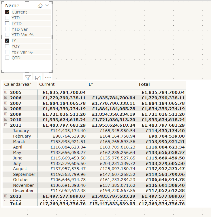
Lets see the calculated measure group in action using a matrix
Name from the time Intelligence group has been added to columns on the matrix.
Year and Month are in Rows
Total Sales, the base measure has been added to values
Name has also been added to a Slicer so you can turn off those you aren’t interested in.
To me, the big win of calculation groups is being able to create one measure and using it across multiple measures instead of creating the same measure over and over again.
And quickly switch to quantity by adding that measure to value
Issues with using calculation groups
formatting each item is much more difficult in tabular editor because you have to know the code. There is no help for creating these expressions.
Similarly, you cant develop DAX Here, you need to do it first within power BI Desktop
Your DAX has to become much more complex, rather than creating a measure and then referencing this measure within another measure. Like Year to Date and Last Year to Date
You cant create the matrix with Months in columns
This is using the measures created in the data set. As you can see, the Months are shown as columns and the measures are also displayed
You cant do this with column groups.
Lets have a look at some visuals already created with time Intelligence to see if we can recreate
Variance Waterfall chart
This is an example of a waterfall variance chart for year to date. If we didn’t have measures outside of a calculation group, could we still pull off the exact same solution?
Table: No you cant recreate the table. You would have to move to a matrix
With a filter on name to the measures you are interested in. It doesn’t appear that you can turn off grand totals though so we have some information there that we don’t need. the Total column.
So, ok but not great
Waterfall visual; there doesn’t appear to be any way you can recreate this. so to create my variance visuals there has to be a measure that can be used.
Conclusion
Calculation groups seem to only for for one visual. the Matrix. Where you can add the base measure to values and the Name to columns.
Even the matrix cant be fully configured to how it would normally be shown with months in columns and the measures underneath.
In order to use time intelligence for all other visuals, there still needs to be measures in your model to use.
It would be a great idea if you could fully get rid of your duplicated measures but you cant.
Because of this, I still don’t have the results I need to spend time creating calculation groups.
Other people seem to be seriously excited about this though so maybe I am missing something. Please let me know if I am, I would be very interested to get another point of view
So now we have all three tools connected into Power BI. Lets have a look at what they can do for you. the following is a few basics from each tool
DAX Studio
With a Power BI pbix file open. go to External tools and click on DAX Studio. It will automatically connect to the data set you have open
Go to Advanced and View metrics
This is a great way of using the Vertipaq Analyser to look at Tables, Columns, relationships, partitions and a Summary of your data model
You get to see which items have low and high cardinality. What items are taking up too much space in your model and really helps you get a feel for what you can do to make your model better
ALM Toolkit
The ALM toolkit comes from the Analysis Services space. Due to Power BI encompassing an Enterprise architecture along with self service, we can now start to use these community tools with Power BI datasets.
Its a schema comparison tool for your datasets.
Use it many scenarios such as incremental Refreshing, metadata only deployment (Now available for Premium and Pro)
This is another big hitter and requires a much more in depth look
Tabular Editor
Again, tabular Editor will connect to the tabular database you have open within your pbix file.
This is an excellent tool to help with quickly modifying tabular models.
If you do anything in here, like add measures into a folder, you will see the change straight away in Power BI Desktop.
You can also test and create measures in here which can offer a much easier way to do this than within power BI Desktop.
basically, using this tool you can automate some of the more tedious tasks and save lots of time.
Like DAX Studio. You can also analyse your entire model to get a feel any improvements you can make.
There are some great videos out there on how to make the most out of this tool and if you use Power BI heavily this is a must have.