Lessons learned whilst working with Microsoft Fabric – Part 2: Power BI and Semantic Modelling

In part 1 of our initial lessons learned in Fabric blog, we looked at Data Engineering components. Our transformed dimensions and fact tables are now stored in Delta Parquet format within the Fabric Gold Lakehouse.

Now its time to look at what we can do with the Power BI Fabric functionality. Lets build our Semantic model and Reports.

The Semantic Model

Previously, the semantic model was created in Power BI Desktop. We could then create another desktop file and connect to the semantic model that had been published to the power BI Service.

With Fabric. You create the semantic model in the Fabric workspace.

We are going to use Direct Lake connection to the Delta Parquet files. As a consequence we don’t need to create dataflows. Lets look at how this looked previously.

Without the SQL DB, with Power BI Premium. Data flows can get complex, as usually the transformations happen within the SQL database. Here they are used to simply store the data centrally before being imported into the semantic model.

You can use the data flows in multiple semantic models. For example, your date dimension could be reused in many models.

Now, we are looking at the following logic.
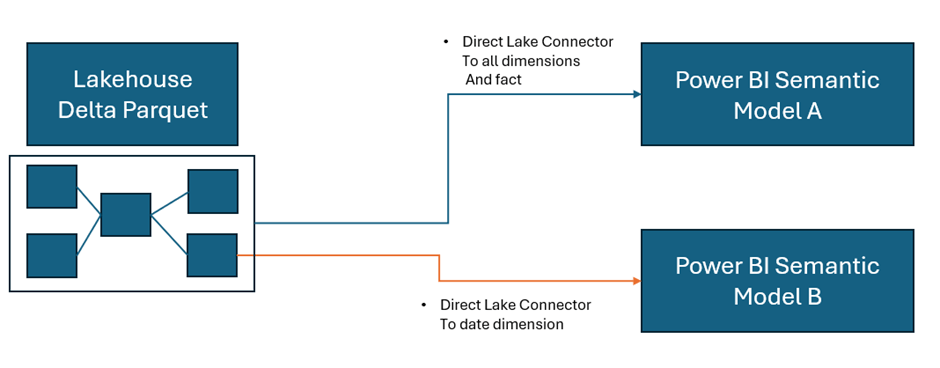
As a consequence, this project has been simplified to Delta Parquet and Semantic model.

In the Lakehouse, go to SQL analytics endpoint

At the bottom of the screen we have a model view. This is the Default Model view

This takes us to the Semantic Model. However, when trying to update the default model we get hit with errors

After looking at some of these issues online, it would appear that currently the ‘default’ semantic model is quite glitchy and many people are having issues with it.

People are using work arounds by creating their own semantic models rather than using the default semantic model. So currently, the default is left alone and a new semantic model is created.

Back in the Lakehouse

Choose New Semantic Model

And work in the same way as you would within your Power BI desktop file. Note that we don’t have to publish. The model auto saves.

And you can then commit your model changes to your GIT repository. Eventually creating versions of your model.  You can quickly create a new report in Fabric to check your DAX as you go.  This is a real change from how we used to work. Where the power BI PBIX file was simply a black box file, with no opportunities to store the code in GIT.

Notice the connections on each object

Direct Lake. Power BI directly connects to the Delta Parquet file. Just like Power BI, the file is a columnar data store, and we do not lose any DAX functionality.

Power BI Reporting

As we have seen. You can create reports directly in Fabric. A big question is, is Power BI desktop still the best thing to use?

Again I think the answer to this question is definitely yes. Although the Fabric reports can be good for quick data model testing.

  • Desktop allows for Offline development
  • Power BI Desktop can be more responsive that working on the cloud
  • Power BI reporting allows for better version control. You can save locally and publish to the service when ready.
  • Desktop integration with other external tools and services
  • Desktop provides more options and flexibility that reporting within Fabric.

With this in mind. Another update we can take advantage of is the Power BI PBIP (Project) desktop files. PBIP allows for version control and collaboration. Finally, Our Power BI files are broken up and code can be stored in out GIT repositories.

PBIP (the Power BI Project File)

Get Data

In Power BI Desktop you can access your Power BI semantic models

Create reports from the Semantic model(s) in Fabric.

Create the Power BI Project (PBIP)

Instead of simply saving as a pbix (black box) file, Save as a project file and see how this can really change how you work. We should see benefits like:

  • Items are stored in JSON format instead of being unreadable in one file
  • JSON text files are readable and contain the semantic model and report meta data
  • Source Control. Finally real source control for Power BI
  • Amendable by more than one person at a time
  • The possibility of using (CI/CD) Continuous Integration and Continuous Delivery with Power BI

Saving as a project is (Currently) in preview so lets turn it on.

Options and Settings / Options

And now we can Save as report.pbip

After saving, the project is stated in the title.  Lets have a look at what has been created in Explorer

The main project file

The reporting folder

The objects within the reporting folder.

For the initial test. The pbip was save to One Drive. It needs to get added into Devops so it can be added into the full source control process along with all the Fabric code.

Azure DevOps: build pipelines for continuous integration

Ensure Fabric is already connected to Azure Devops And cloned to a local drive.

Add a powerbi folder in the local repository and all the Power BI Objects are moved here.

PBIP is in local but not yet in the cloud.

Git Bash is installed locally to work with https://git-scm.com/downloads

Using GIT Bash you can push the powerBI files up to the central repository by creating a new branch to work on

Add and commit the changes. Then Push to the cloud

Back in DevOps

We can see the Power BI Items. If you have pushed to a branch, you can then create a pull request to pull the new power BI files over into main.

To work with the file again, remember to open the (PBIP) project file from your local repository. Then you can work in Git Bash to once again. Create a new branch. Add, Commit and Push the changes.

For self service Power BI developers, this may be something that takes time to embed itself, since the process is more complex and you need to have some understanding of version control but it is really worthwhile to train your developers and build this into your standard procedures. Especially with the Silver and Gold standard (Promoted and Certified) content.

The Fabric Capacity Metrics App

Finally, lets take a quick look at the Fabric Capacity Metrics app. You need to be an admin to install and view the report.

Why is the Fabric capacity app important?

  • It provides insights into how the capacity is being used.
  • Monitoring usage patterns helps to identify how to scale resources up and down.
  • High usage items can be quickly identified

Installing the App

Go into your Fabric Workspace and click on the settings cog at the top right of the screen and select the governance and insights Admin Portal

I am the admin for the Fabric capacity so ensure you know who your Fabric Capacity Admin is

Click on the capacity and get the capacity ID from the URL

You can use the ID for the Capacity Metric App

In the Fabric Workspace. Go to your Power BI experience at the bottom left of the screen

Click on Apps and Get Apps

Search for the Fabric capacity App and Get it Now to install

Connect to start working with the app
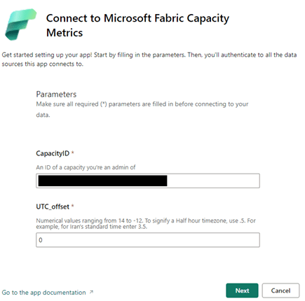
The screen is where you can use the capacity ID, copied from the Admin Portal. You then need to sign in and connect.

Here is where the Fabric experience falls down for me slightly currently.

The capacity app doesn’t show financial costs (Although part of the license fee. There are still costs to running spark jobs). Also, only the Fabric admin can see this information.

As a none admin user, I still want the power to be able to see my utilisation as I work with fabric.

Conclusion

The more you learn with Fabric the more exciting it gets. The next goals are to work with the Data Warehouse and the real time capabilities.

There are so many opportunities to use the Delta Lake or SQL DW as our transformation (Staging area) with Direct Lake Power BI connection. I can see Delta Lake being the option of choice to quickly to build up smaller solution projects.

As a SQL Developer, I am now a big fan of Pyspark. These two make a great tool set for the Fabric analytics engineer.

And as always with Power BI, there are exciting updates every month to look forward too. You never stop learning as an Analytics Engineer.

As at time of adding this blog. I am working towards the Fabric Engineer Certification after getting my Azure Engineer Associate some time ago. So lots more to think about. My current excitement is the real time analytics within Fabric. I.m really looking forward to trying to implement a project with this.

Microsoft Fabric Part 9. Taskmaster Project. Creating the Semantic Model

The Semantic Model

moving straight on from Part 8. We were in the SQL Analytics Endpoint.

At the bottom of the screen we have a model view. This is the Default Model view

This takes us to the Semantic Model

Semantic Modelling in Fabric

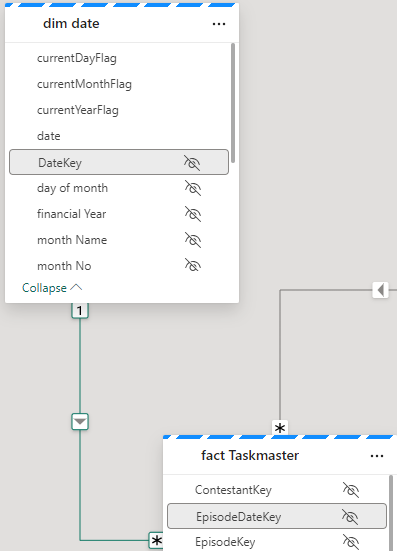
Lets update the default semantic model. Set the relationships. Hide Keys, set up Orders, hierarchies etc.

Direct lake

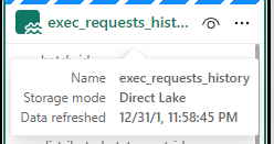
Notice the Storage model is Direct Lake. this has greatly reduced the amount of copies of the data we have. Power BI is using the PARQUET files in the same way it would Import into the Columnar Power BI data Store.

Direct lake is only available with Microsoft Fabric and Delta PARQUET tables

Unfortunately I have hit a problem.

The Semantic Model isn’t working. After every change we hit

 ‘We cannot access source column ‘<ccon>series</ccon>’ from delta table ‘<ccon>dimepisode</ccon>

However, checking the Data and series is available.

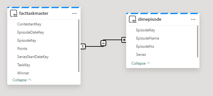
Also the directions on the join are incorrect (Before the changes are removed)

After looking at some of these issues online, it would appear that currently the ‘default’ semantic model is very glitchy and many people are having issues with it.

People are using work arounds by creating their own semantic models rather than using the default. This seems very disappointing, and I hope its rectified soon (As at 30/05/2024)

https://powerbi.microsoft.com/en-gb/blog/improvements-for-creating-new-direct-lake-semantic-models/

Create a Semantic Model

Back in the Lakehouse

Choose New Semantic Model

Select All

Join Dim Episode to Episode Key

Immediately we see an issue. the many should be on the fact side.

Time to go back to the SQL analytics endpoint to quickly check what is happening.

Going back to My Queries and the Taskmaster data checks file.

SELECT f.TaskKey AS FactTaskKey, COUNT(*)
FROM [DebbiesFabricLakehouse].[dbo].[facttaskmaster] f
GROUP BY f.TaskKey

SELECT t.TaskKey AS DimTaskKey, COUNT(*)
FROM [DebbiesFabricLakehouse].[dbo].[dimtask] t
GROUP BY t.TaskKey
Having COUNT(*) > 1

SELECT Task, TaskOrder, COUNT(*) FROM [DebbiesFabricLakehouse].[dbo].[dimtask] 
GROUP BY Task, TaskOrder
HAVING COUNT(*) > 1

it would seem that from running the above queries. Everything is correct. 1 Task to Many. In Power BI desktop this would automatically create the correct relationship for you,

So in this instance, go into the relationship and reset. (is this an issue in Fabric at the moment?)

Relationships and hiding keys

Friendly Names

Now I want to set up Friendly names for the columns and tables. If we change a table name in Data, how does this affect the DELTA PARQUET table? Lets check.

it doesn’t affect Delta PARQUET file so lets add Friendly names into the model for the dims

E.g.

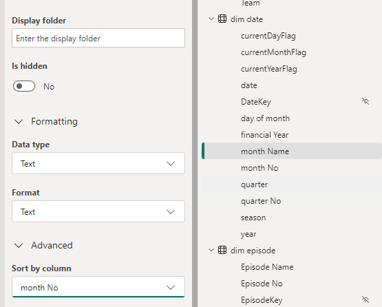
Add Sort orders and hide

This has been repeated on :

  • Dim Date Quarter / Quarter No
  • Dim Episode Episode Name / Episode No
  • Dim Task Task / Task Order

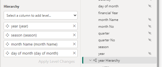
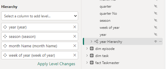
Hierarchies

Dim Date

Hide the original fields outside of the hierarchy so not to confuse the user.

For this project, Lets not use Quarter and hide it for the time being

Lets also hide financial year

Dim episode

Don’t forget to click Apply level changes

DAX

Now we can start to add the DAX. The question here is, In power BI Desktop we can create DAX and then immediately create a visual to check its looking good. how do we do this in the Semantic model in Fabric?

Points

Total Points = SUM(‘fact Taskmaster'[Points])

And hide the base metric

And add the new DAX to a Folder

So how do we quickly check this

Using the new report we can quickly create a test report.

No need to save this report. it is just a tester.

There is something wrong with the Date connection. We can go back to the SQL analytics Endpoint to quickly check (After checking the relationships)

Our Date Dimension starts in 2020, and we are only at 2017 so the Date Delta PARQUET needs an update.

Dim Date NoteBook

Back in Dim Date. All we need to do here is to reconfigure these Start and End Dates

# Define your start and end dates
start_date = '2015-01-01'
end_date = '2027-12-21'

And rerun the entire notebook

then go back to the Query just jun.

And after a refresh on the report

Great. this issue has now been resolved.

Week

And whilst in Dim Date Dimension. there is one thing that we havent added and thats week.

Week is really important because each Each episode is once a week. Its more important than day. So lets quickly update to bring in a Week column and we can update the hierarchy and hide day.

from pyspark.sql.functions import to_date, weekofyear

dfDateWeek  = dfdate2.withColumn('weekofyear', weekofyear(dfdate2.date))

dfDateWeek.show()

And Update the Creation of the files to use this dataframe

Update the date Hierarchy

Once set lets go back to the semantic model

Right click and Refresh

This didn’t work. Week of year isn’t appearing in the model.

Clicking this seems to have worked.

We don’t want to sum up the weeks so in Properties / Advanced, set summarize by to None.

Update the hierarchy

Also, Don’t forget to set as Date table

Back to the DAX.

Base Metrics

Total Contestants = DISTINCTCOUNT('dim contestant'[Contestant Name])

Total Episodes = DISTINCTCOUNT('fact Taskmaster'[EpisodeKey])

Total Points = SUM('fact Taskmaster'[Points])

Max Points Scored (ALL Contestant Images) = MAXX(
                    ALL( 'dim contestant'[Image]),[Total Points])

Points for Group Tasks = CALCULATE(SUM('fact Taskmaster'[Points]),'dim   task'[Assignment] = "Group")

Points for Special Tasks = CALCULATE(SUM('fact Taskmaster'[Points]),'dim task'[Assignment] = "Special")

Total Series = CALCULATE(DISTINCTCOUNT('dim episode'[Series]), 'dim episode'[Series] <> "NA")

Total Tasks = DISTINCTCOUNT('fact Taskmaster'[TaskKey])

DAX with variables
Winner + Tiebreaker = 
var tiewin = CALCULATE(SUM('fact Taskmaster'[Winner]),FILTER('dim task','dim task'[Task Type] = "Tie Breaker"))

RETURN  [Total Points]+tiewin

DAX using If

Group Tasks = IF(CALCULATE(DISTINCTCOUNT('fact Taskmaster'[SeriesStartDateKey]),'dim task'[Assignment] = "Group") = BLANK(), 0,
              CALCULATE(DISTINCTCOUNT('fact Taskmaster'[TaskKey]),'dim task'[Assignment] = "Group"))

Special Tasks = IF(CALCULATE(DISTINCTCOUNT('fact Taskmaster'[SeriesStartDateKey]),'dim task'[Assignment] = "Special") = BLANK(), 0,              CALCULATE(DISTINCTCOUNT('fact Taskmaster'[TaskKey]),'dim task'[Assignment] = "Special"))

Tie Breaker = IF( CALCULATE(DISTINCTCOUNT('fact Taskmaster'[TaskKey]),'Dim Task'[Task Type] = "Tie Breaker") = BLANK(), 0,              CALCULATE(DISTINCTCOUNT('fact Taskmaster'[TaskKey]),'Dim Task'[Task  Type] = "Tie Breaker"))

Tie Breaker episode ? = IF([Tie Breaker]>=1 , "Tie Breaker", "Won on points")

Percentages

% Tasks = [Total Tasks]/ CALCULATE([Total Tasks], ALL('dim task'[Assignment]))*100

% Tasks by Series = [Total Tasks]/ CALCULATE([Total Tasks], ALL('dim episode'[Series]))*100

% Tasks by Type = [Total Tasks]/ CALCULATE([Total Tasks], ALL('dim task'[Task Type]))*100

And each one is added to a display folder. E.g. Measures\Tie Breaker to give us a sub folder under Measures

Highlighting Metrics By Colour will be used later in the reporting.

Highlight Max Points Scored (ALL Contestant Images) = 
Var MaxPoints = MAXX(
                    ALL( 'dim contestant'[Image]),[Total Points])


Var Check = IF([Total Points] = MaxPoints, "Light Green","White")

Return Check

Highlight Max Points Scored (ALL Episodes) = 
Var MaxPoints = MAXX(
                    ALL('dim episode'[Episode Name]),[Total Points])


Var Check = IF([Total Points] = MaxPoints, "Light Green","White")

Return Check

Highlight Max Points Scored By Episode = 
Var MaxPoints = MAXX(
                    ALL('dim episode'[Episode Name]), [Total Points])


Var Check = IF([Total Points] = MaxPoints, "Light Green","White")

Return Check

Highlight Min Points Scored (ALL Contestant Images) = 
Var MaxPoints = MINX(
                    ALL('dim contestant'[Image]), [Total Points])


Var Check = IF([Total Points] = MaxPoints, "Light Red","White")

Return Check

Hide original fact data

With Everything hidden in the table. we get out fact icon, establishing that this is a fact table

Final Updates

Have Thousands separators set for numbers (Measures)

Make sure percentages are also set correctly

Set Image as Image URL in Properties > Advanced

Our Semantic model is complete. Or at least ready for us to start creating reports.

The other thing to note about this semantic model is there is no need to publish. It autosaves and we simply need to refresh our data source for the reporting to bring through changes.

Lets move on to creating the visuals in the next post.

Design a site like this with WordPress.com
Get started